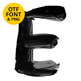
Most brush fonts throw the serifs away. Brushstroke Art Font keeps them, painting a high-contrast display serif with heavy streaked stems, hairlines that break into dry specks and feet that flare the way a brush splays. It suits mastheads, galleries, publishing, fashion editorials and wine labels. The set types from a plain OTF and includes transparent PNG letters.
Brushstroke Art Font Paints a Serif
Most brush fonts throw the serifs away. The Brushstroke Art Font keeps them, so you get a high-contrast display serif with thin hairlines and proper bracketed feet, painted rather than drawn. Because a loaded brush laid every stroke, the thick stems carry visible bristle streaks down their length. The hairlines thin almost to nothing where the brush lifted. Meanwhile the edges wobble slightly, exactly as a hand would. Naturally no two stems hold the same amount of ink.
Fat Stems, Thin Hairlines, Rough Edges
Above all, contrast is the point of the design. The stems run heavy and almost solid black, since that is where the brush pressed hardest. Then the hairlines beside them break into dry specks. Besides that, the serifs flare outward the way a brush naturally splays at the end of a stroke. Likewise small flecks land beside a few letters. Of course the underlying shapes stay classical, which is what separates it from a casual script.