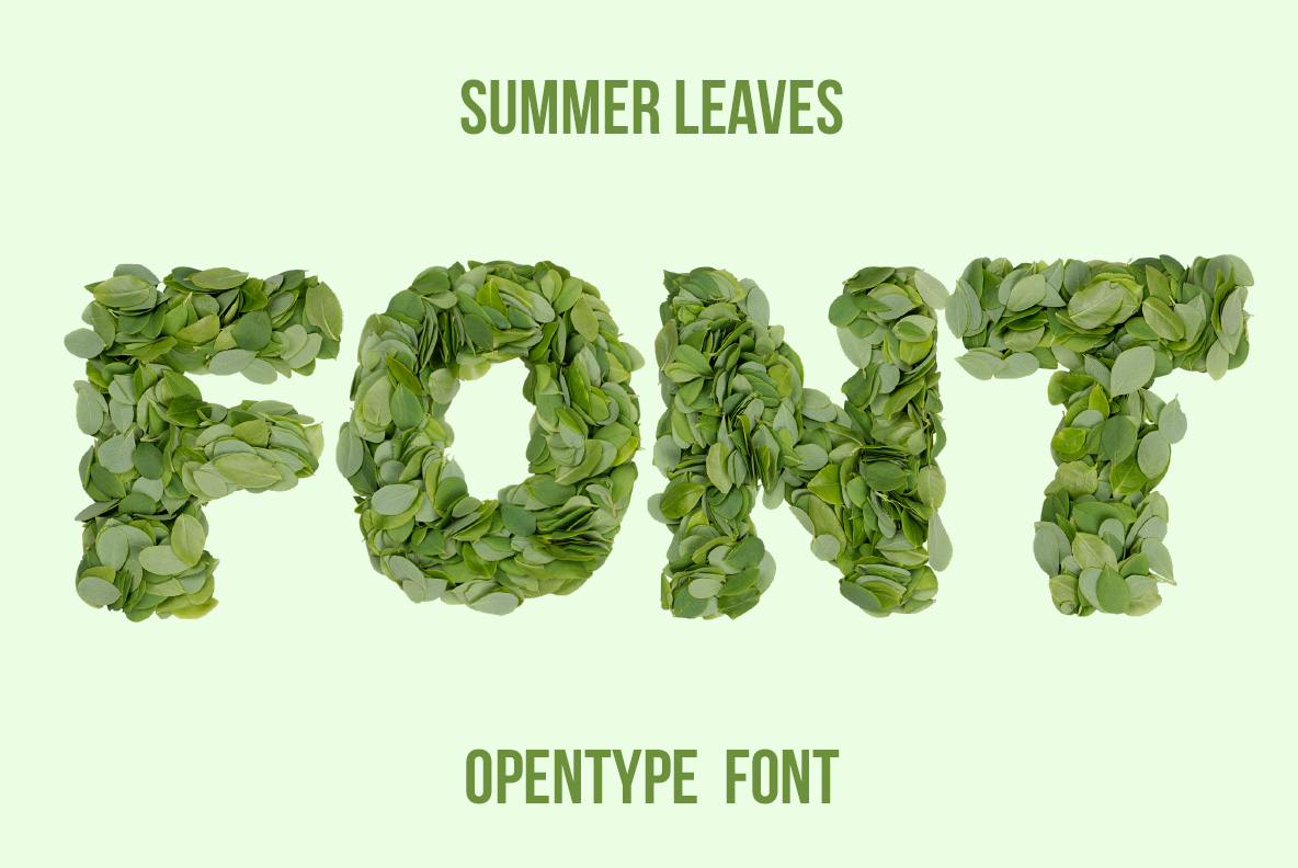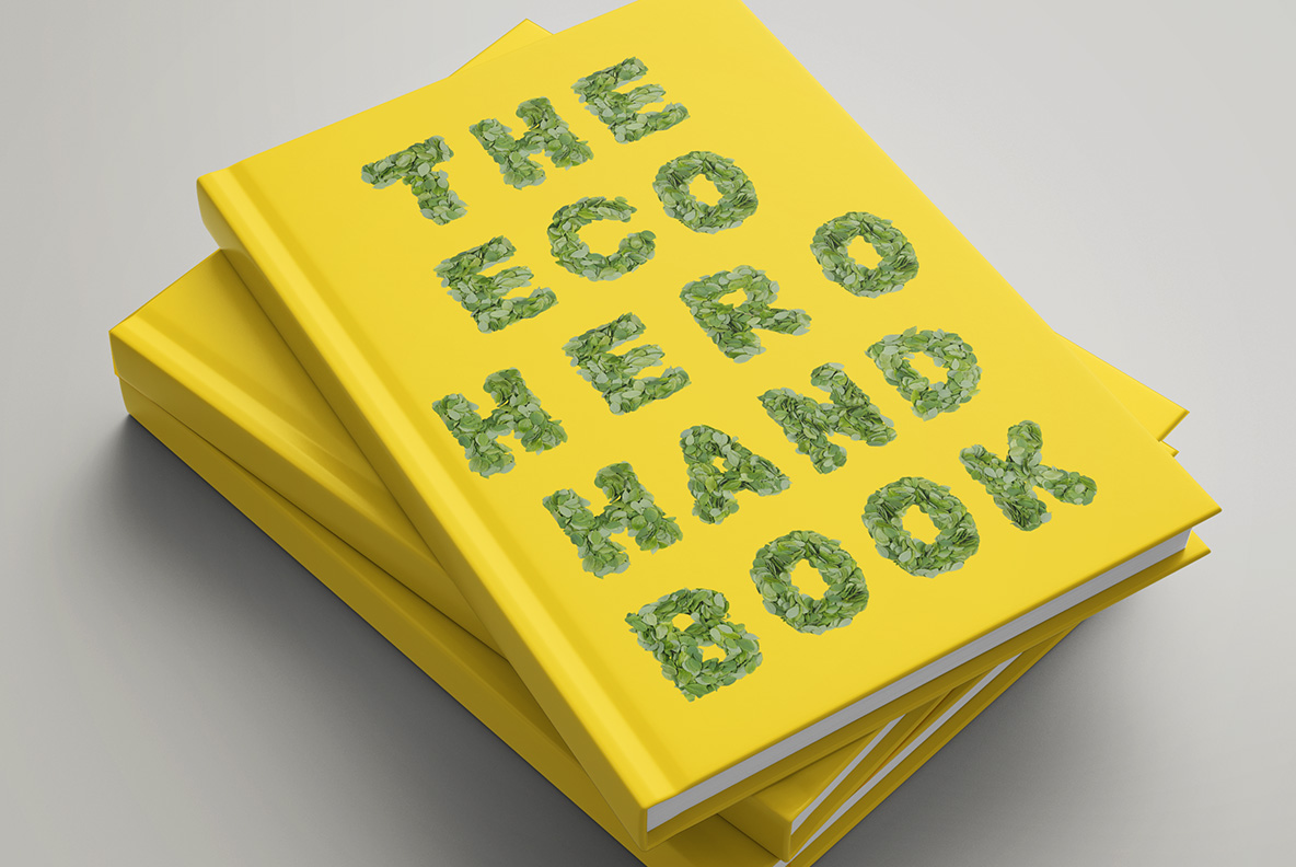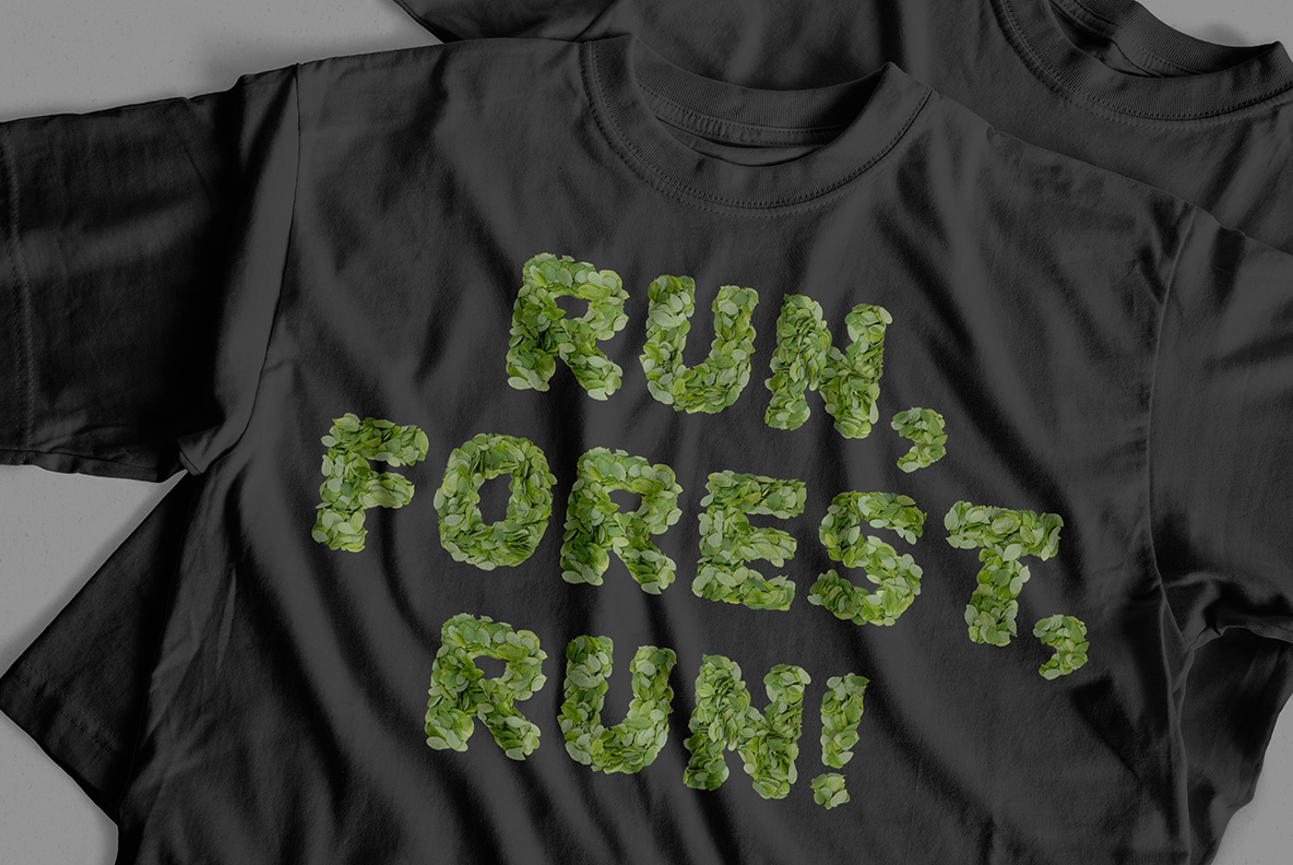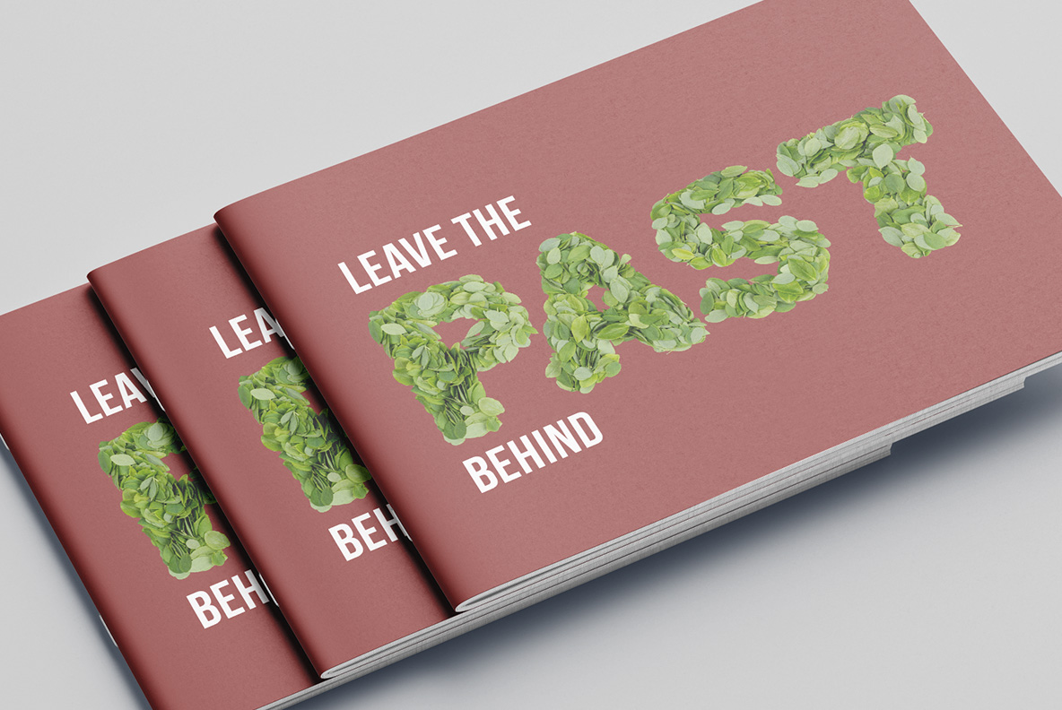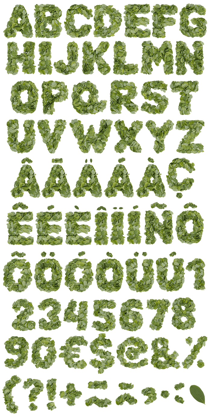

Summer Leaves Font heaps dozens of small oval leaves into every character, layering them until the outline breaks up with stray tips and stems. Because the leaves show both faces, mid-green and pale silver alternate across each stroke. A bold sans holds the shape underneath, and the OTF plus transparent PNG files ship together.
Summer Leaves Font Heaps Real Leaves Into Letters
Summer Leaves Font layers dozens of small oval leaves into every character until the shape fills in, so no two glyphs stack the same way twice. Because each leaf keeps its own curl and shine, the surface stays lively rather than printed. Meanwhile stray tips and short stems push past the outline, which softens the silhouette without losing it. So the letters look gathered by hand that morning.
Layers That Break The Outline
Underneath sits a bold sans with sturdy counters, so the words hold up even where the foliage spills over. Since the leaves show both faces, deep mid-green and pale silvery underside alternate right across a stroke. Besides, the shadows between layers give each letter depth that a flat green fill could never fake. Meanwhile the palette stays natural throughout, so photography sits alongside it comfortably.