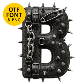
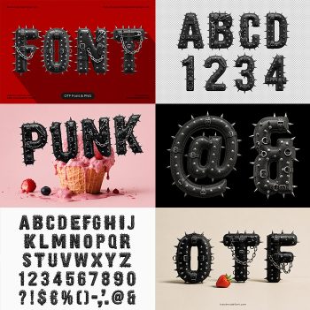
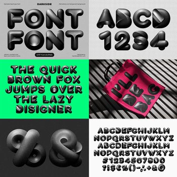
Fat rounded capitals moulded from wet-look black latex, with hard white highlights snapping along every curve and small studs set into the seams. The Domina Font never leaves black, so it lifts cleanly off red, magenta or a lit screen. Masks, hands, a staring eye, a laced heart and a few solid shapes ship alongside the alphabet.
Black Latex, Pulled Tight
In fact, every capital looks moulded from patent latex and then polished hard. The black runs deep, yet hot white highlights snap along each curve, so the material reads wet at a glance. Besides that, seams, eyelets and small studs sit exactly where a garment would carry them. Because the surface reflects so sharply, the letters change completely when the light moves. Since the highlights fall in hard streaks, even a single glyph suggests a curved surface. Nothing here is matte, and naturally nothing apologises for it.
One Colour, Every Kind of Shine
Shape-wise the alphabet stays fat and rounded, almost inflated. That softness is deliberate, since it stops the finish from turning purely aggressive. Strokes likewise swell through the middle and pinch at the joins, the way an air-filled panel would. Meanwhile the palette never leaves black. Against red, magenta or a lit screen the type therefore lifts straight off the background. Above all, one colour keeps a busy poster under control.