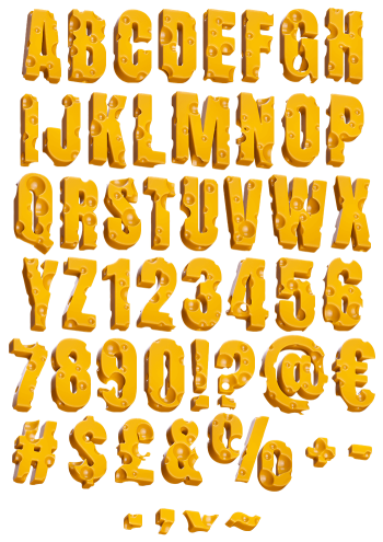
Stamped out of a single flat slice, with holes punched where they feel natural and a gentle gloss on top. Moon Cheese Font keeps every glyph the same thickness, so words read as one cut sheet of Emmental. Menus, dairy packaging, cereal boxes and cartoon titles all suit it. The set types from an OTF and ships transparent PNG letters.
Moon Cheese Font Cuts Letters From One Slice
This is one flat slice, not a wedge. Every glyph in the Moon Cheese Font came out of a single yellow sheet, so the thickness stays the same everywhere. Because the edges curve softly, nothing looks cut with a knife. Holes punch through at random, since a tidy pattern would look manufactured. Meanwhile a gentle gloss sits on the surface, just damp enough to read as fresh. Naturally the colour runs warm yellow, closer to Emmental than cheddar.
Holes Where the Counters Should Be
The holes do real design work. Some land inside the counters of an O or a B, so the letter reads doubly hollow. Others bite into the outer edge, because a clean silhouette would be boring. Rather than repeating, each glyph gets its own hole pattern. Then the small ones cluster near the big ones, the way they actually do in a block of cheese. Of course a few letters stay almost solid, and that contrast keeps the set from turning into lace.