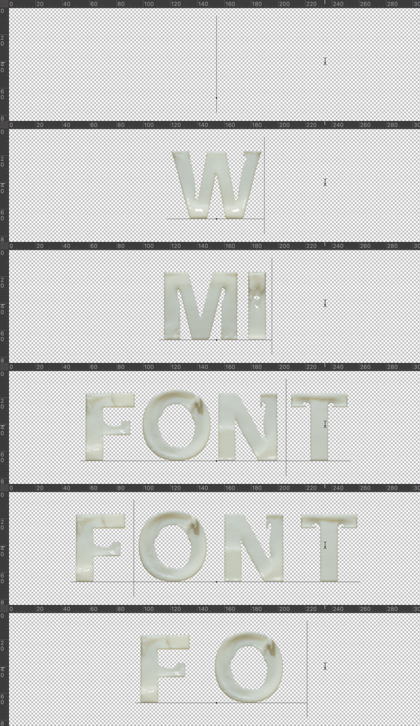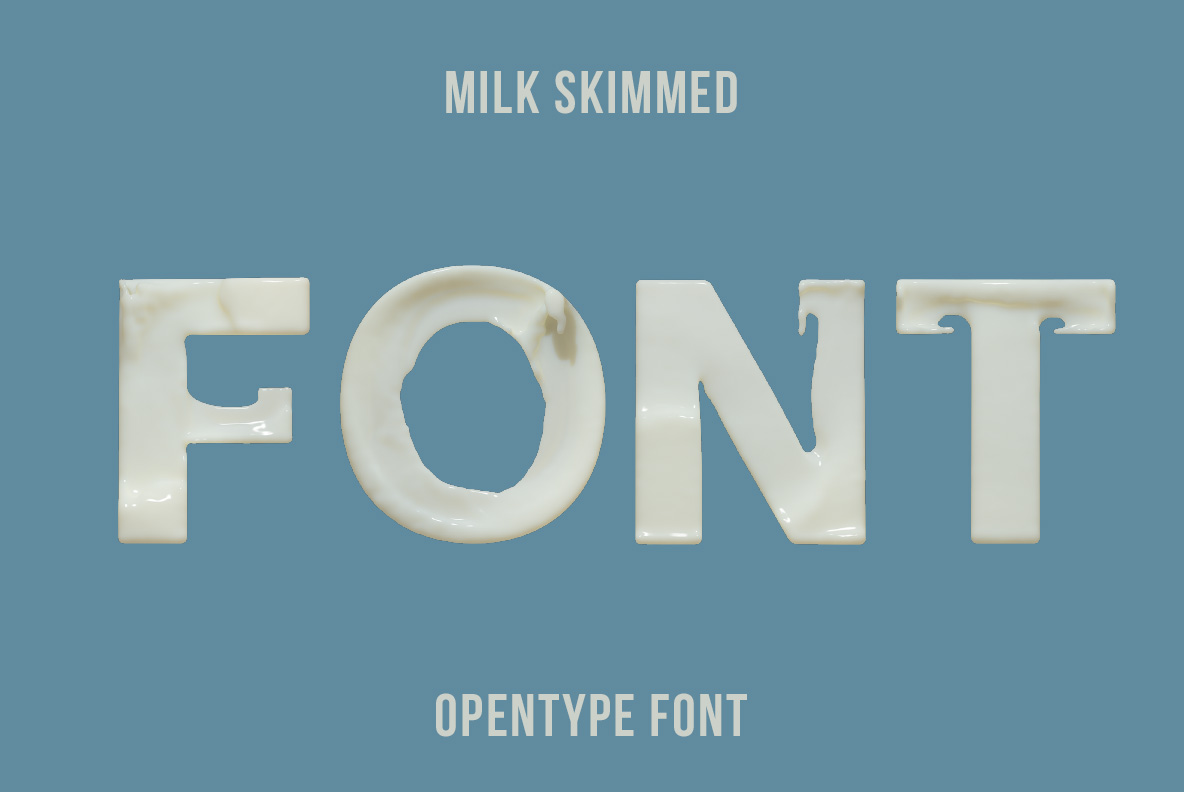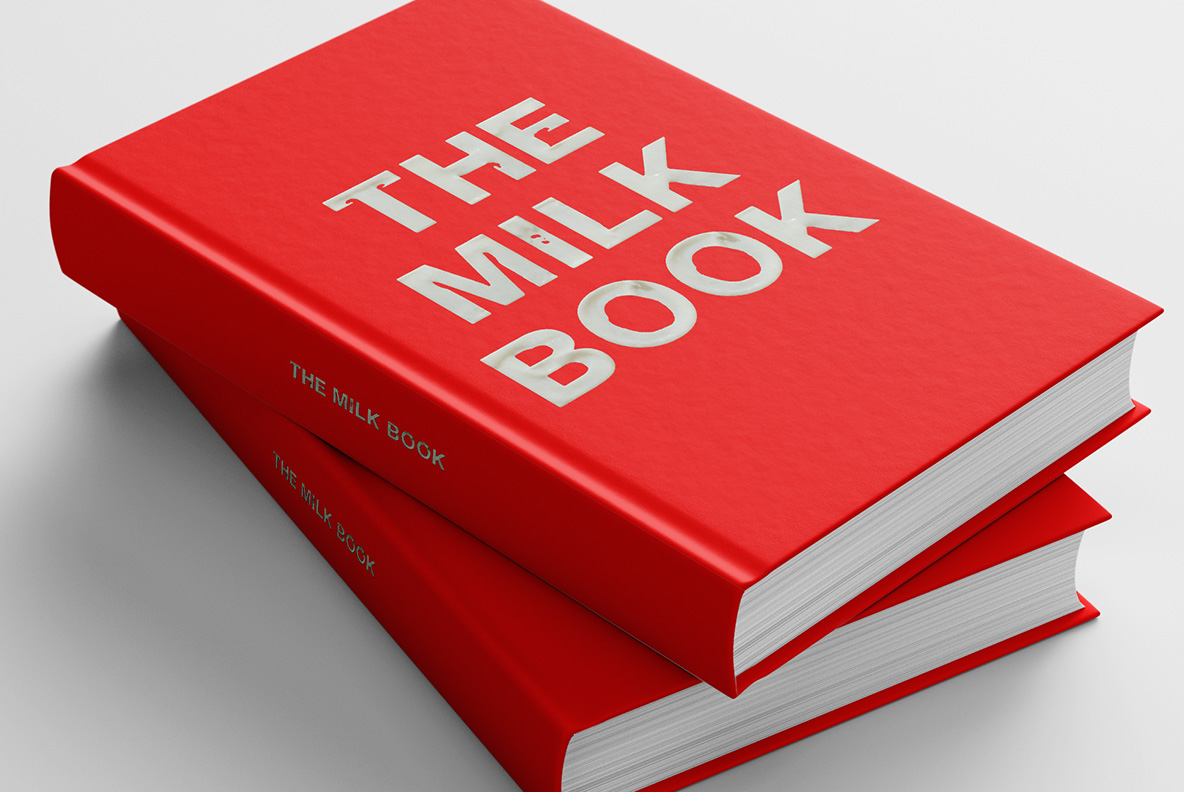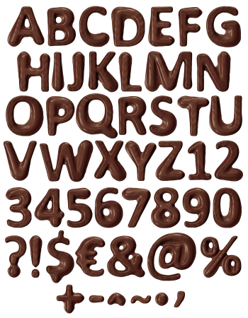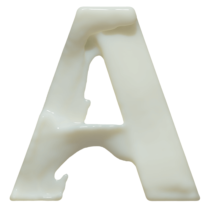
Letters that behave like cream caught a second after it settled. Milk Skimmed Font keeps rolled edges, a soft band of gloss along every stroke and that faintly warm off-white tone. It suits dairy packaging, skincare labels, bakery boards and anything selling smoothness. The set installs as a normal OTF and brings transparent PNG letters too.
Milk Skimmed Font Pours Its Letters
Milk does not hold a shape on its own, so this one got help. Each letter in the Milk Skimmed Font behaves like cream that stopped moving a second ago. The edges roll slightly instead of cutting straight down, because liquid never gives you a sharp corner. Meanwhile highlights sit in a soft band along the top of every stroke. Naturally the colour stays that faintly warm off-white, never a clean paper white. Look at the G and the surface still seems to be moving.
A Surface That Stays Soft and Glossy
The finish is the whole trick. It reads as glossy but never plasticky, since the shine spreads wide rather than pinpointing. Shadows underneath stay pale, so the letters feel light instead of heavy. Where two strokes meet, the join swells a little, exactly as poured cream would. Besides that, the thickness stays even from A to Z, which keeps whole words tidy. Put it on a pastel background and it almost disappears into a dessert menu. On black, of course, it turns into something far richer.