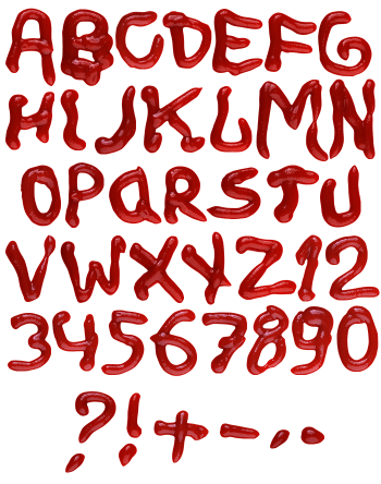
A leaning brush script poured in bright scarlet sauce: even strokes, small rounded ball ends and a long wet highlight running down every spine. Where two strokes cross the sauce piles up and darkens. It suits burger joints, sauce labels, diner menus, delivery apps and film posters that want something spilled.
A fast brush stroke, not a slow squeeze
The letters, of course, lean forward like a signature written in one go. Strokes stay fairly even in width, then finish in a small rounded ball where the nozzle lifted. Where two strokes cross, the sauce piles up slightly and darkens. Because the rhythm is quick, the whole alphabet reads as handwriting rather than lettering. A few tails also flick out past the baseline.
High-gloss scarlet that catches the light
The red here is bright scarlet too, not a cooked brick tone. Every stroke carries a long white highlight down its spine, so the surface looks wet and freshly poured. Shadows sit tight underneath, meanwhile, which keeps the letters on the page. On black it turns almost lacquered, though on white it stays appetising. Naturally, nothing about the finish is matte.