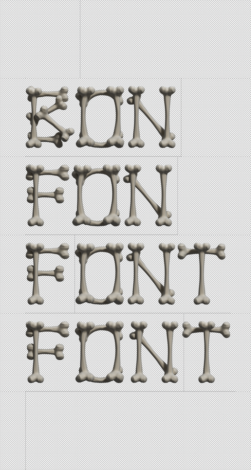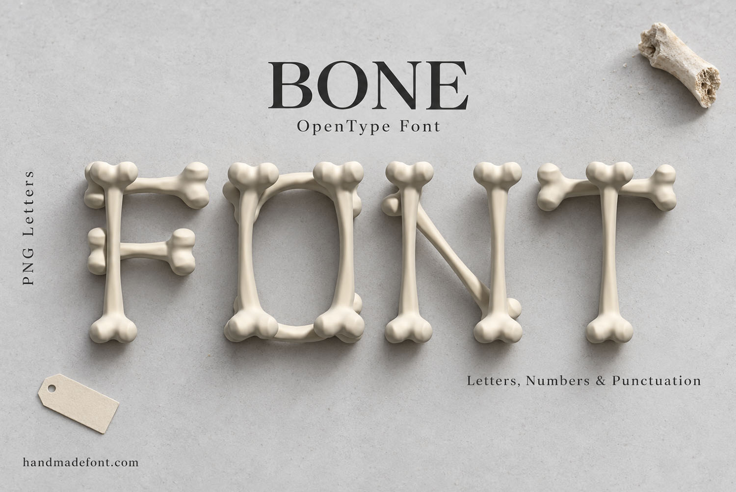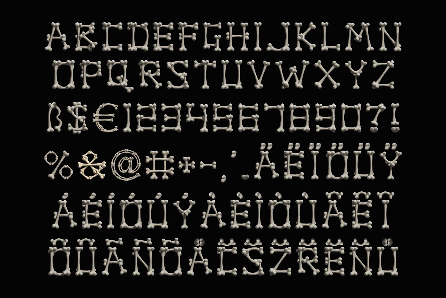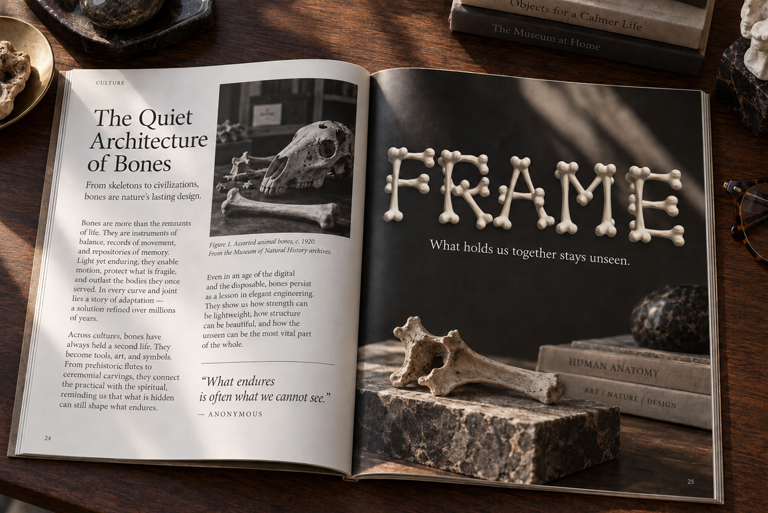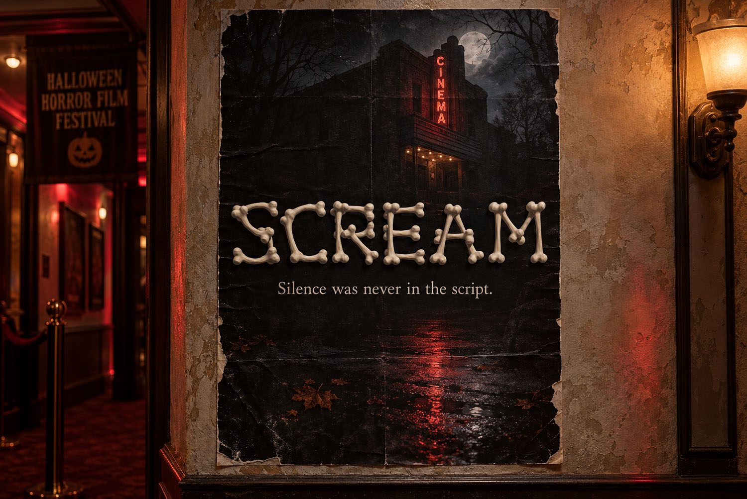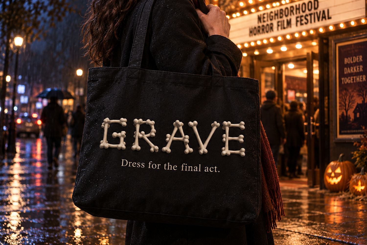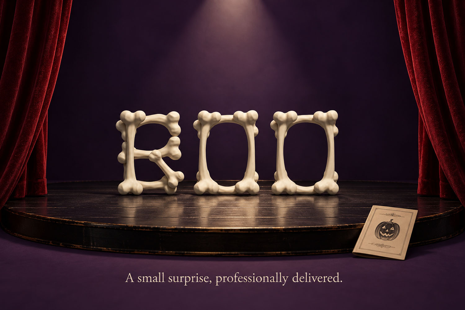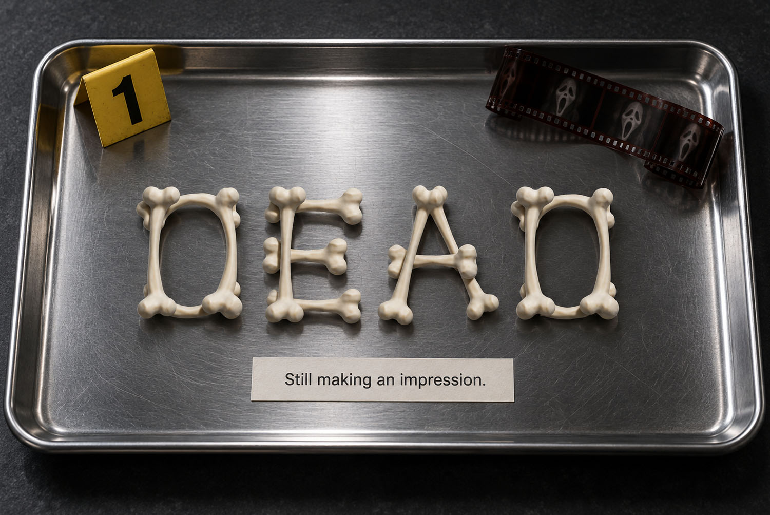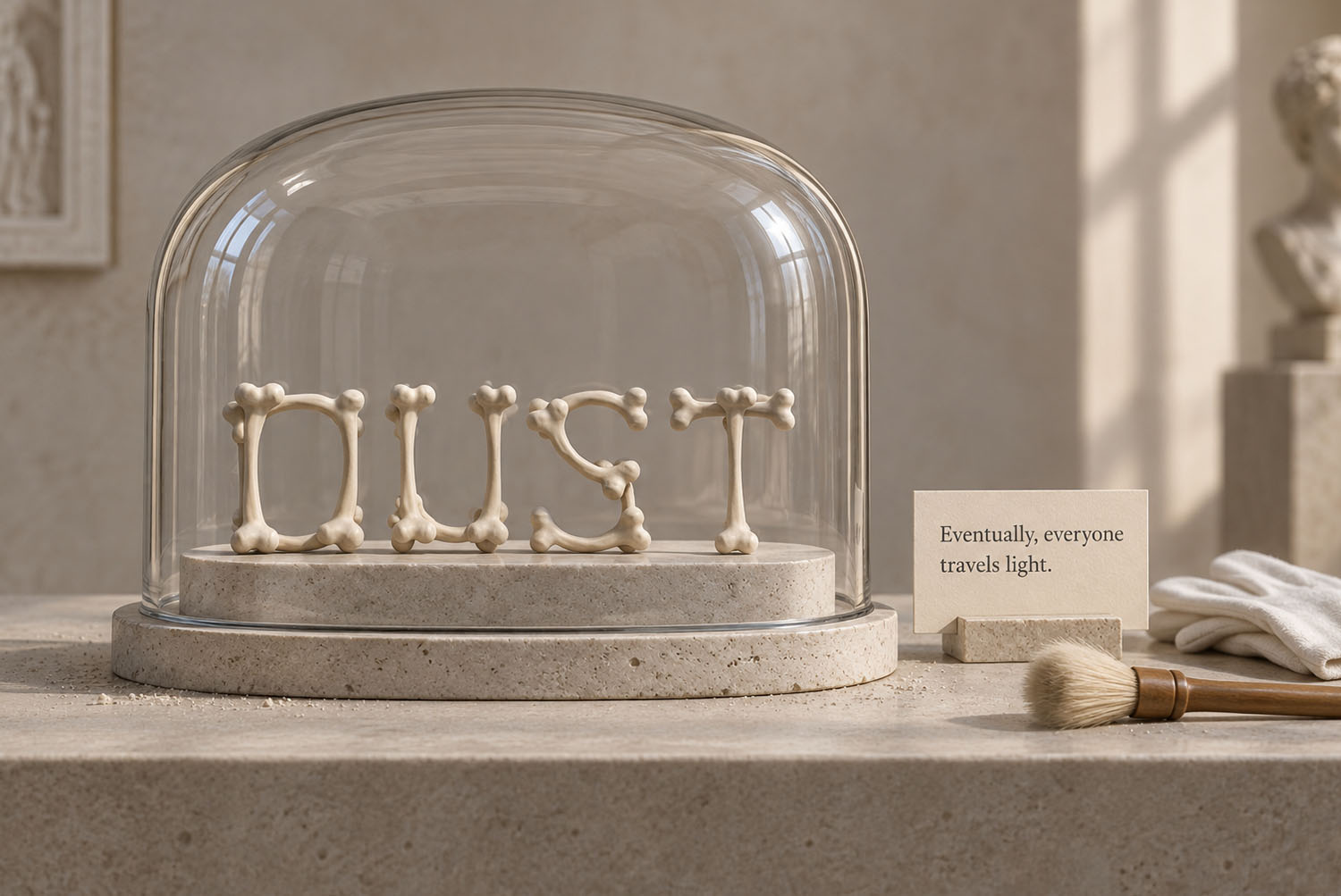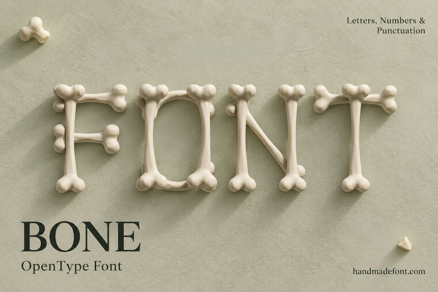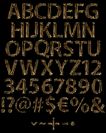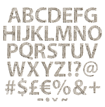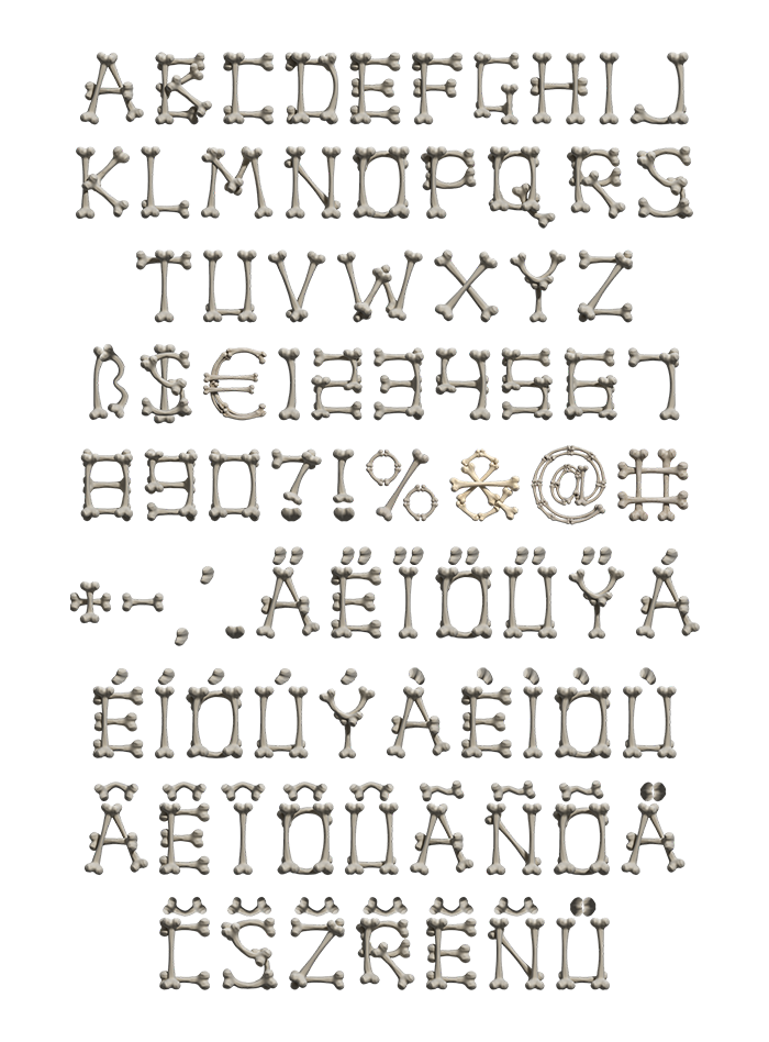
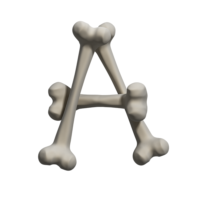
Bone Font builds every capital from classic double-knob bones, one bone per stroke, crossed and overlapped at the knuckles. The finish is matte ivory fading into cool grey, with soft light on the knobs and a little wear on each shaft. You get an OTF you can type with, plus separate high-resolution PNG letters on transparent backgrounds.
Bone Font Builds Letters the Simple Way
Every stroke here is one bone, the classic kind with two rounded knobs at each end. So an H takes three of them, while an A leans two together and lays a third across. Nothing curves, because bones do not bend. As a result, round letters in the Bone Font turn into short straight runs that meet at the knuckles. Of course, that gives the alphabet a slightly stiff, hand-assembled look. It feels as if someone laid it out on a table piece by piece, and that is the charm.
Pale, Smooth and Slightly Worn
At first glance the surface reads as matte ivory drifting into cool grey. Light rolls along each shaft, so the knobs catch a soft highlight while the joints drop into shadow. Meanwhile, faint wear keeps the finish from looking like plastic. Because the knobs overlap wherever two bones meet, every letter of the Bone Font carries little bumps along its outline. Consequently, even a plain word looks busy in a good way, yet it stays easy to read at headline size.