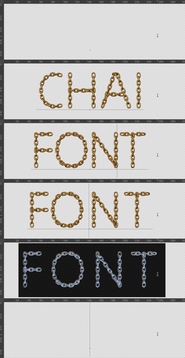
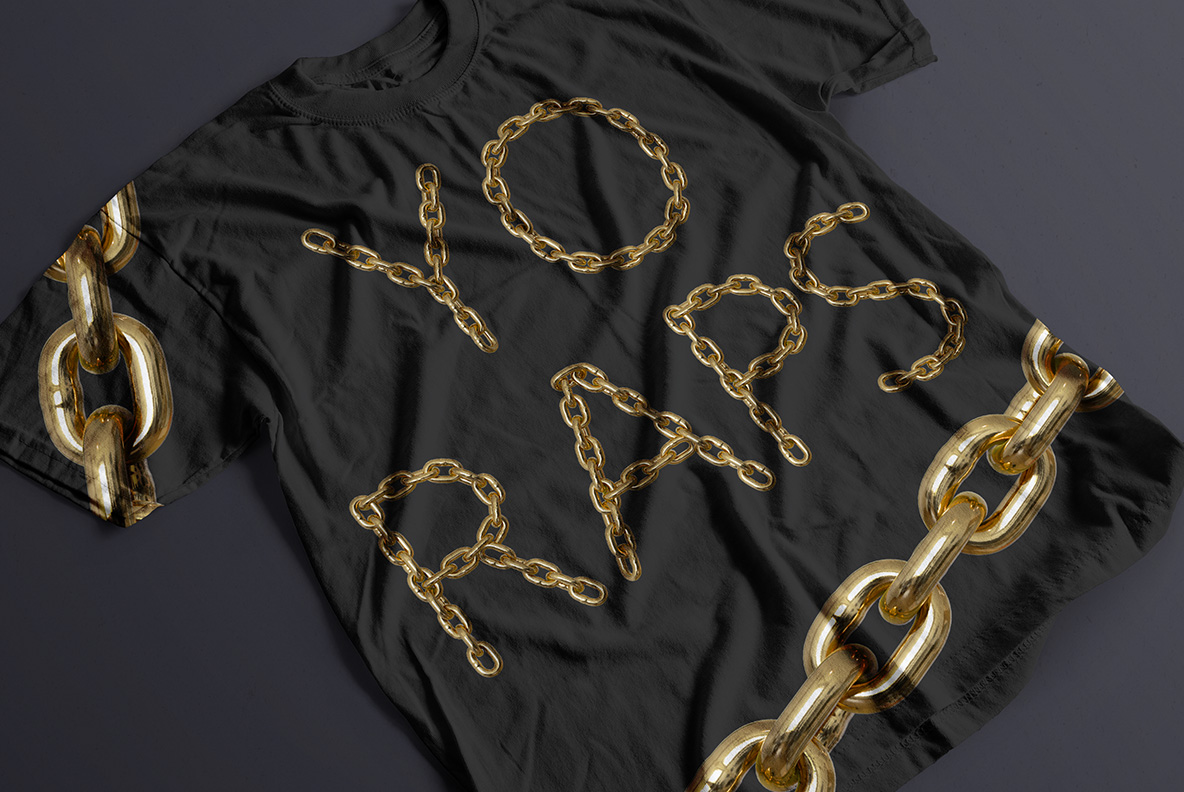
Thin monoline capitals traced from a single run of small polished gold links, twisting as each stroke turns and leaving loose ends hanging at the terminals. The Gold Chain Font stays light on the page where most chain alphabets go heavy. Figures, currency signs and punctuation are strung exactly the same way.
One Fine Chain, Bent Into Words
You can draw with a chain, provided the links stay small enough. Here each capital is traced by a single run of fine gold ovals, one link feeding into the next. The links twist as the stroke turns, so highlights shift constantly around a curve. The gold reads warm and softly polished rather than mirror-bright. Because every run is laid by hand, repeated letters never fall the same way. Small shadows gather where two links overlap as well, which gives the stroke depth.
Light Strokes, Loose Ends
The weight is the surprise. This is a thin monoline rather than a chunky display face, so whole words stay light on the page. Loose ends hang free at the terminals too, which keeps the letters from looking sealed. That delicacy is what separates the Gold Chain Font from heavier chain alphabets. In addition, figures, currency signs and punctuation are strung the same way.