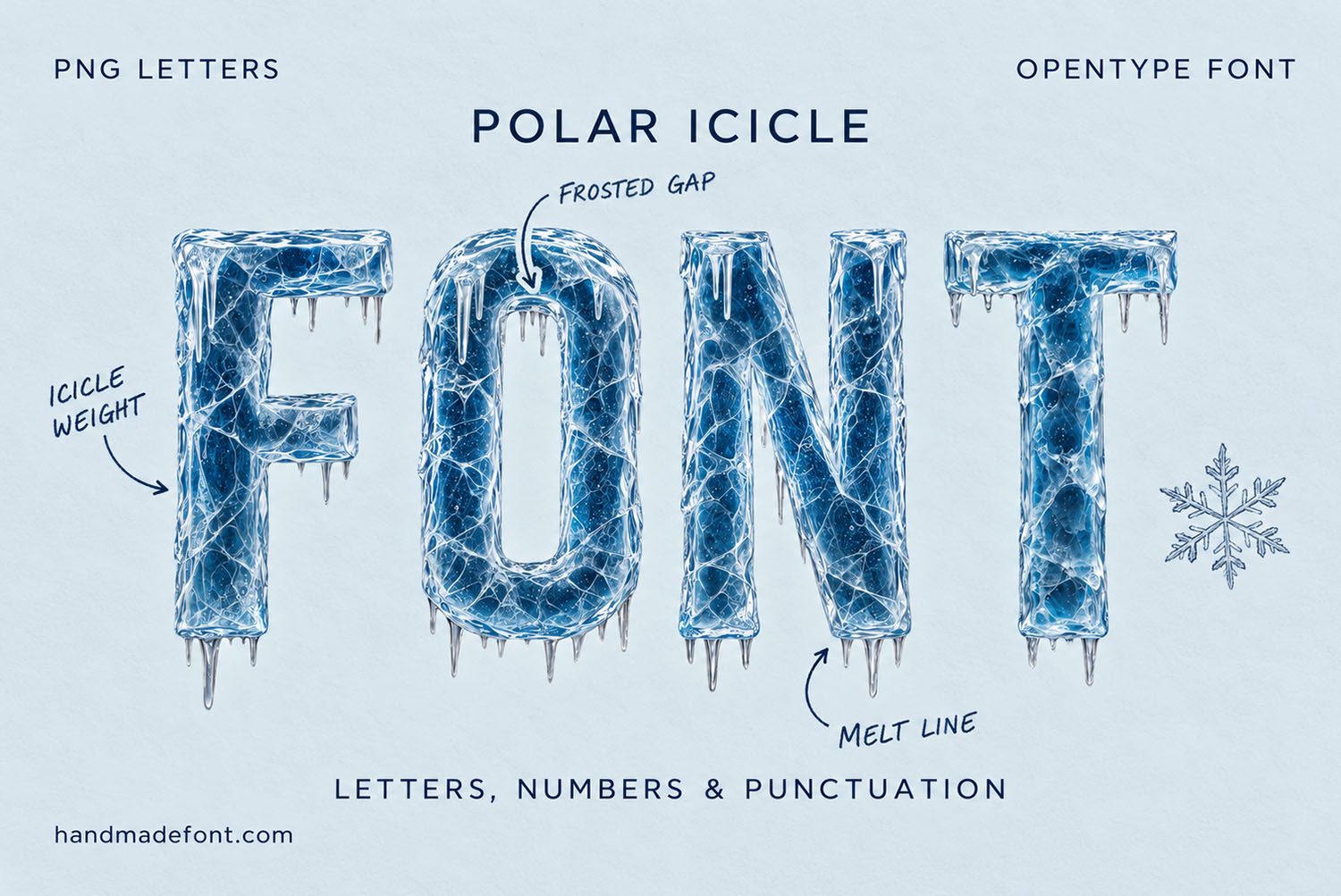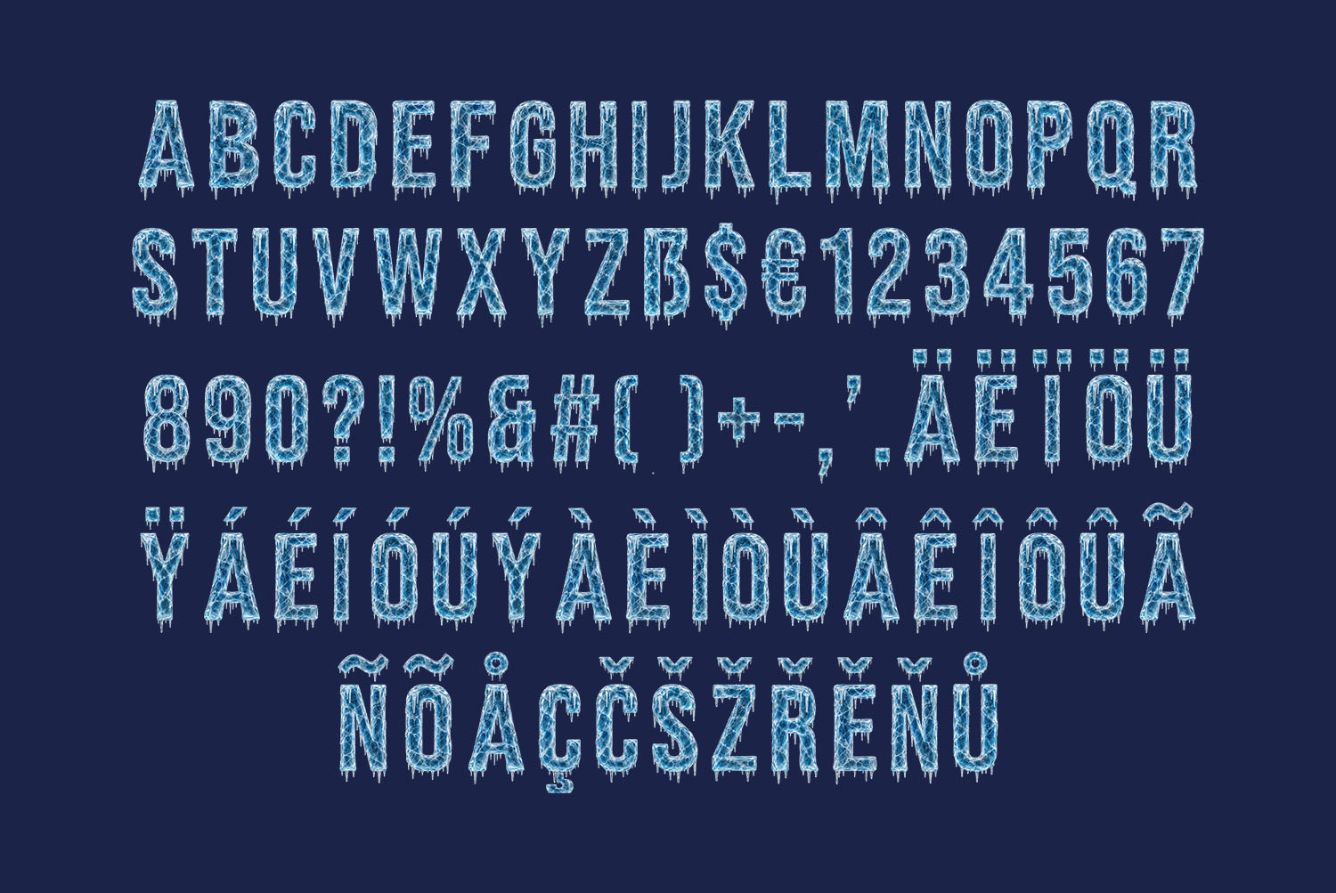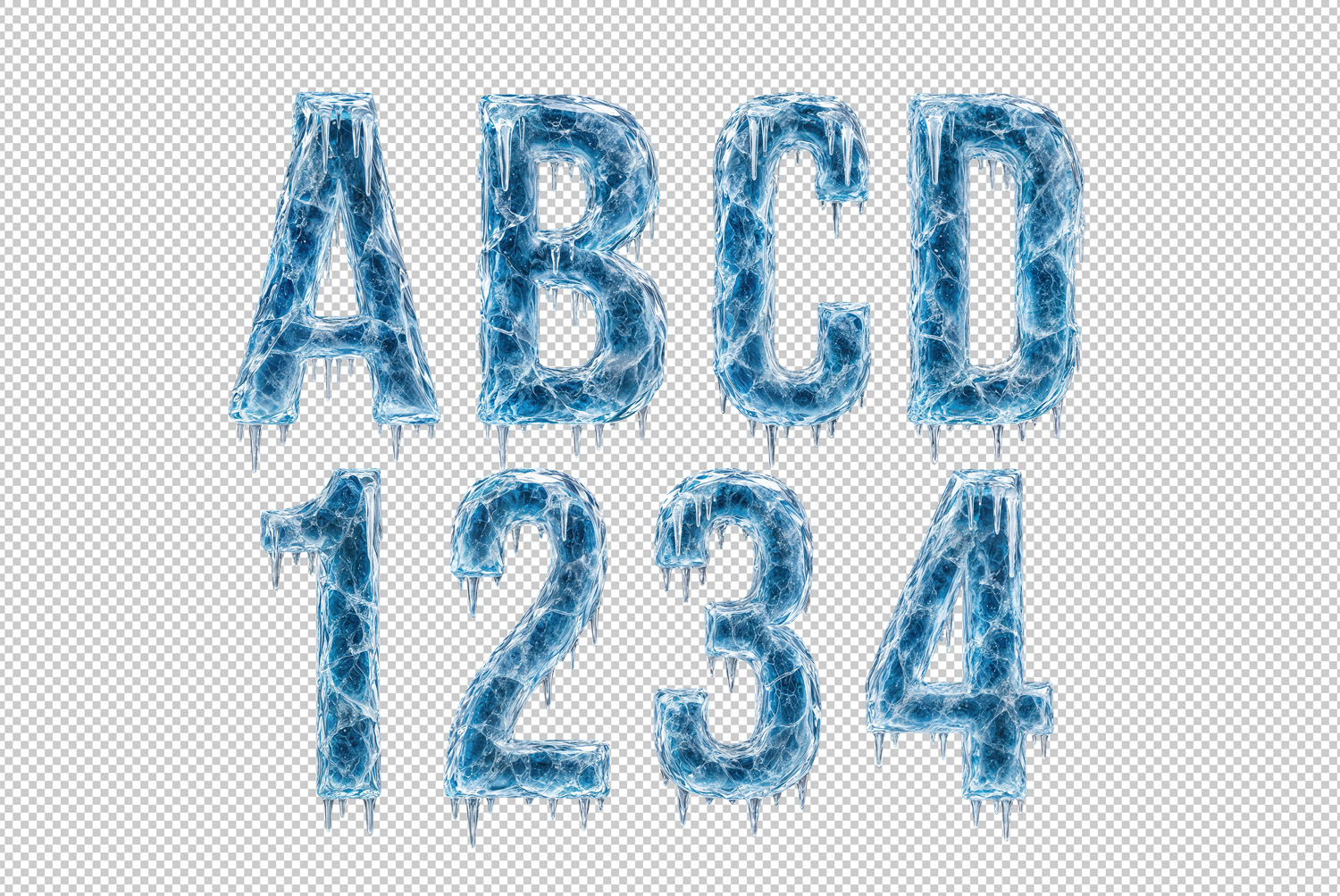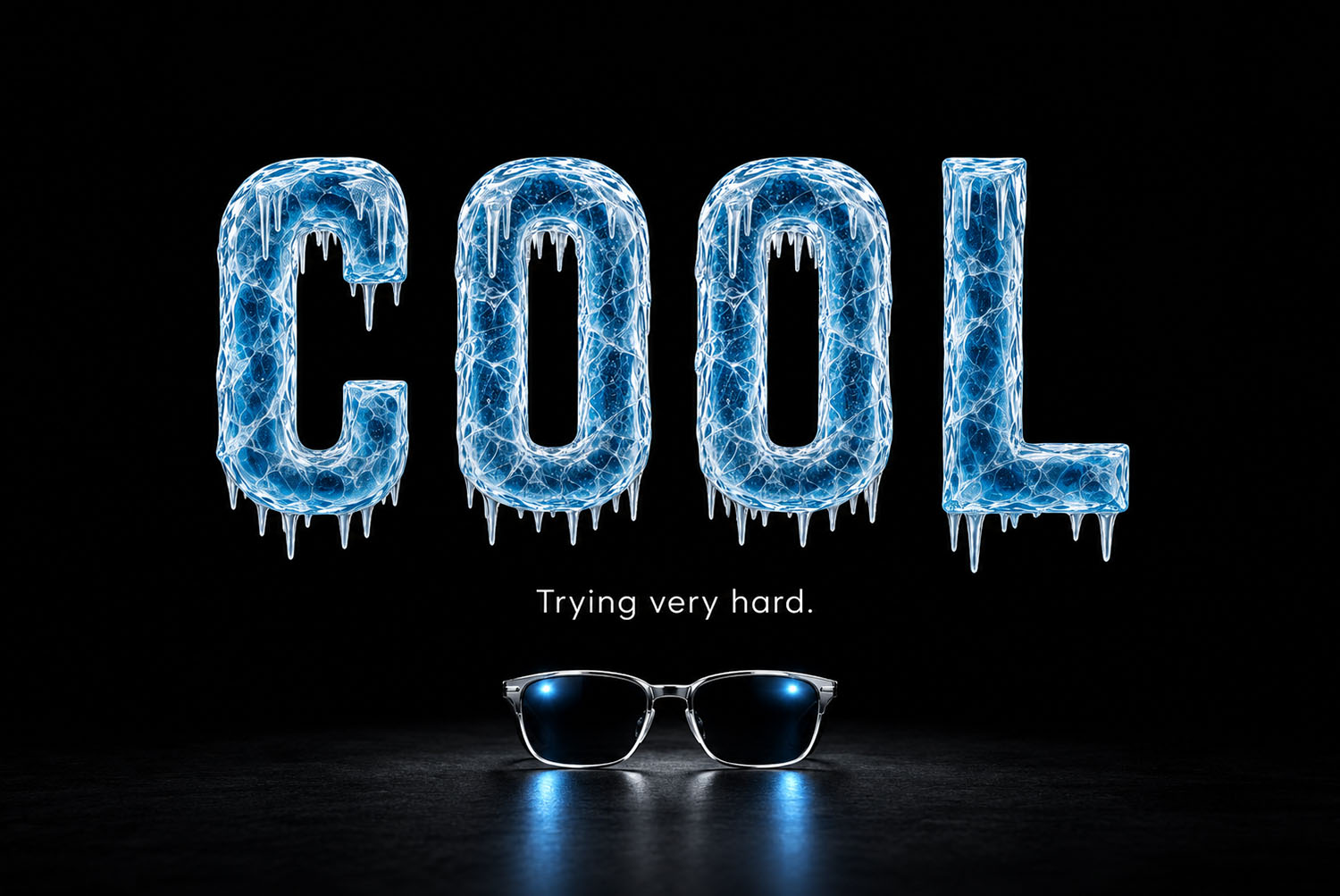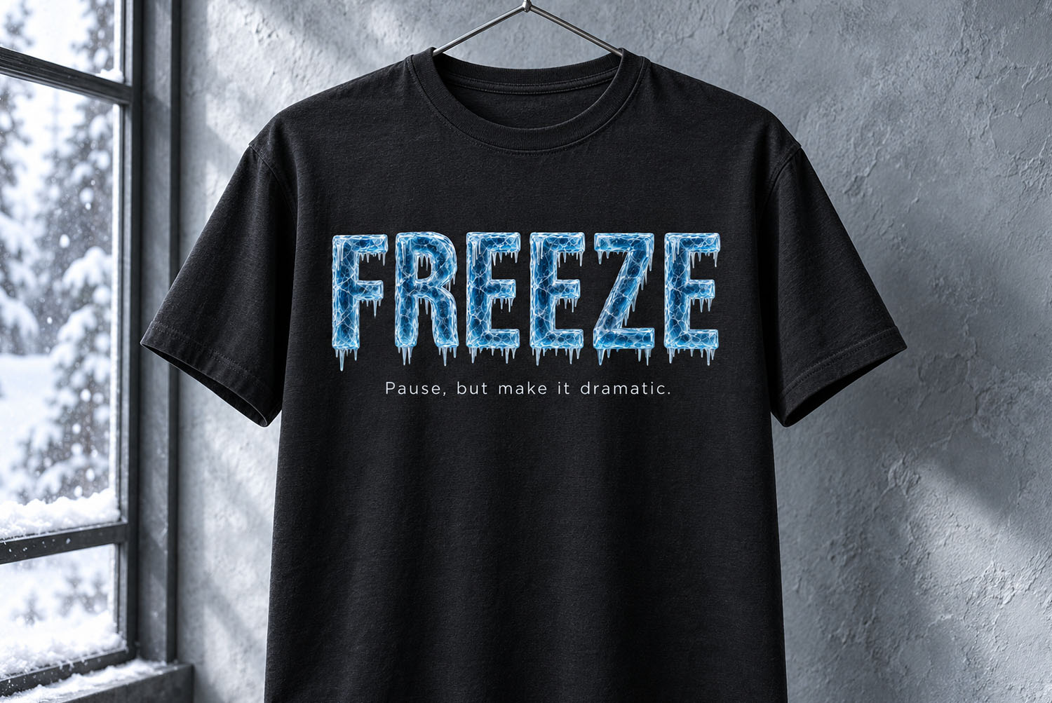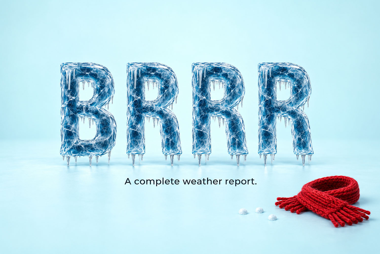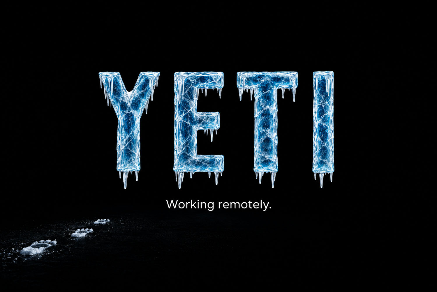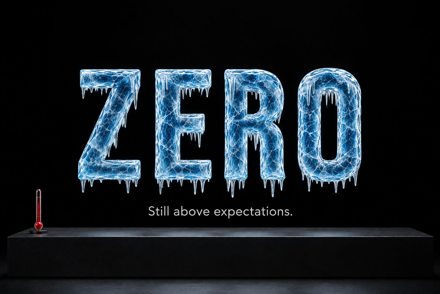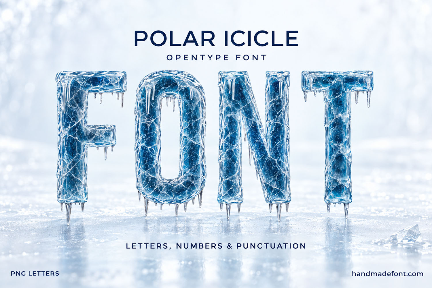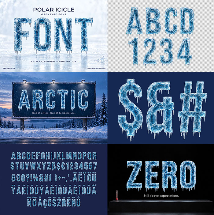
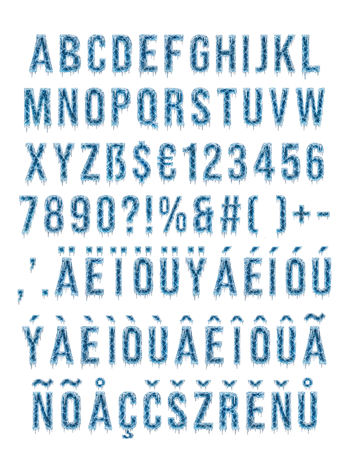
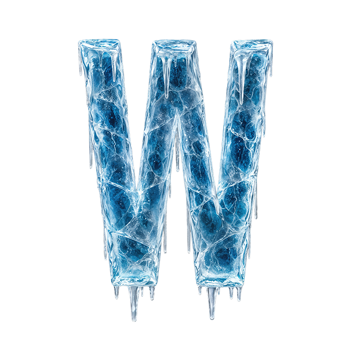
Polar Icicle Font builds tall, narrow capitals out of cracked blue ice, with a web of white fractures inside every stroke and short icicles hanging from the lower edges. It glows on navy and black, so winter campaigns, cold drinks and ski posters get a headline that looks freshly frozen. You get an OTF font plus transparent PNG letters.
A Polar Icicle Font Cut Narrow and Tall
Picture a frozen lake split into letter-shaped slabs, then stood upright. Each capital is narrow and tall, so a long word still fits on one line. Meanwhile the blue runs deep in the middle and pales to frost along the edges.
In addition, short icicles hang from every bottom edge and crossbar. They stay short on purpose, since long ones would crowd the next line. Of course, even the E and the F drip a little from their arms.
Cracks All the Way Through
When you get close to any letter, a web of white fractures appears. It looks like ice that took a hit and still held together. Light also catches every crack differently, so no two strokes repeat.
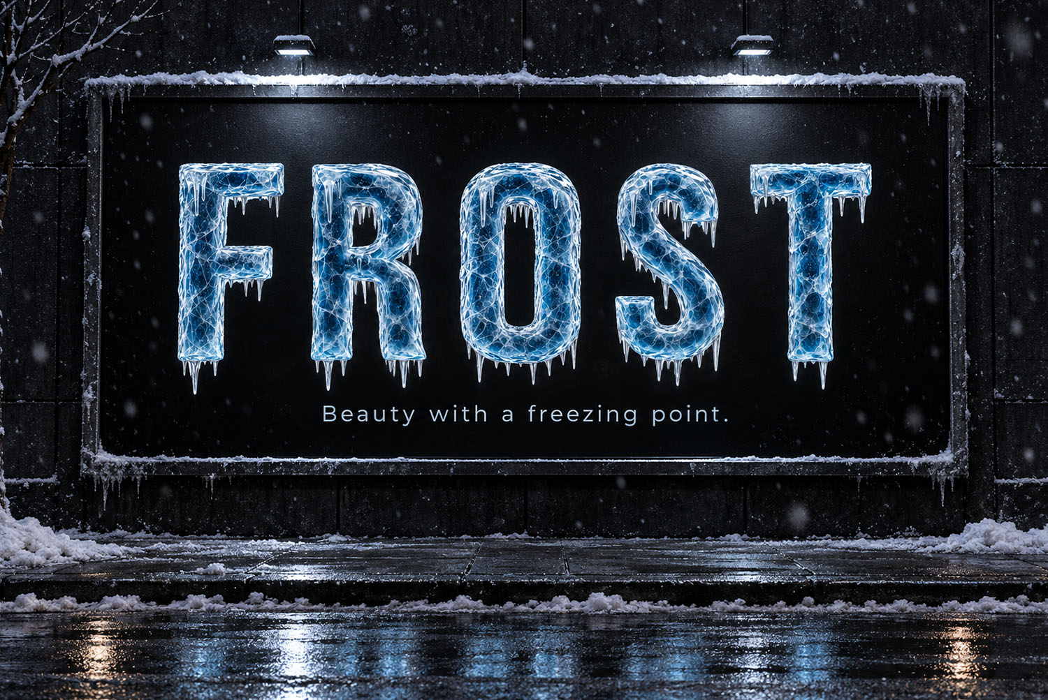
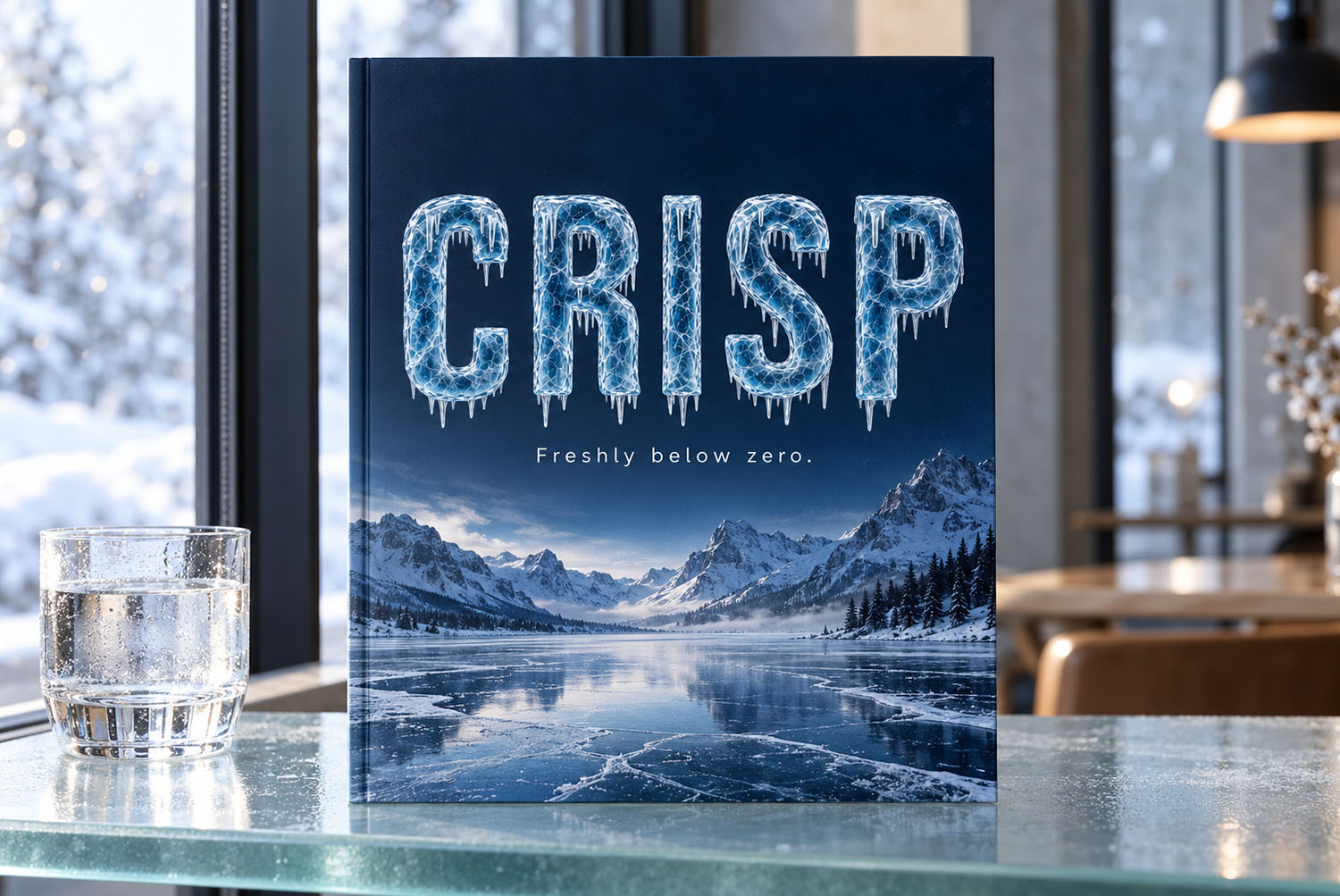
That detail survives at large sizes, so that is exactly where the Polar Icicle Font belongs. On navy or black, for example, the blue glows almost electric. Above all, give it room, because tight tracking makes the drips collide. Against a snowy photo, though, it turns pale and quiet instead.