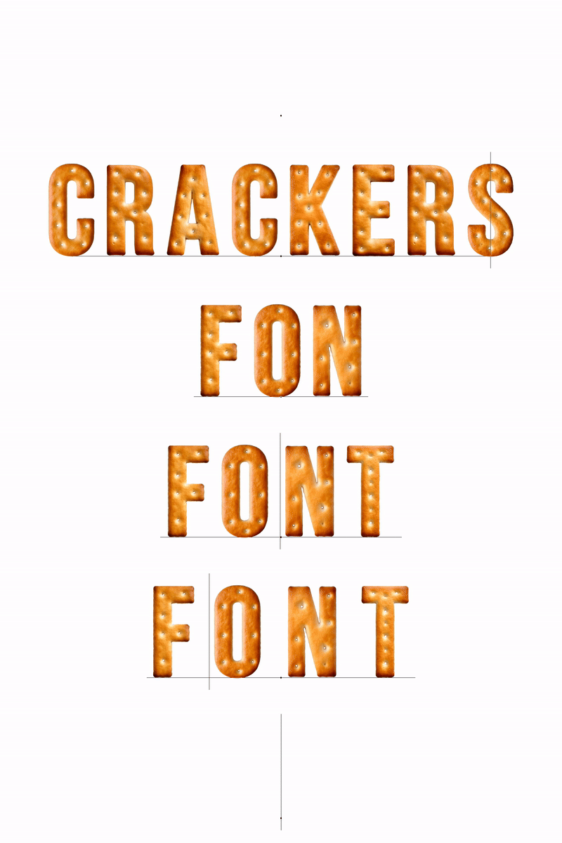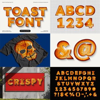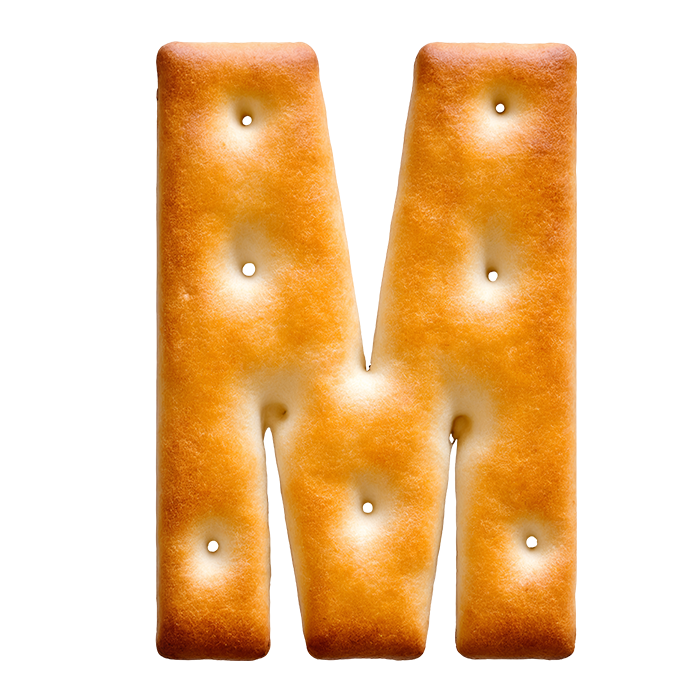
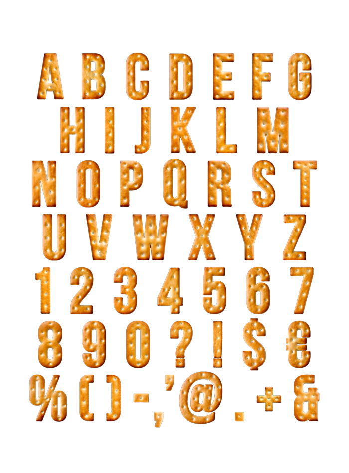
Golden baked crust, docking holes scattered in a loose grid, edges toasted a shade darker than the middles. The Crackers Font sits on narrow squared-off capitals, which is what a cracker wants to be anyway. Caps, numerals, currency and punctuation are baked the same way. Give it a warm ground and a big size, and it reads as homemade.
Baked, Docked and Slightly Uneven
Every character in the Crackers Font came out of an oven rather than a vector tool. Docking holes dot the surface in a loose grid, so no two letters carry the same pattern. Edges are toasted a shade darker, while the middles stay pale gold. Tiny bubbles and salt crystals also sit right on the crust, catching the light. Because each glyph bakes a little differently, a word never looks stamped out.
A Condensed Sans Underneath the Crumb
Strip the texture away and you find narrow, squared-off capitals. That is deliberate, since a cracker is flat and rectangular to begin with. Caps run A to Z, and numerals, currency and punctuation get baked the same way. Even the at sign kept its docking holes. So the set holds up long after the alphabet runs out.