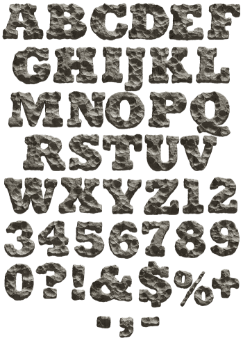
A high-contrast serif with real hairlines, its faces crusted in pitted grey stone with chips, scratches and shadowed hollows. Rocky Relief Font reads as carving rather than rubble, and a soft shadow lifts every glyph. Uppercase, numbers and punctuation, plus separate PNG letters. Suits history titles, gallery print and monument signage. Numbers and punctuation are carved to match.
Rocky Relief Font Puts Stone on a Serif
Rough rock usually kills fine typography, whereas here the two hold together. The skeleton is a high-contrast serif with real hairlines and bracketed feet. Over that sits a crust of pitted, chiselled grey stone, complete with chips and shadowed hollows. Because the letterform stays elegant, the texture reads as carving rather than rubble. Meanwhile a soft drop shadow lifts each glyph off the page.
Chiselled, Not Poured
Look along any stem, and the surface has been worked with a tool. Small facets, scratches and broken corners run the length of it. Since the greys stay cool and narrow, the whole alphabet holds one tone. So long words keep their rhythm instead of turning into noise. Also, the hairlines survive because the crust stays shallow.