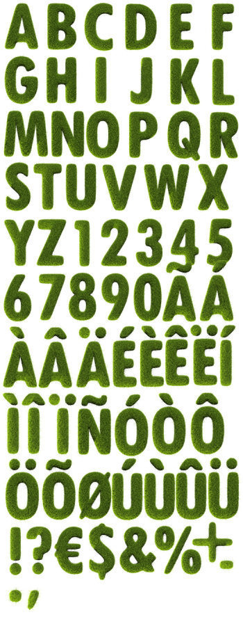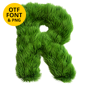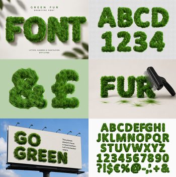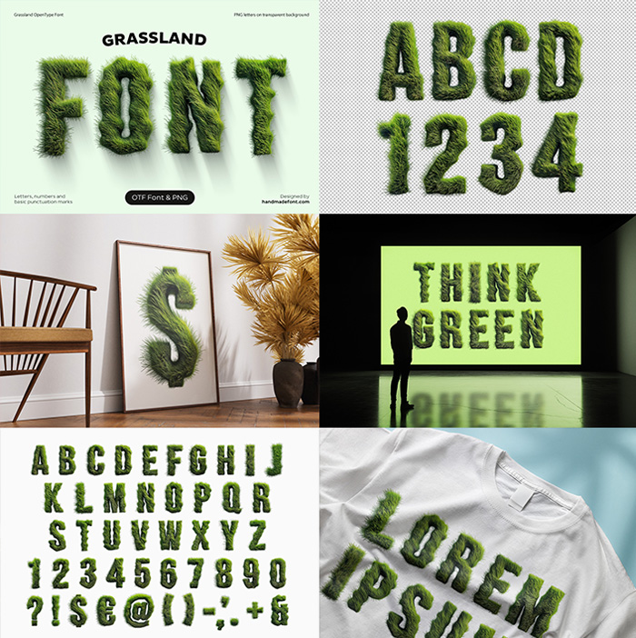

Fat rounded capitals buried under thousands of upright grass blades that lean out past every edge, dark at the roots and almost yellow at the tips. The Grassland Font keeps wide strokes and open counters, so words still read from across a room. Figures, currency signs and punctuation grow the same coat.
A Meadow Standing Up Straight
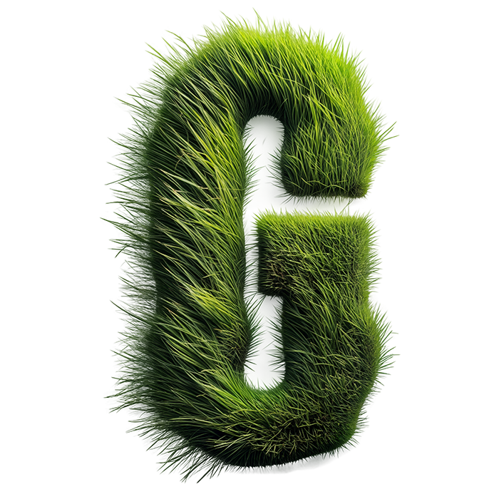
Naturally the first thing you notice is that nothing lies flat. Thousands of blades stand upright and lean outward, so every capital bristles along its edges. The green runs fresh and bright, darker at the roots and almost yellow at the tips. Light passes through the thinner blades too, which gives the letters real depth. Because the growth is uneven, no two glyphs bristle the same way. Look closely and short new shoots push up between the longer blades.
Rounded Sans Under the Blades
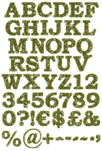
Underneath, of course, the letterform is a fat rounded sans. Wide strokes and generous counters stop the grass from swallowing the shape. That balance matters, since a texture this busy usually destroys smaller text. Here the words still read from across a room. In addition, figures, currency signs and punctuation grow the same coat. Besides, a second colourway threads small blossoms through the blades. In addition, the texture never flattens into a printed pattern.