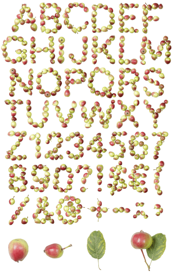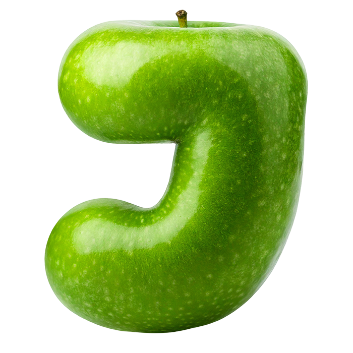
Chunky rounded capitals shaped from whole green apples, the skin waxy and speckled, with a dimpled stalk well sitting at the top of most letters. The Green Apple Font keeps open counters and soft blunt terminals, so words hold together even at smaller sizes. Figures, currency signs and punctuation all grow exactly the same skin.
Straight Off the Branch
Every capital here is a whole apple bent into shape, naturally. The skin stays waxy and taut too, with tiny pale speckles scattered across it. A dimpled stalk well sits at the top of most glyphs, and a few keep the stalk itself. The green runs grassy rather than minty, darkening where the form turns away. Because each letter catches light differently, a word never looks flat. Turn a glyph and the highlight travels across the skin the way it would on real fruit.
Soft Shapes, Hard Shine
The letterforms themselves, of course, are chunky, rounded and deliberately childlike. Strokes swell through the middle and end in soft blunt terminals, so nothing reads sharp. Since the counters stay open, words hold together even at smaller sizes. Highlights sit hard and white on every curve too, which keeps the fruit looking fresh. In addition, figures, currency signs and punctuation grow the same skin.