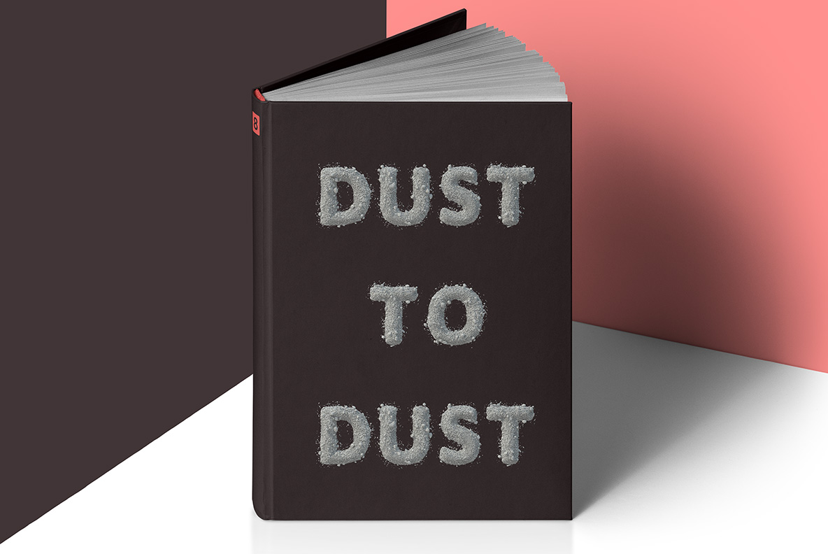
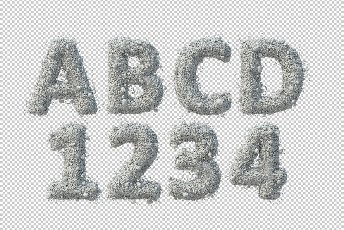
Stone Dust Font heaps thousands of tiny pale grey chips into each letter, so the edges crumble and loose gravel scatters around every glyph. Because no chip is placed twice, the surface never repeats itself. A bold sans holds the shape underneath, and the OTF plus transparent PNG files ship together for print and screen.
Stone Dust Font Heaps Gravel Into Letters
Stone Dust Font piles thousands of tiny pale grey chips into each character, so the surface reads as crushed rock rather than carved stone. Because the chips simply heap up, the edges crumble instead of holding a clean line. Meanwhile loose gravel scatters across the ground around every glyph, which makes the letters look poured a moment ago. So the alphabet feels unstable in a way solid stone fonts never manage.
Edges That Crumble On Purpose
A bold sans holds the shape underneath, so the words stay readable however ragged the outline gets. Since the palette runs cool grey to chalky white, the letters lift easily off dark backgrounds. Besides, each chip catches its own small highlight, which builds real depth without any extra shadow. Meanwhile the counters stay open, and even small settings hold together.