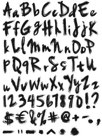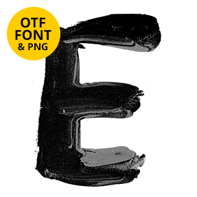
Wet paint does what it wants. Black Brush Paint Font comes off a loaded round brush, swelling in the middle of every stroke, tapering at the ends and feathering wherever the paint was still moving. Thin passages fade to a grey wash. It suits skate labels, gig posters, zines and record sleeves, and it types from a plain OTF with transparent PNG letters.
Black Brush Paint Font Keeps Its Edges Wet
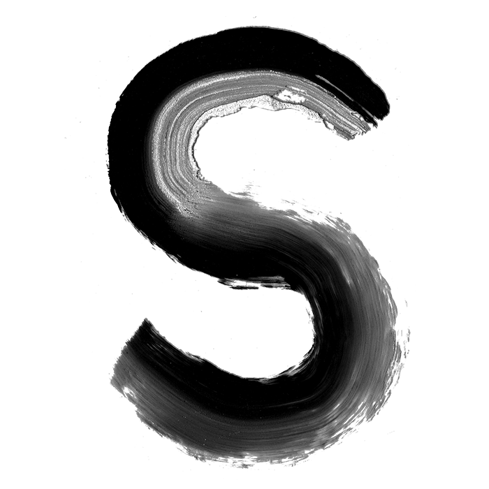
Wet paint does what it wants. Each letter in the Black Brush Paint Font comes off a loaded round brush, so the strokes swell in the middle and taper at both ends. Because the paint was still moving when it settled, the outlines feather rather than cut. The blacks vary from dense to a thin grey wash where the brush ran dry. Meanwhile the letterforms bounce along the baseline, none of them sitting quite level. Naturally no two strokes carry the same weight.
Soft Corners, Thin Washes
Roundness is the whole character. Corners arrive as curves, since a round brush cannot turn a sharp angle at speed. Where two strokes cross, the paint pools darker and slightly wider. Besides that, tiny flecks sit beside some letters, thrown off when the brush lifted. The thinner passages go almost transparent, so whatever sits behind shows through. Of course that softness is what separates it from a ruled, constructed letter.