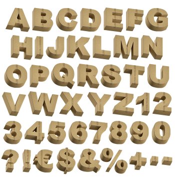
Thick letters cut from packing board and stood on end. The faces are smooth kraft, while every edge shows the wavy fluting sandwiched inside, so you can read the thickness at a glance. Corners are crisp rather than torn. It is the shipping box turned into a typeface, without a single scuff or stamp on it.
The Edge Is Where the Story Is
Look at the side of any letter first. That wavy corrugation runs the full depth, so the material announces itself before the shape does. Faces stay flat and matte, while the cut edges stay ridged and slightly furry. Warm kraft brown covers everything, because nobody bleached the board. Shadows fall into the flutes and pick out every ripple, obviously. The Cardboard Package Font letters sit at a chunky weight, therefore the depth always reads.
Built Thick on Purpose
Thin strokes would hide the corrugation, so the Cardboard Package Font runs heavy throughout. Bowls stay round and generous, since a tight counter would swallow the shadow. The extrusion sits at a consistent angle across the set, therefore words line up cleanly. Meanwhile the depth suggests a box even where nothing is folded or scored. Each letter casts its own soft shadow onto the surface below. Above all the board never looks printed, because the fluting keeps proving it is real.