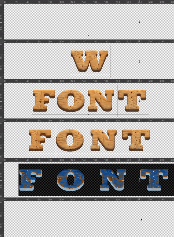
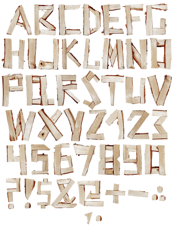
Pale pine letters, sanded smooth, with amber knots left showing wherever a branch used to be. Pine Board Font is a heavy slab serif underneath, so headlines stay solid while the grain does the talking. Uppercase, numbers and punctuation, plus separate PNG letters. Good for toy shops, forest books, cabin menus and anything that should feel warm rather than polished.
Every Knot in Pine Board Font Sits Where the Branch Was
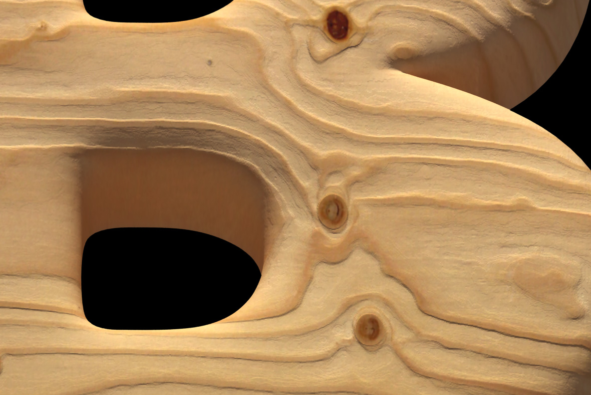
Wood never grows to a grid, and this alphabet does not pretend otherwise. Each letter is cut from pale pine, then sanded until the edges soften. So the grain runs the length of every stroke, and it bends around the curves. Amber knots break the surface wherever a branch once grew. Because of that, no two letters read quite the same. Naturally, the resin spots stayed in.
A Slab Serif Lives Under the Timber
Strip the material away, and a proper display face is still standing. The strokes are thick, while the serifs are heavy wedges. Since that skeleton is so solid, the grain never turns to mush at small sizes. Set a headline, then read it from across the room. Blow one letter up to poster height instead, and the surface takes over.