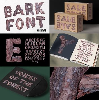
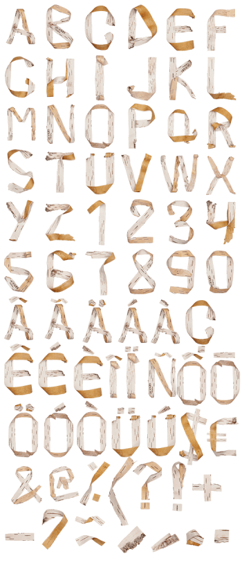
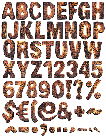
Dry Wood Font is built from real cracked, weathered timber — every letter shaped by grain, knots, and sun-bleached texture instead of smooth vector lines. It brings a rough, handmade feel to any design, perfect for cabin branding, outdoor gear, craft breweries, or nature-inspired projects that want raw, organic texture instead of a polished, digital look.
Letters Carved From Weathered Timber
Dry Wood Font takes its shape from cracked, sun-bleached timber — every letter built from real grain, splinters, and knots rather than clean vector curves. The forms feel hand-hewn, like they were cut from a fallen branch and left out to dry for years. Cracks run through the strokes the way they run through old fence posts, and the color shifts from warm honey to ashy gray, mimicking the natural variation you’d find in a stack of reclaimed lumber.
Rough Edges, Real Character
Nothing about this typeface is smooth. The outlines splinter and fray at the corners, and the surface carries every crack, knot, and fiber of real dried wood. Some letters look like they could crumble at the edges, others still hold the ring pattern of the tree they came from. That roughness is the whole point — it reads as handmade and weathered, the opposite of a sterile digital font, and it works best where a project wants to feel grounded and tactile rather than sleek.