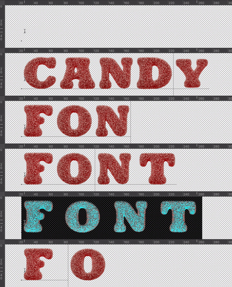
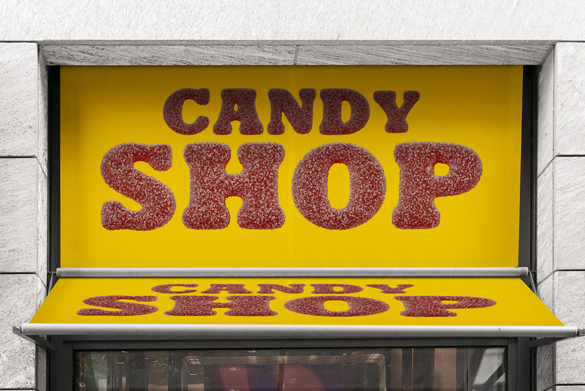
Sugar Candy Font rolls a soft gummy alphabet in coarse sugar, so every curve wears a crunchy white crust over deep berry red. Because the shape underneath is a fat rounded slab, the letters stay readable while still looking properly edible. Five colourways ship together, and the OTF plus transparent PNG files cover print and screen alike.
Sugar Candy Font Wears Its Sugar On The Outside
Every glyph in the Sugar Candy Font begins as a soft gummy shape, and then a coat of coarse sugar goes over it, so the crust catches light along each curve. Because the crystals stand proud of the surface, the outline reads slightly furry instead of sharp. Meanwhile the deep berry red underneath glows through the white grains, which keeps the colour rich rather than dusty. So the letters look properly edible, not merely textured. Even the counters carry the same crunch.
Soft Shapes, Crunchy Surface
Underneath all that sugar sits a fat rounded slab with wide open counters, so the alphabet stays readable at poster size. Since every stroke swells a little towards its ends, the whole set keeps a chewy, bouncy rhythm. Besides the berry red, the pack runs through purple, green, blue and teal, so one word can change flavour letter by letter. Meanwhile the numerals and punctuation carry the same crust, and nothing looks added on afterwards.