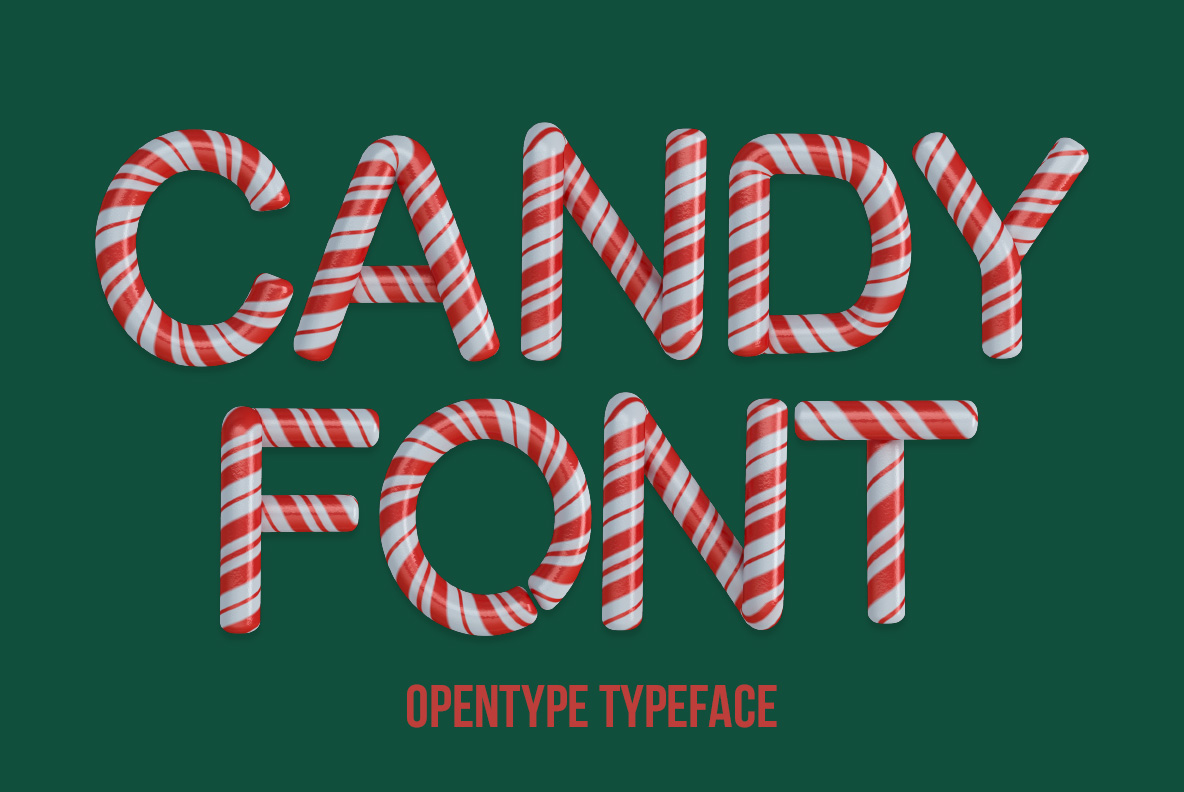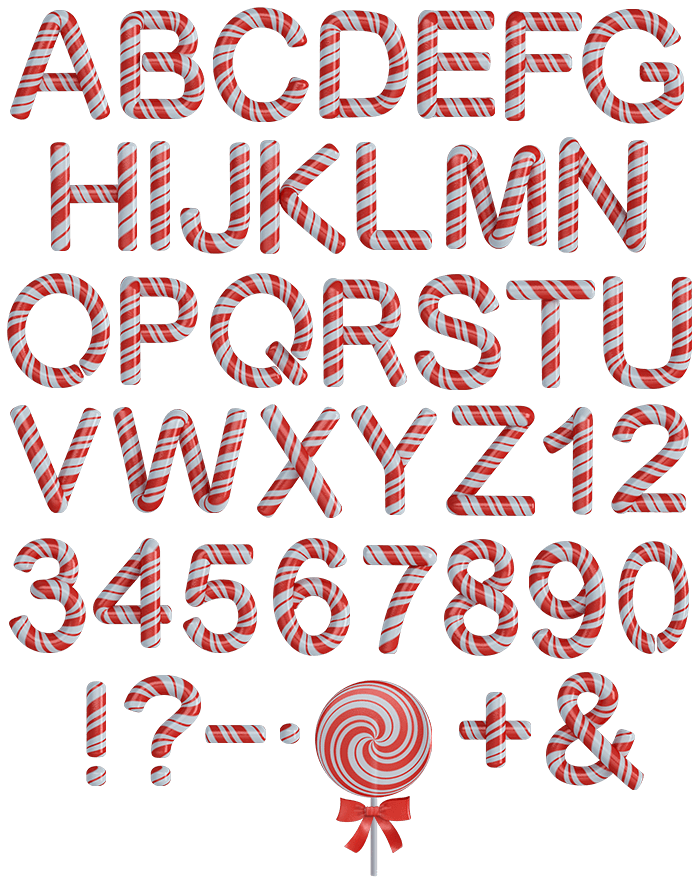


These letters came off the same machine as a candy cane. Candy Font wraps red and white stripes around a smooth rod of hard sugar, stretching the bands on the outside of every curve and bunching them on the inside, with clean cut ends showing the stripe in cross-section. It suits Christmas ranges, sweet shops, winter markets and theme park signage.
Candy Font Wraps Every Letter in Stripes
These letters came off the same machine as a candy cane. Every glyph of the Candy Font is a smooth rod of hard sugar with red and white stripes spiralling around it, so the bands wrap the form rather than sitting flat on it. Because the stripe follows the stroke, it stretches on the outside of a curve and bunches on the inside. Then the surface stays glassy and reflective all over. Meanwhile the ends read as clean cuts, showing the stripe in cross-section. Naturally the red goes slightly translucent where the sugar thins.
Hard Sugar, Wrapped and Polished
Two things make it convincing. The stripe pitch stays constant, since a real candy cane is pulled and twisted at one speed. Likewise highlights sit as tight white streaks along the top of every rod. Besides that, the white bands pick up a faint pink bounce from the red ones either side. A soft shadow underneath keeps each letter sitting on the page, of course. Above all, the set reads cold and hard rather than soft.