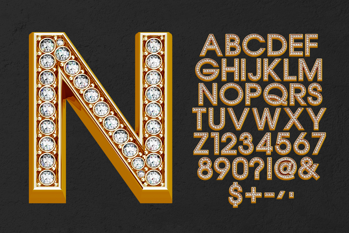
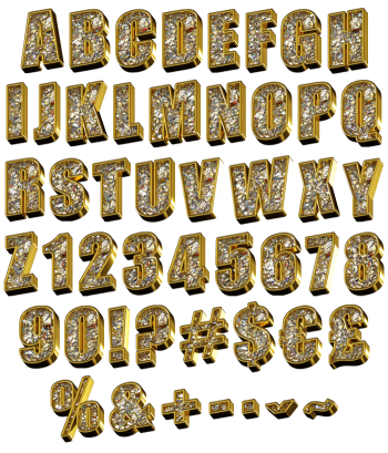
Shine Font runs a channel of bezel-set white diamonds down the middle of every polished gold letter, exactly the way a jeweller would build it. Because the slab serif underneath stays broad and steady, the stones sit in neat rows rather than scattering. Numerals carry the same setting, and OTF plus transparent PNG files ship together.
Shine Font Sets Diamonds Into Solid Gold
Shine Font cuts a channel down the middle of every polished gold letter and fills it with round white diamonds, each one held in its own bezel. Because the stones follow the stroke rather than scattering across it, the alphabet reads as jewellery rather than glitter. Meanwhile the gold keeps a warm mirror finish, so the metal and the stones separate cleanly. So a single word already looks expensive.
A Slab Serif Built Like Jewellery
The skeleton is a broad slab serif with strong flat feet, which gives the setting somewhere solid to sit. Since the strokes stay even in weight, the diamond rows run unbroken from one end of a letter to the other. Besides, the numerals and currency signs carry the same treatment, so prices look as dressed as headlines. Meanwhile black backgrounds suit it best, because the highlights need somewhere dark to fire against.