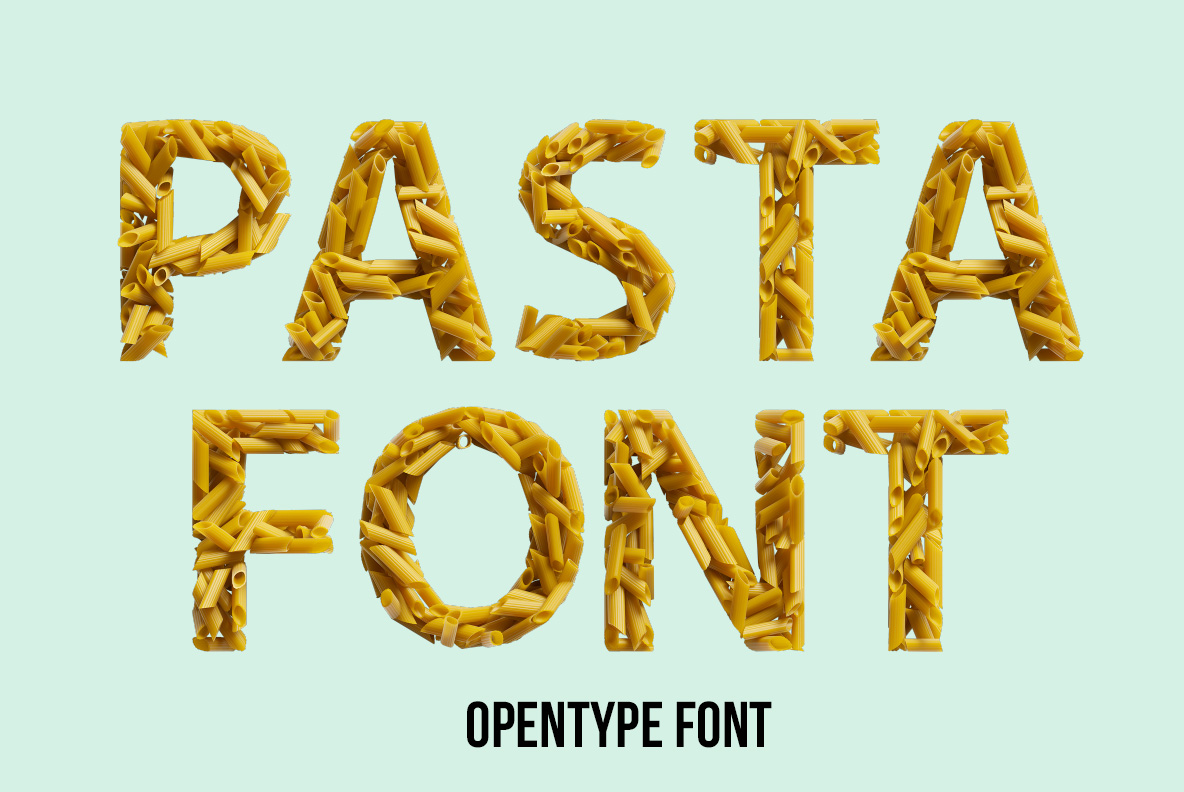
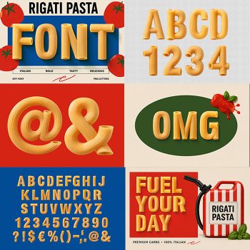
Dry penne tubes tipped into letter shapes and left where they landed. The pasta is raw, so it keeps that pale golden colour and the fine ridges running down each tube. Some pieces lie flat, others point straight at you. It looks like the moment before somebody scoops it all into a pan.
Raw Penne, Straight From the Box
Nobody cooked this. The tubes are raw, pale gold and slightly translucent at the cut ends, with the fine ridges that penne rigate carries along its length. Pieces overlap at every angle, so some lie flat while others point their open ends at the camera. Because the pile is loose rather than packed solid, gaps show through and give the letters air. Since the lighting stays warm, the whole alphabet looks edible.
Why the Pasta Font Reads at a Glance
Legibility is the surprise here. The Pasta Font holds a wide bold sans underneath, which is the only reason a loose heap of tubes still reads as a letter. Counters stay open and stems keep an even width. Above all the pasta sits within the outline rather than spilling past it, though a few pieces break the edge on purpose. Naturally every glyph was assembled on its own.