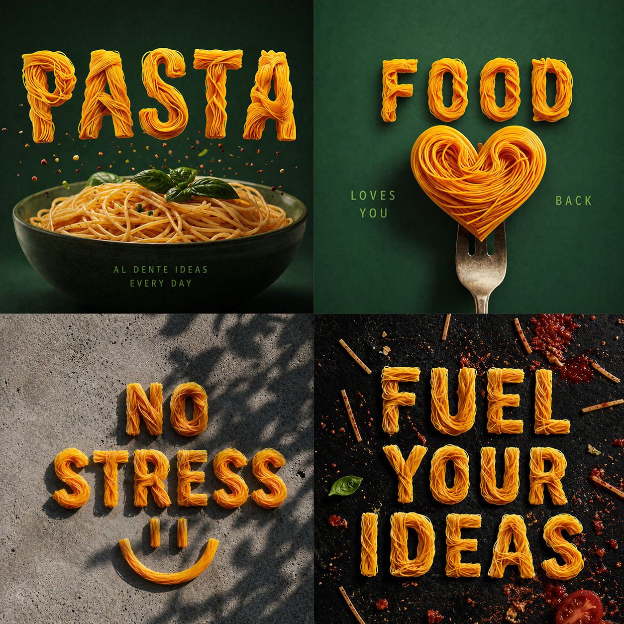
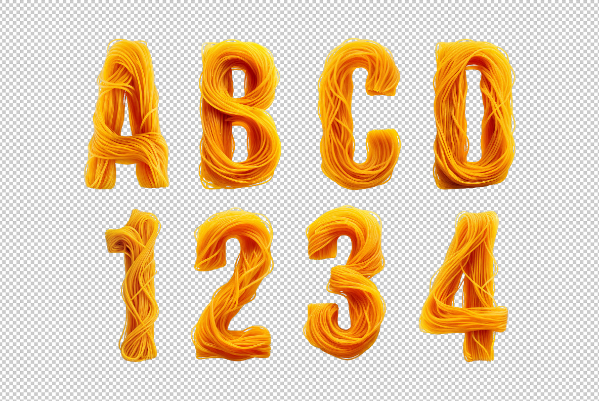
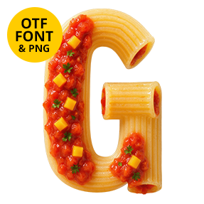
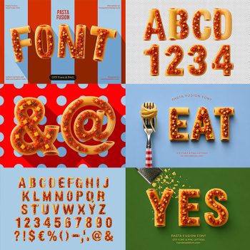
Al Dente Font winds long strands of golden spaghetti into every capital, coil after coil, until the letter fills out. The pasta still looks freshly drained, so highlights sit wet along each strand and loose ends curl free. Besides the alphabet, the set brings a big run of pasta icons, from hearts and hands to a grinning skull.
Wound, Not Drawn
Nobody drew these letters, of course. Instead the Al Dente Font wraps real strands around each capital, layer over layer, until the shape closes. Because the coils overlap at different angles, no two glyphs catch the light in quite the same way. The rhythm stays even, though, so a whole word never turns into a knot.
The Al Dente Font Keeps the Pasta Looking Cooked
Naturally, colour does a lot of work in the Al Dente Font. The strands run deep egg-yellow into warm orange, and a soft gloss sits along the top of each one. Nothing looks dry or dusty, since the pasta comes off the boil rather than out of the packet. Loose ends poke past the outline too, which keeps the letters from feeling machine-made.