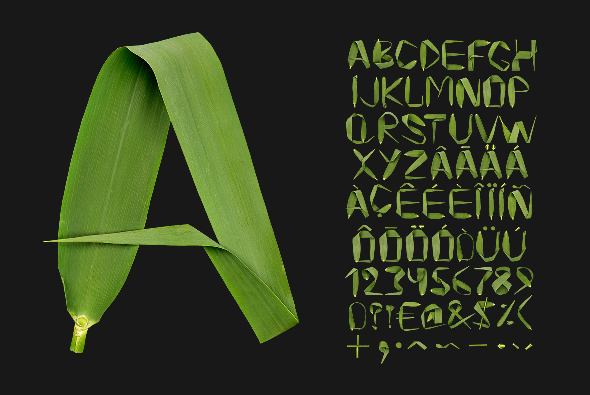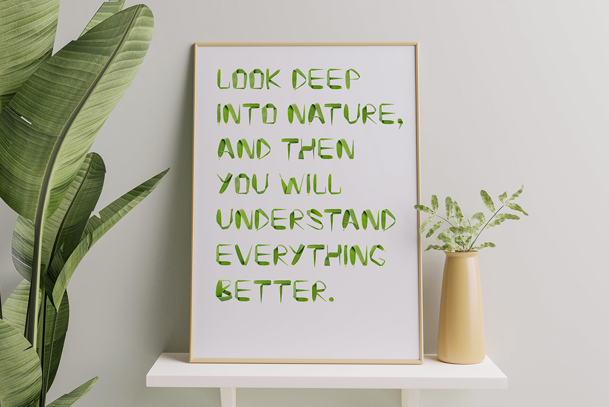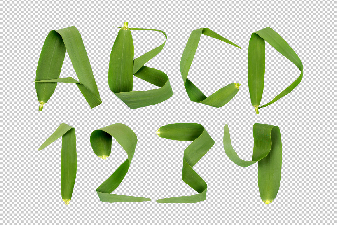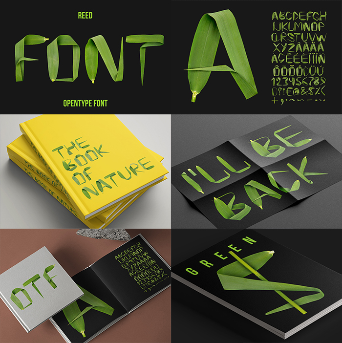
Long glossy reed leaves, folded and bent until they hold a letter, with the central vein still running down each blade and the tips tapering to a point. Reed Font is deep green and sharp-edged. Uppercase, numbers and punctuation, plus separate PNG letters. Made for tea packaging, spa branding, garden print and festival posters. Numbers and punctuation are folded from the same leaves.
Reed Font Folds Rather Than Cuts
Each letter uses a small number of long leaves, and the folds alone do all the shaping. Where a stroke turns, the blade creases and the light changes right across it. Because the leaves are glossy, sharp highlights run along every edge. Meanwhile the central vein stays visible, so the material never reads as flat green. So the letters look built in a few decisive moves.
Dark Green With Real Edges
The colour sits deep and slightly blue, rather than the bright green most plant fonts reach for. Since the blades are narrow, the strokes stay lean and the counters stay comfortably open. Tips taper to a point too, which gives several letters a natural flick. Set it on black, and the highlights carry the shapes on their own. Besides, no two letters fold in quite the same way.