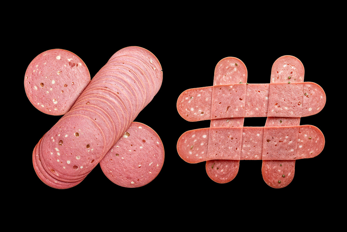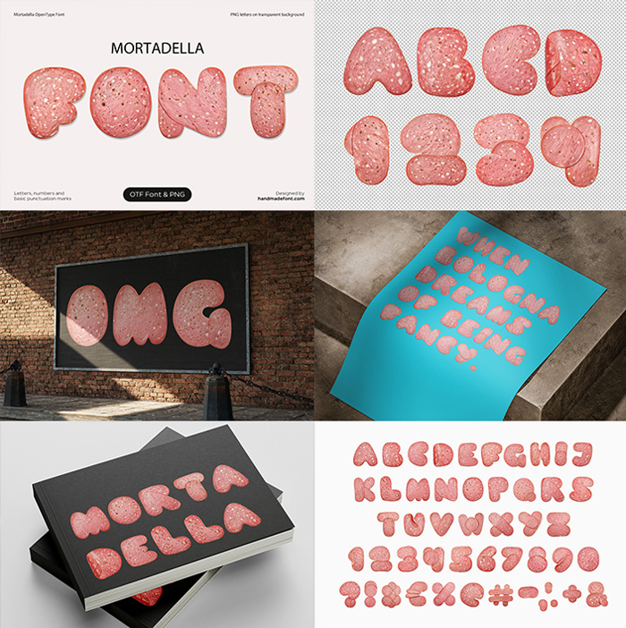
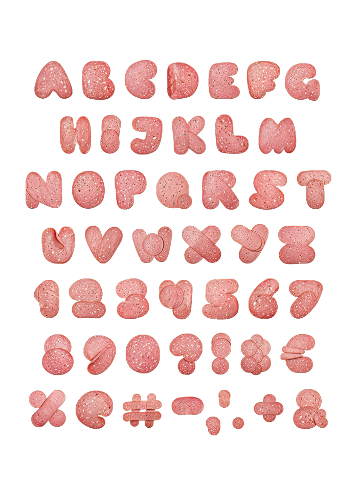
Somebody looked at a slice of mortadella and saw a letter M. Fair enough, given the pale pink, the white specks of fat and that soft bouncy edge. These characters are fat, round and unmistakably deli counter. They look ridiculous on a business card and perfect on a sandwich board, which is precisely the point.
Cold Cuts, Cut Into an Alphabet
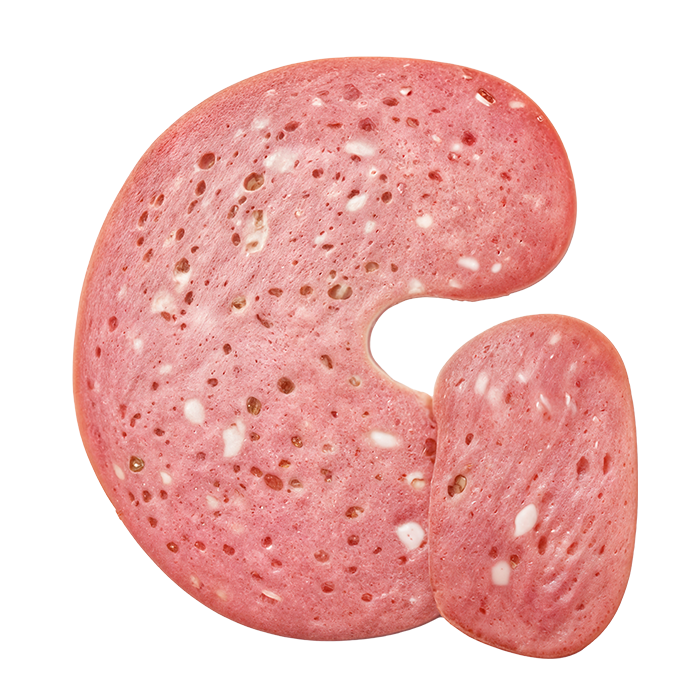
Every letter is a slice. The outer rim keeps that slightly darker cured edge, while the body holds the pale rose of the meat and the white specks of fat land at different spots on every character. Because nothing repeats, a word never looks stamped from one template. The shapes themselves are soft and heavy, with rounded terminals that bulge the way a real slice bulges. So the whole thing reads warm rather than clinical.
Why the Mortadella Font Stays Pink
Pink is doing a lot of work here, obviously. It sits between appetising and absurd, which is exactly where the Mortadella Font wants to live. Put it on a pale blue field and it turns friendly. Drop it on a brick wall at billboard scale, though, and it turns loud. The mockups try both, and they add a black notebook cover where the pink almost glows. Naturally the colour is baked into the artwork, so it stays consistent everywhere.