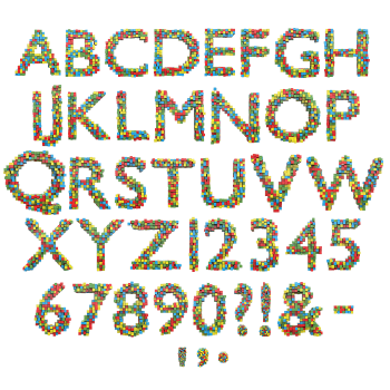
A tidy brick letter is somebody else’s font. Lego Scatter Font drops its pieces at every angle, so edges overhang, corners jut out and light passes through the gaps between them. Red, blue, green and yellow repeat without a pattern. It suits toy packaging, children’s books and games branding, and it types from a plain OTF with transparent PNG letters.
Lego Scatter Font Never Lines Its Bricks Up
A tidy brick letter is somebody else’s font. In the Lego Scatter Font the pieces land at their own angles, so edges overhang and corners jut out. Because no two glyphs stack the same way, the whole alphabet feels hand-built. Then the studs catch small highlights across the top of every piece. Meanwhile the colours run red, blue, green and yellow, mixed without a pattern. Naturally the letterform still holds, since the scatter follows the skeleton underneath.
Four Colours and a Lot of Gaps
Gaps do as much work as bricks here. Light passes between the loose pieces, because nothing was pressed together properly. Since the palette repeats only four colours, the noise never turns muddy. Some bricks sit flat on, while others tilt far enough to show a side face. Besides that, the plastic reads glossy but slightly worn, exactly as a well-played box would. Above all the scale stays consistent, so a word keeps one texture from end to end.