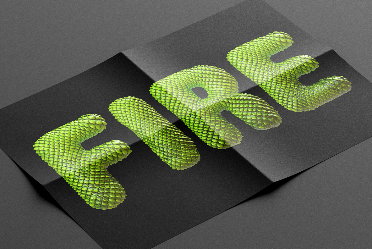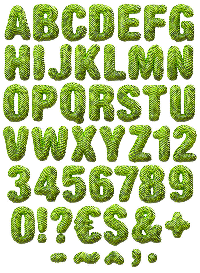

Scales cover every millimetre of these letters. They overlap in neat diagonal rows, so the surface behaves like real hide rather than a pattern laid on top. Colour runs from acid green on the high points to deep olive in the creases. The letterforms underneath are fat and rounded, which lets the scales wrap properly.
Skin That Follows the Letter
Scales here do not simply sit on the surface, of course. They shrink around tight curves and stretch along straight stems, so the hide bends the way skin actually would. Each scale carries its own highlight, therefore the rows shimmer slightly as they turn. Colour deepens in the overlaps, since less light reaches down there. Nothing repeats visibly, because the scale size shifts with the stroke width. Above all the Dragon Skin Font keeps this consistent from A to Z.
Fat Letters for a Reason
Thin strokes cannot hold scales, so the Dragon Skin Font runs heavy and rounded. Bowls stay wide, while terminals finish in soft domes instead of corners. That generosity gives every scale room to read at normal sizes. Acid green sits on the crowns, then olive and near-black fill the gaps beneath. Highlights land exactly where a rounded surface would catch light, naturally. Nothing looks flat, because the shading follows the curve of each form.