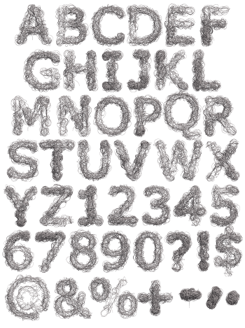
Tall narrow capitals drawn by hand as twisted barbed wire, two strands winding down every stroke with barbs bristling out along the way. The Freedom Font stays pure black line work, so it reverses cleanly out of any colour and prints sharp at every size. Figures and punctuation keep the same handmade wobble.
Wire Drawn by Hand, Not Photographed
Of course, this alphabet was drawn line by line as twisted strands of barbed wire. Two strands wind around each other down every stroke, and barbs bristle out at regular intervals. The line work stays fine and scratchy, so the whole thing reads as ink on paper. In fact, the barbs are what carry the meaning here. Because this is illustration rather than photography, it prints clean at any size. Nothing shines, and naturally nothing casts a shadow.
Tall, Narrow and Deliberately Uneasy
The capitals likewise run tall and thin, closer to a wanted poster than a sign system. Baselines wobble slightly, and no two letters carry identical barbs. That unevenness is the point, since machine-perfect wire would lose the tension. Strokes also cross and knot where the wire doubles back. Besides, a narrow width lets a long slogan run in one line. Meanwhile the figures and punctuation follow the same handmade rhythm.