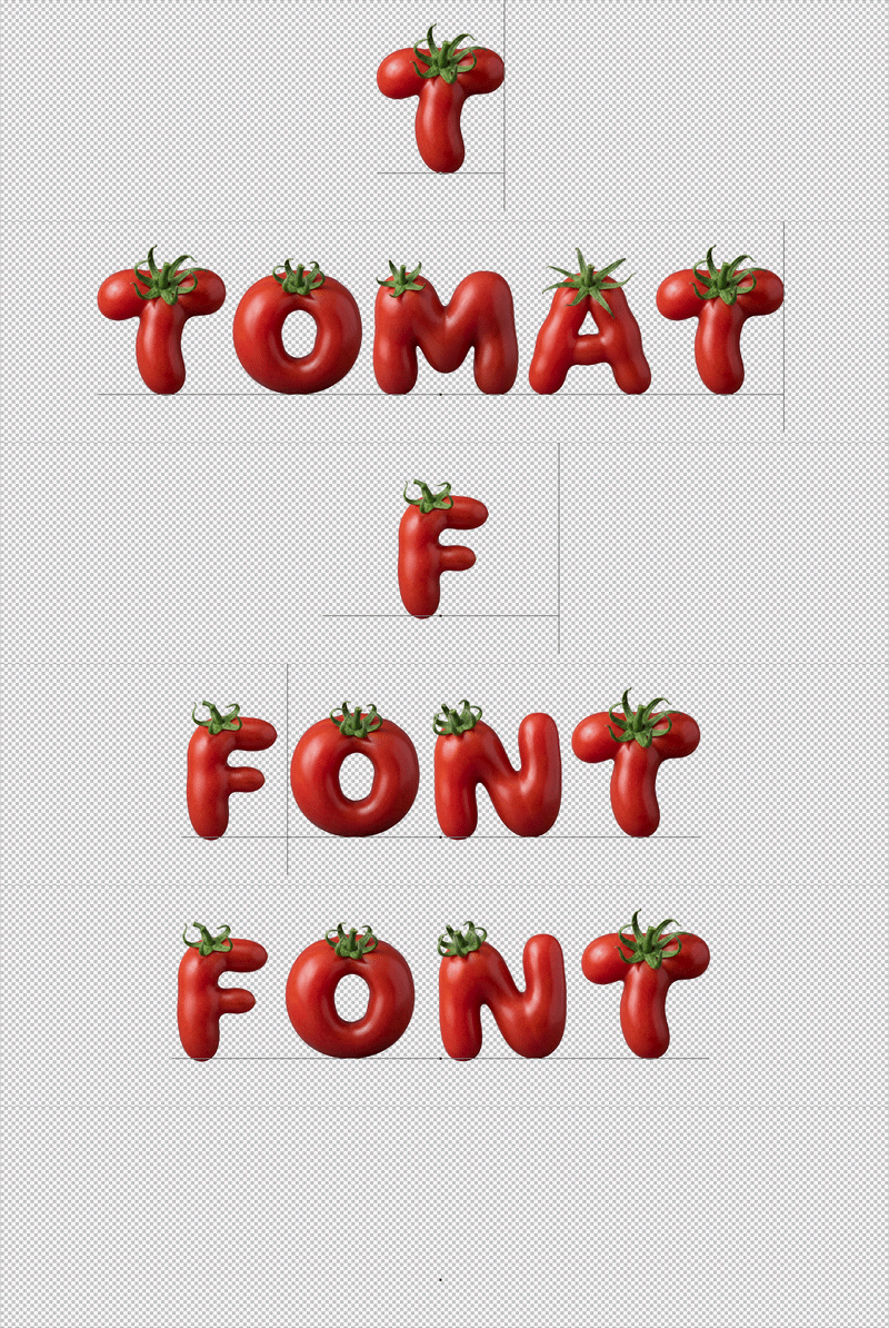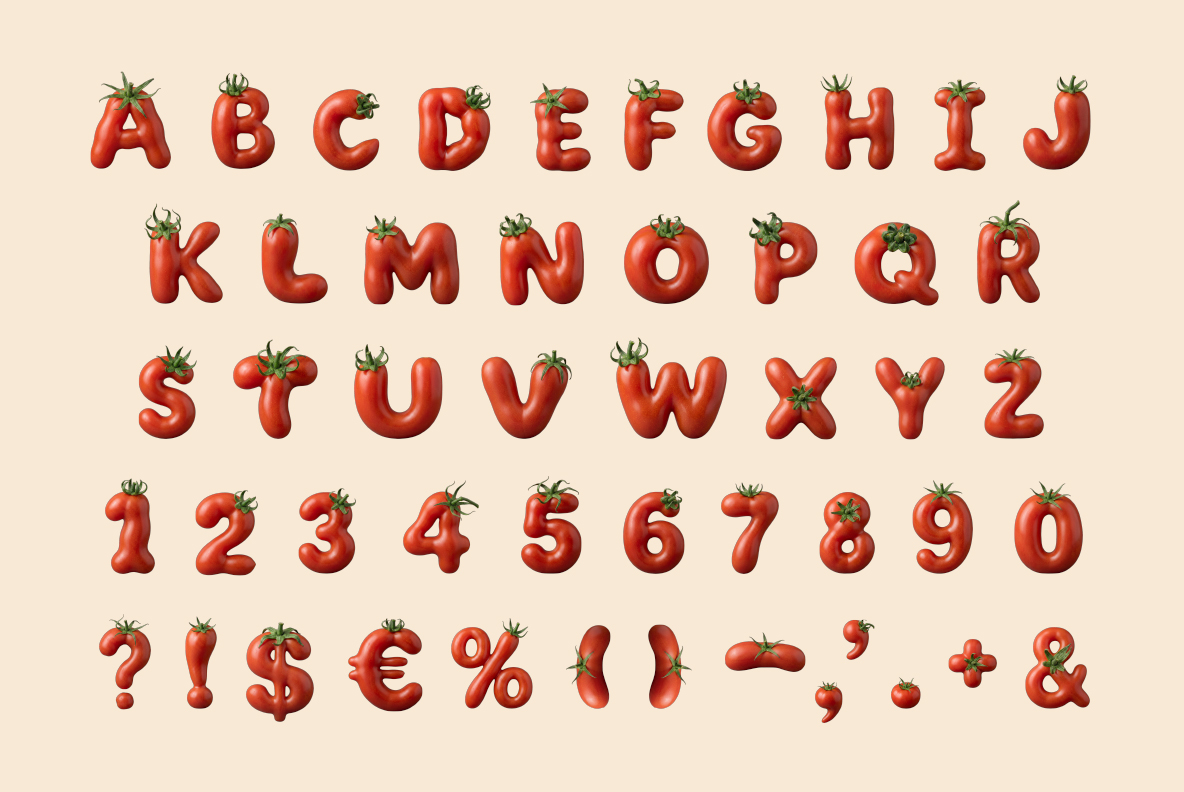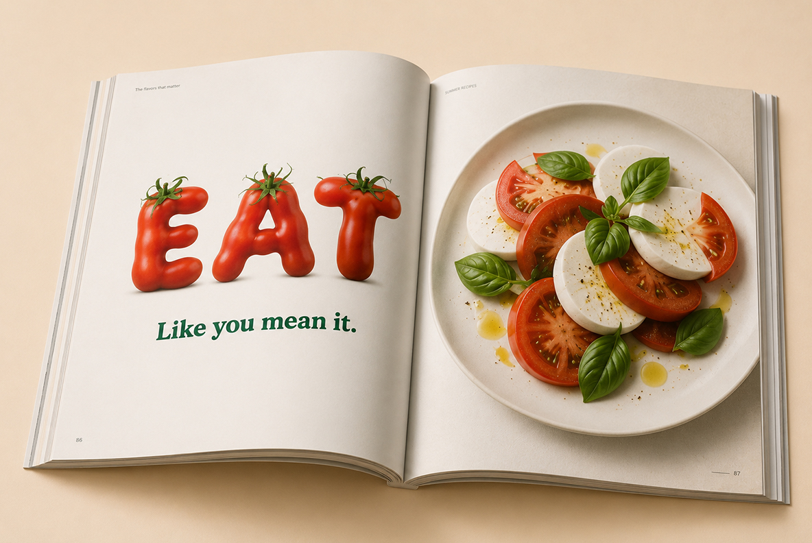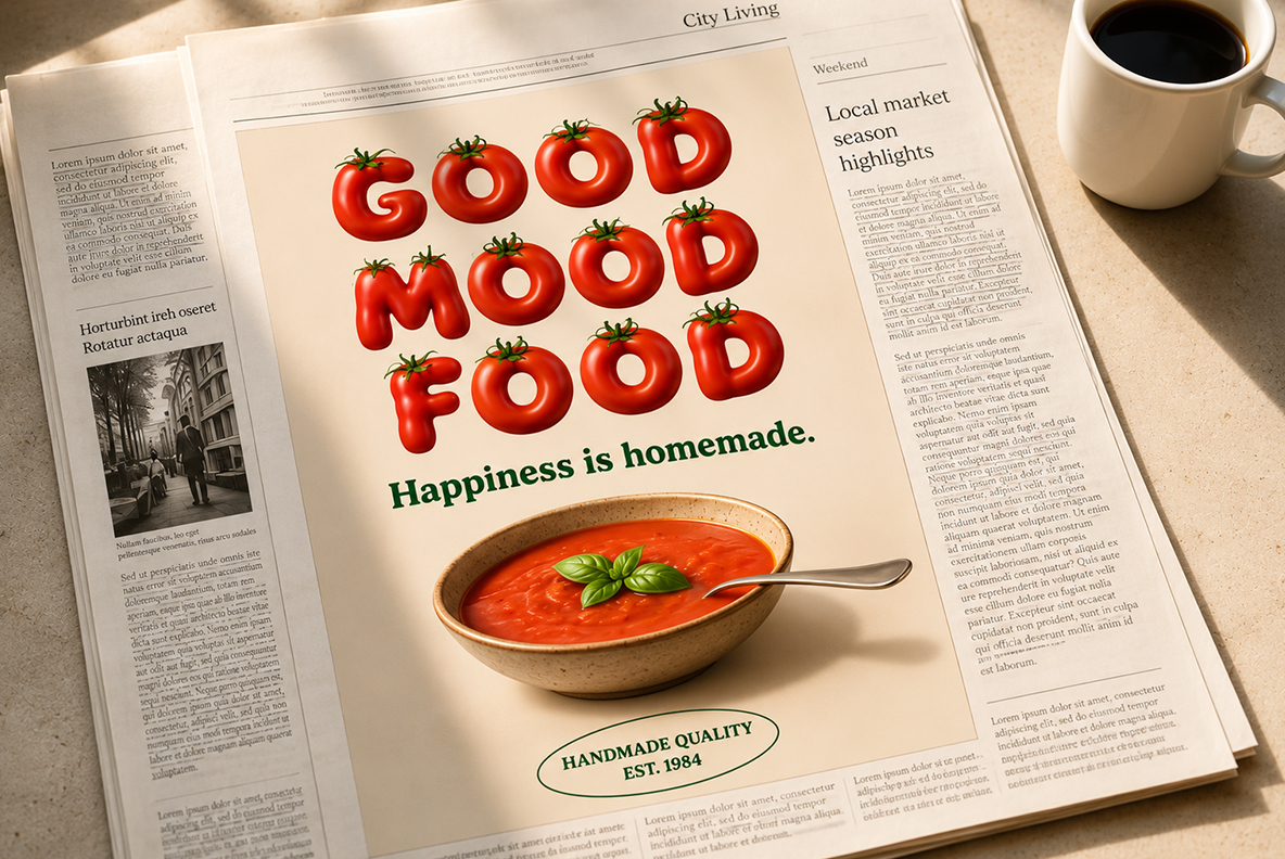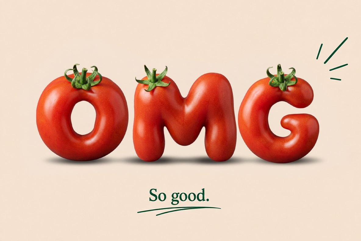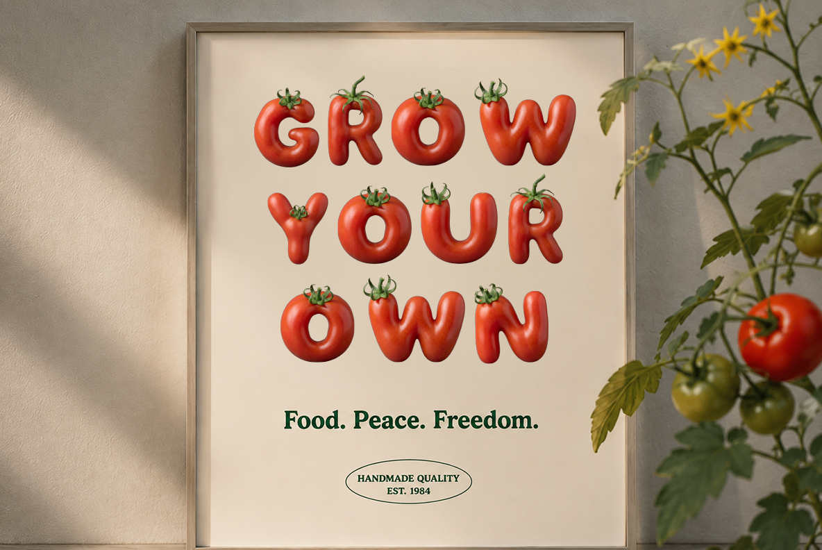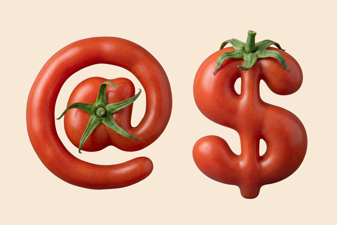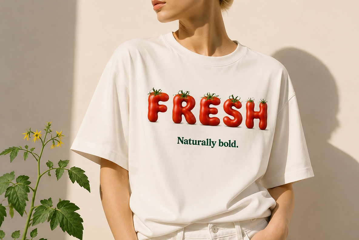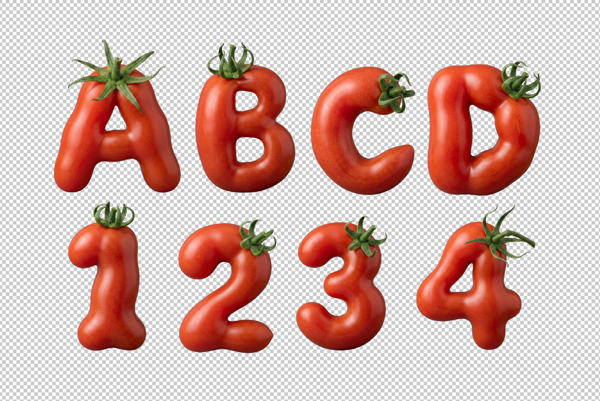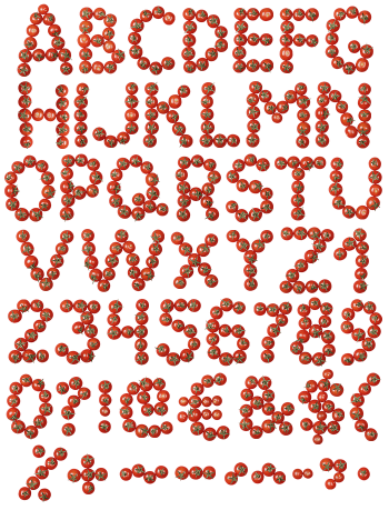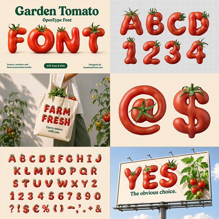

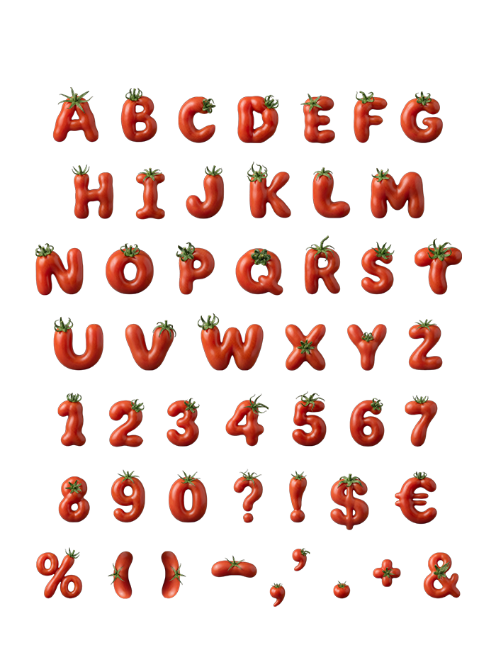
Deep brick-red tomatoes picked with the stalk still on, so every letter wears a little green star of calyx. The Garden Tomato Font keeps a matte skin and chunky rounded shapes, which lets it sit calmly on cream and off-white. Mockups run from seed-packet posters to a cookbook spread and a skateboard. Supplied as an OTF plus transparent PNG letters.
Picked, Stalk Still Attached
These letters were picked rather than moulded, and the green stalk proves it. Naturally, each glyph carries a little star of calyx perched on top, leaves still curling. Skin runs deep brick red and mostly matte, so highlights stay soft instead of glassy. Shapes are chunky and rounded too, which keeps the alphabet friendly at any size. Look closely and small dents and creases turn up, exactly as on real fruit.
The Garden Tomato Font Uses a Quieter Red
That darker red is the useful part, because it behaves on cream and off-white. So the letters sit calmly in editorial layouts rather than shouting over them. Also the green stalks hand you a second colour for free. Meanwhile the matte finish photographs well under soft light, without blown highlights. This one therefore fits a slow homegrown mood far better than a neon one.