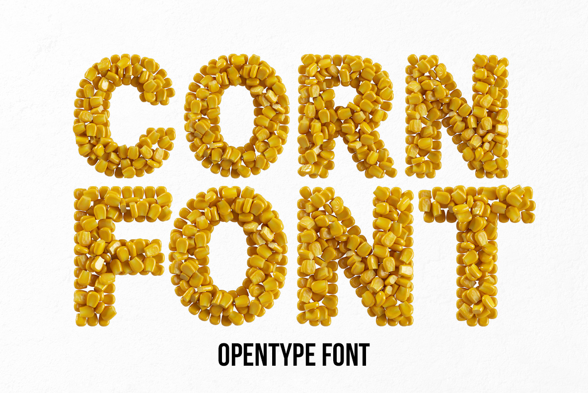
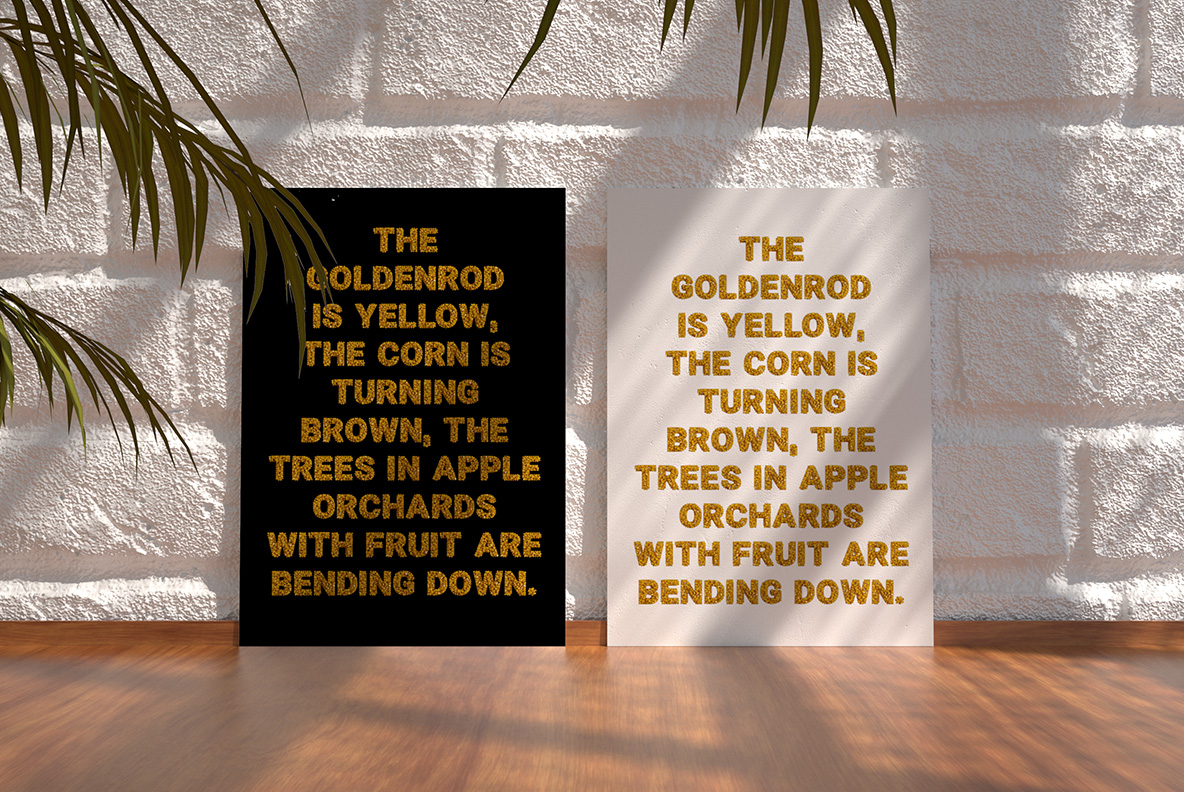
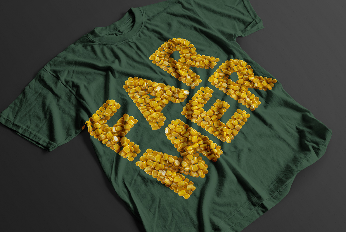
Sweetcorn straight from the tin, glossy and butter-yellow, heaped several kernels deep until each letter swells out of shape. A bold rounded sans holds underneath, so words stay readable through all that produce. Strays roll off the baseline for good measure. Made for canned-goods labels, farmers markets, taco menus, barbecue flyers and cheerful childrens covers.
Straight From the Tin
Kernels this shiny have, in fact, been sitting in brine. Each one also looks plump, deep butter-yellow and wet, with a hard little highlight riding the top. Besides, they pile several deep, so the outline of a letter swells and dips instead of running straight. A few strays even tumble off the baseline, which is exactly what happens when you tip a tin out. Naturally the light bounces around between them. Nothing about it looks dry, after all.
How the Corn Conserve Font Holds Together
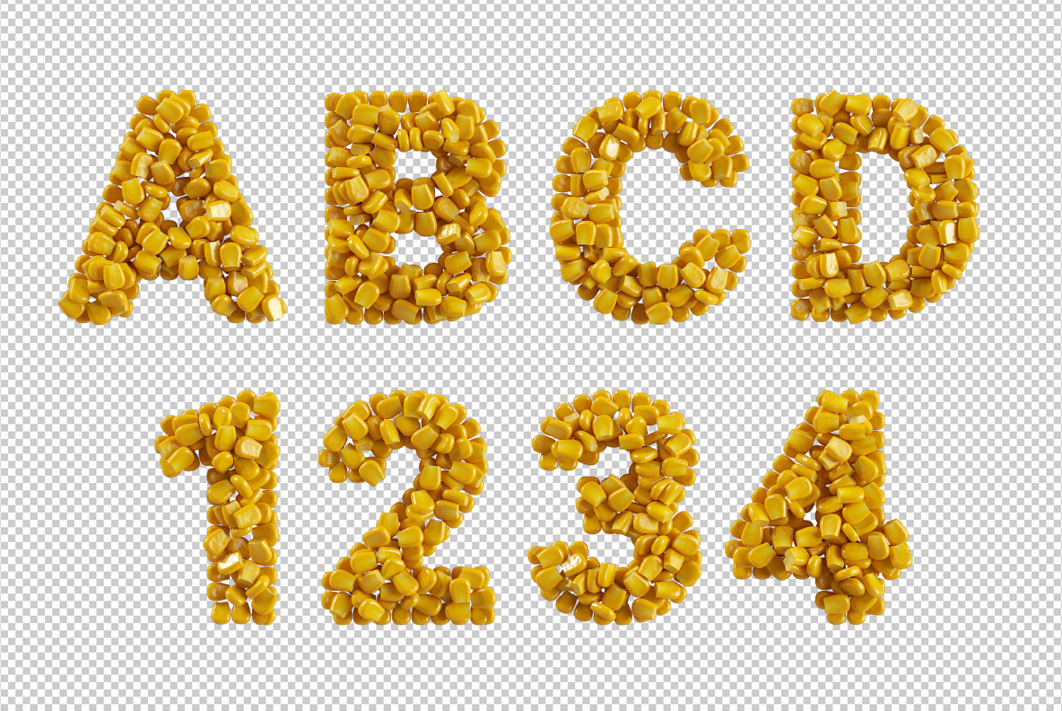
A bold rounded sans hides under all that produce, though. Because the skeleton stays simple, the Corn Conserve Font still reads at a glance, even though the surface is chaos. Kernels also bunch tighter on the joints and looser at the ends, so strokes look poured rather than arranged. Yellow meanwhile stays warm throughout and never turns acid. Above all, the shadows between kernels give each letter real depth. Even the numerals keep their heap, of course.