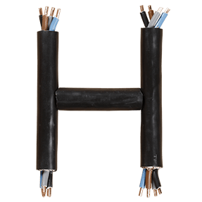
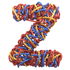
Someone emptied a box of offcuts and wound the alphabet out of them. Teal, orange, red and yellow strands loop over each other hundreds of times, so each letter is more nest than outline. Loose ends spring away from the edges. The colours never separate into stripes, because the tangle mixes them the whole way through.
A Nest, Not a Line
Most wire letters are a single bent strand, so you read the path immediately. Instead, the Color Wire Font builds every glyph out of chaos. Hundreds of thin strands wrap around one another, then the letterform emerges from the mass. Teal sits against orange, while red and yellow surface wherever the winding thins out. Stray ends poke out along the edges, since nobody trimmed them. Look closely and the tangle keeps going underneath.
Colour That Mixes Itself
No strand is thick enough to dominate, so the eye blends them into a warm rust-and-teal field. Step back far enough and it reads almost like tweed, naturally. Move closer, though, and individual wires separate again. Depth comes free with this build, because the strands behind sit in genuine shadow. Highlights catch on the plastic insulation as well, therefore the letters look shiny rather than matte. Nothing about the palette needed flattening.