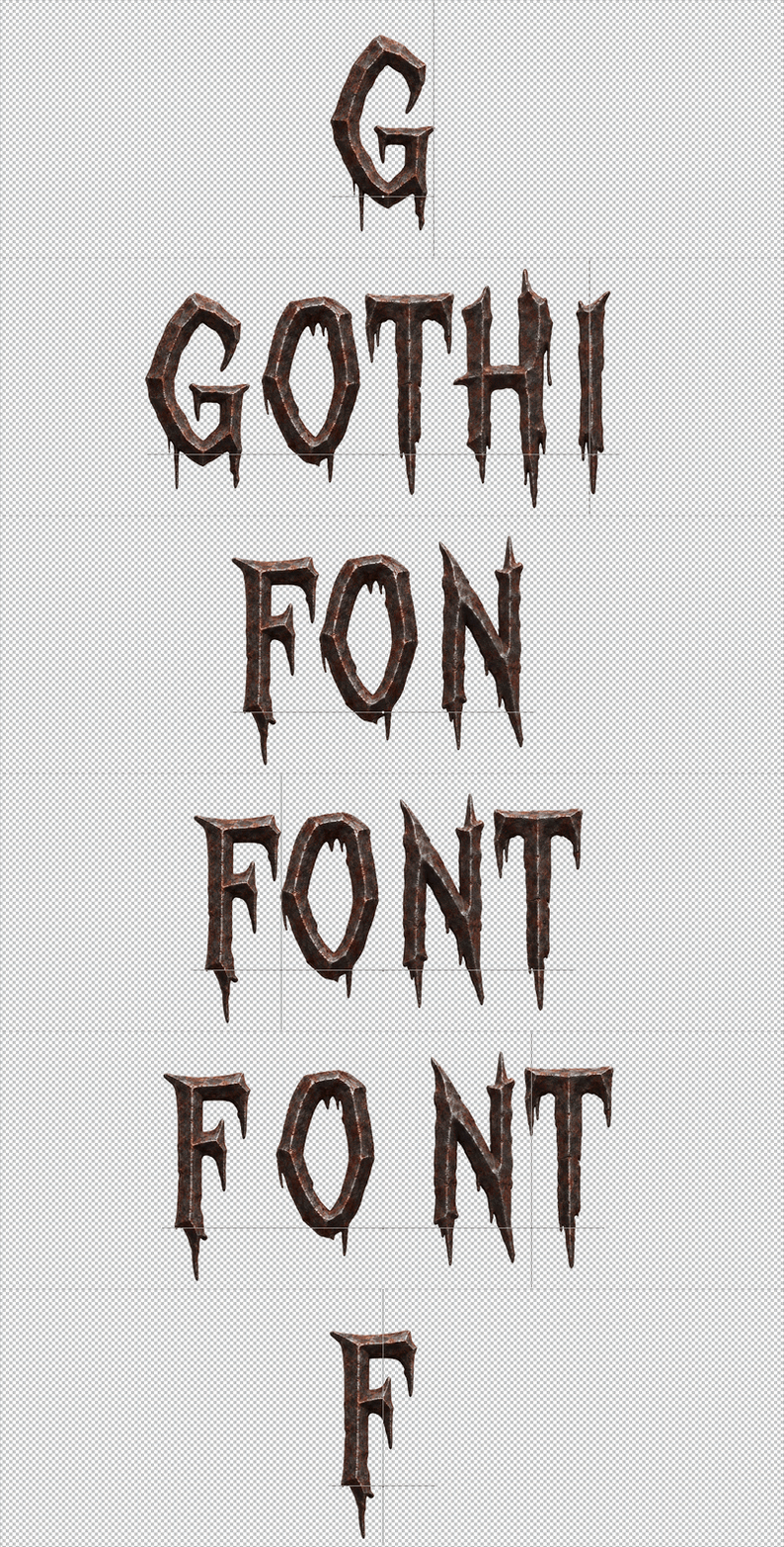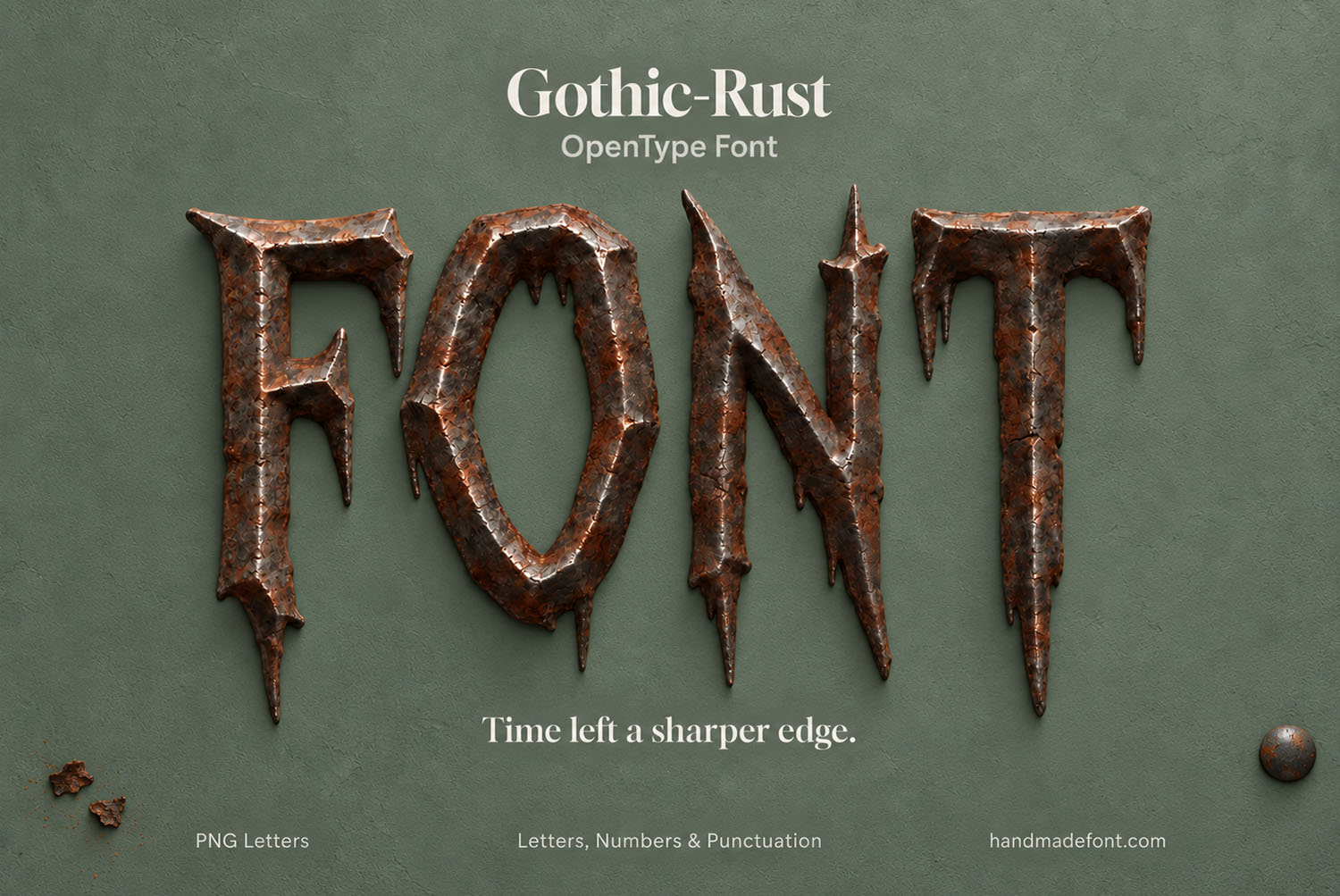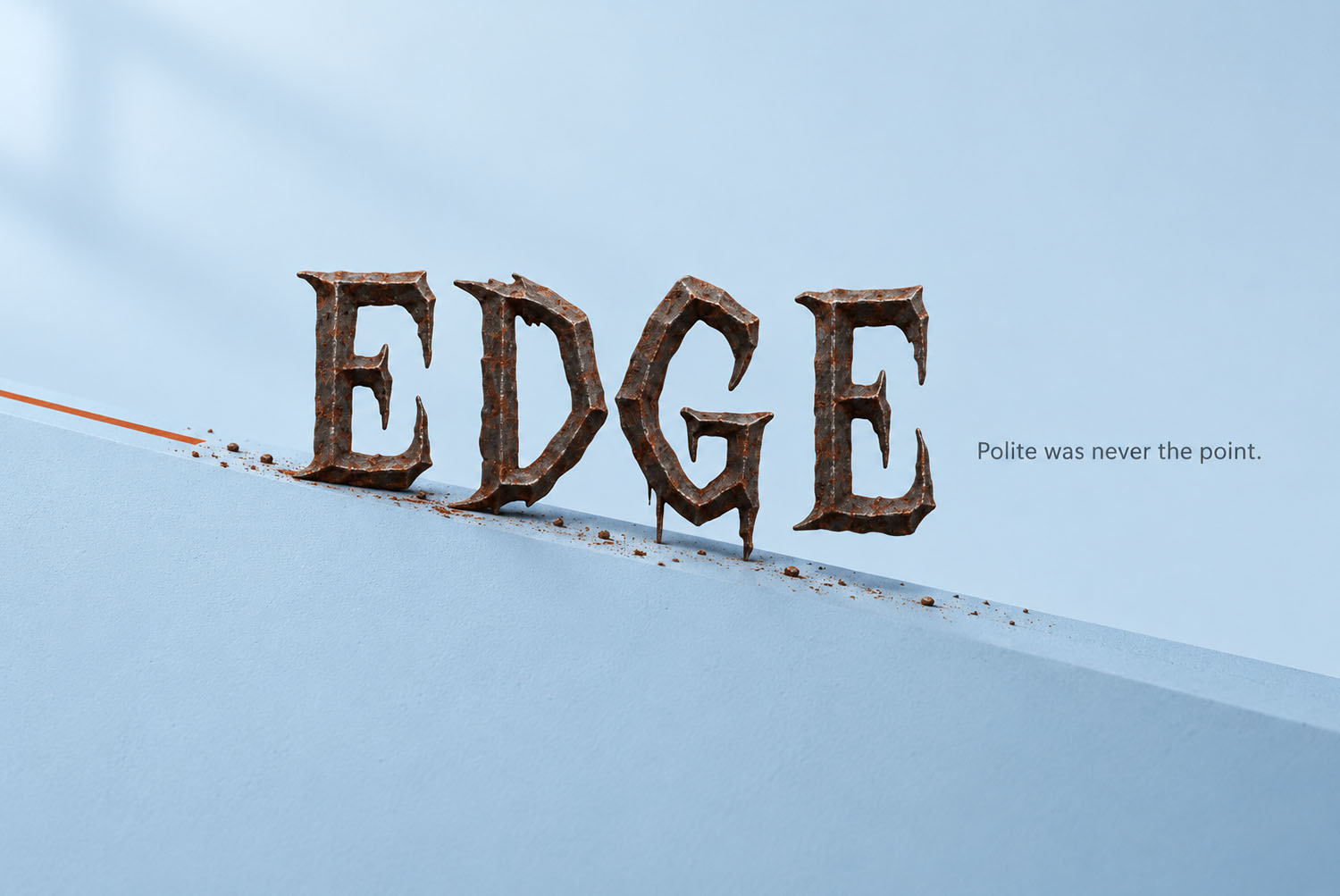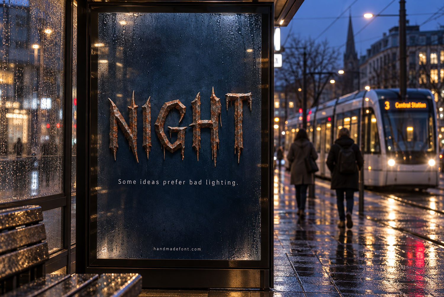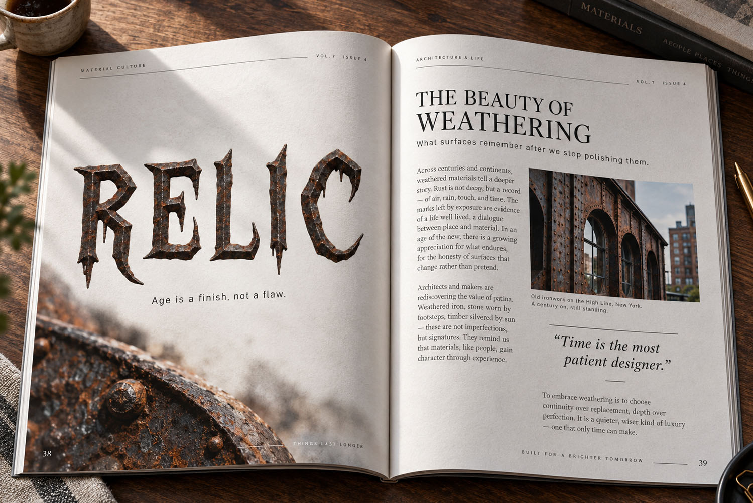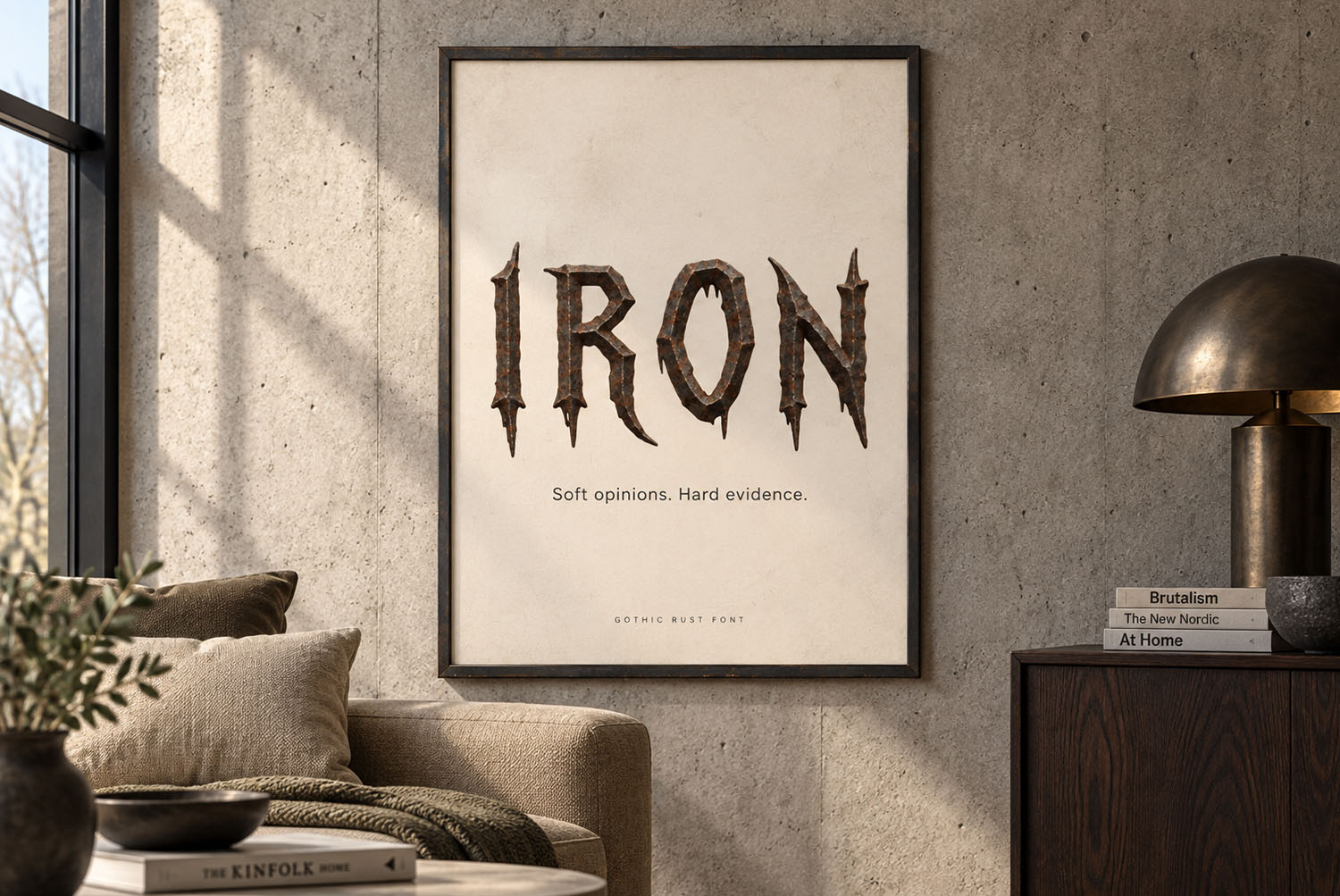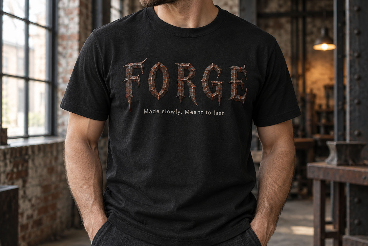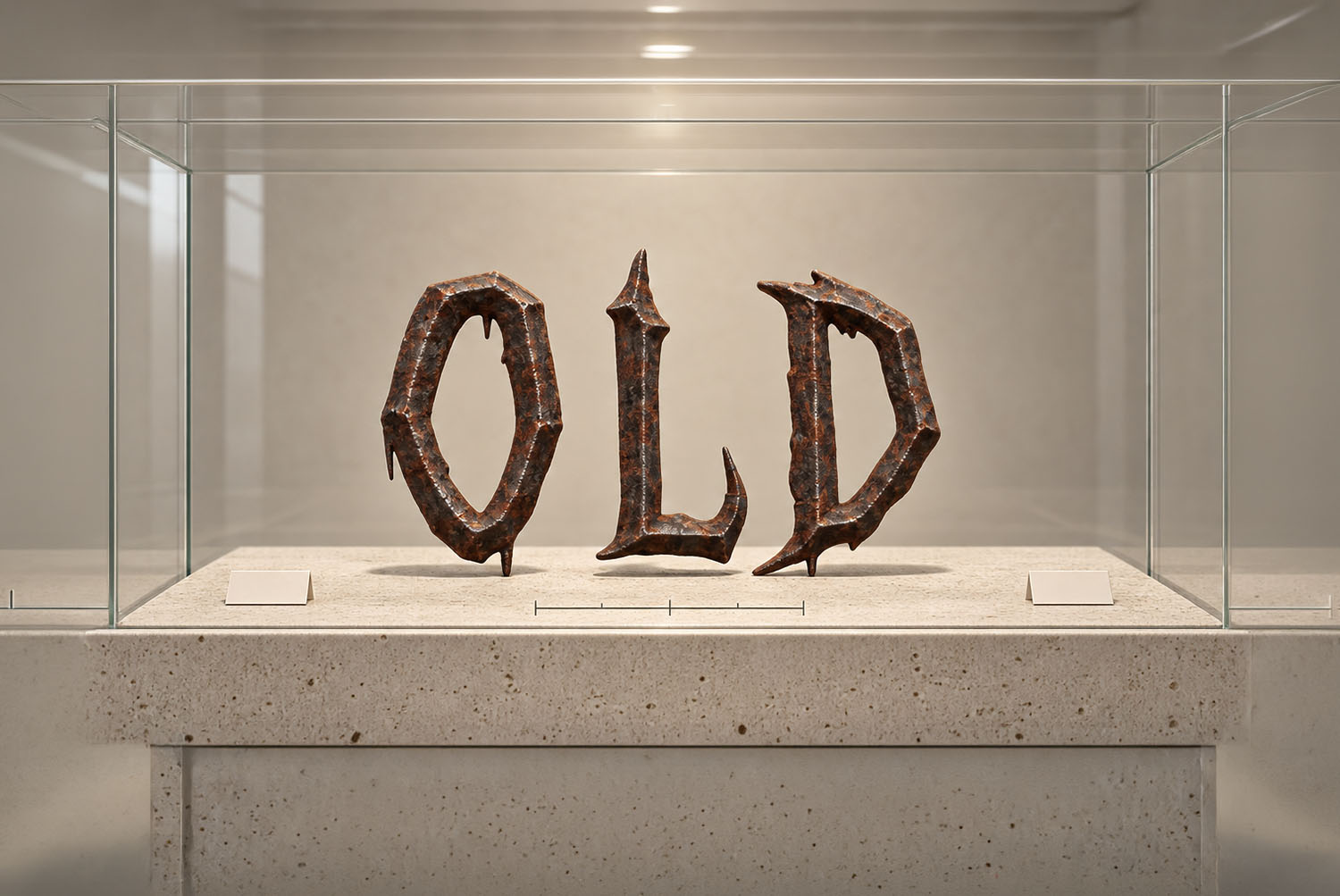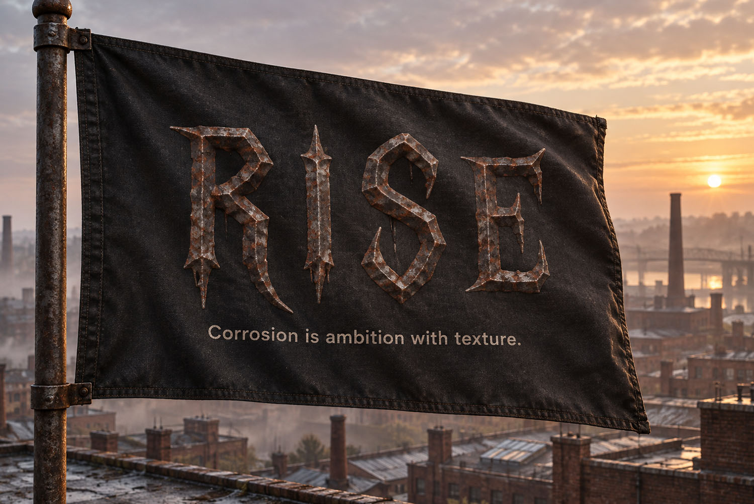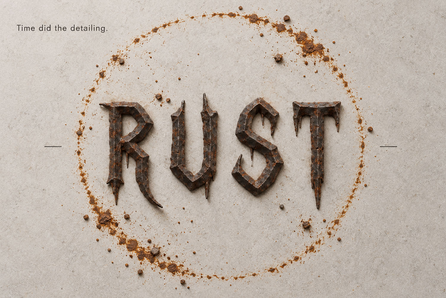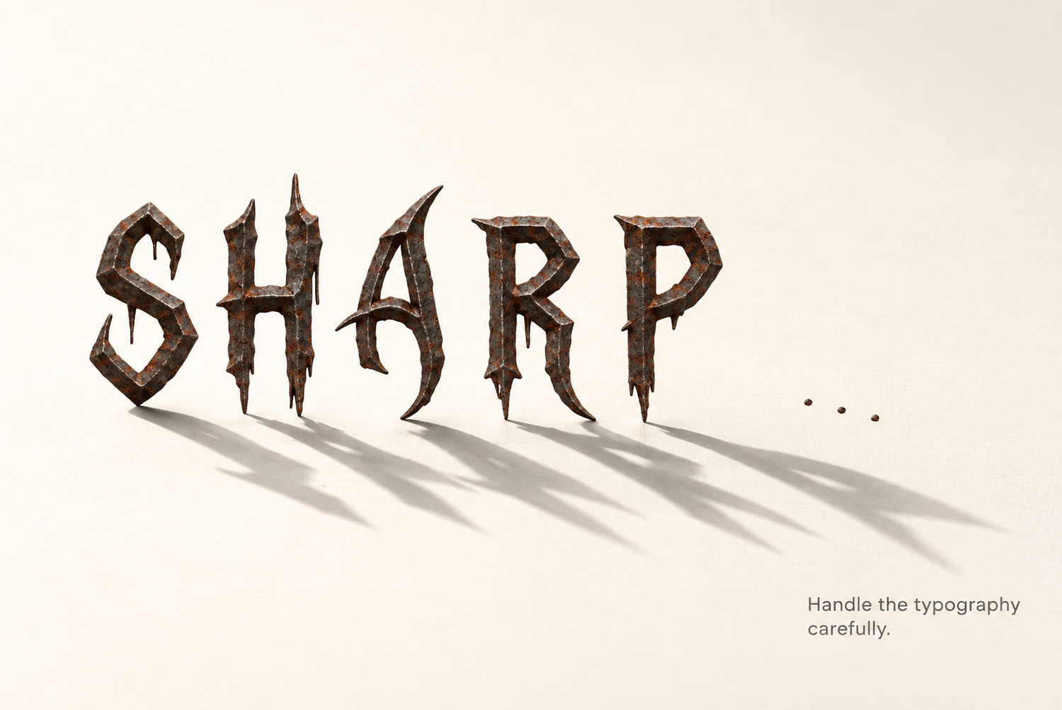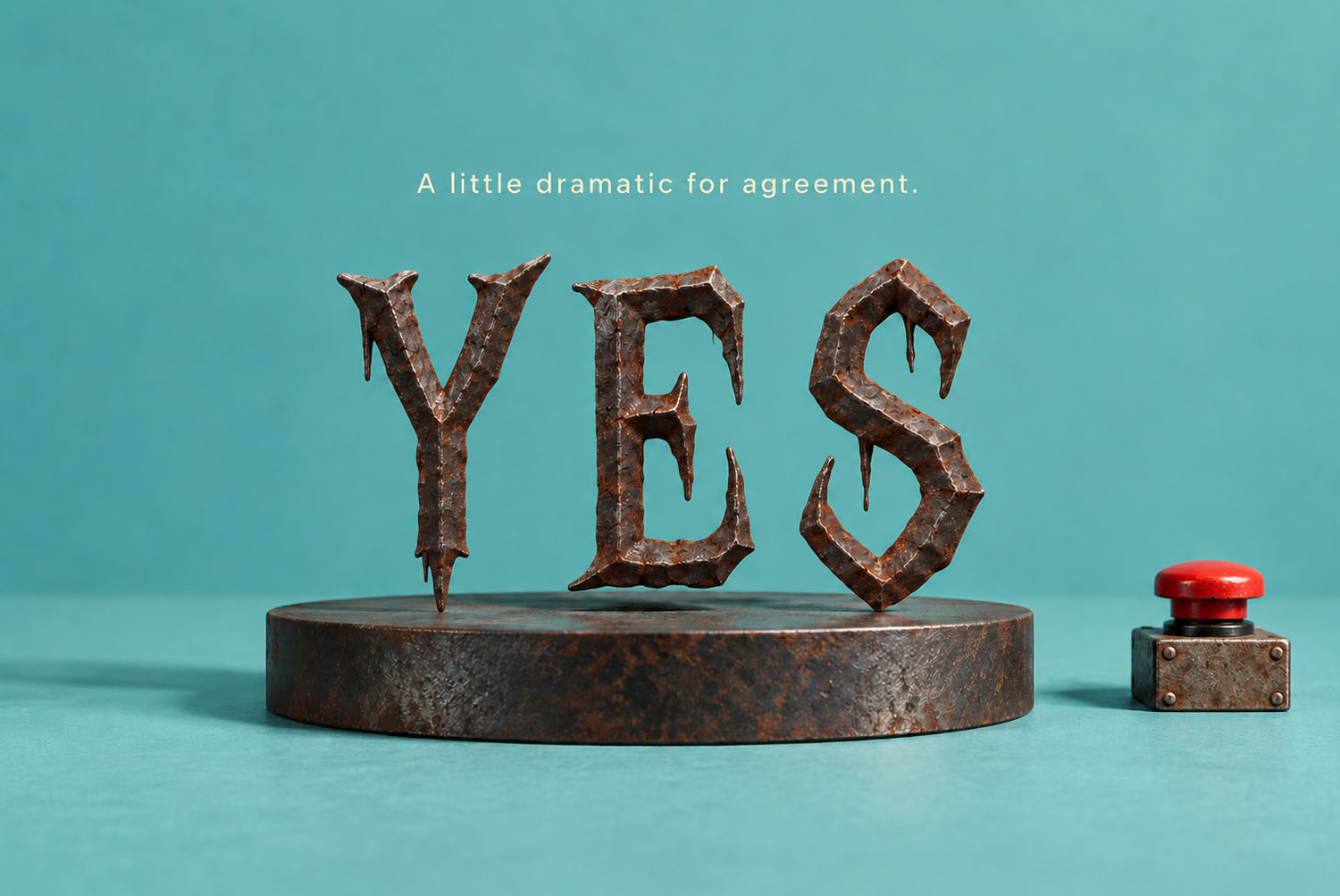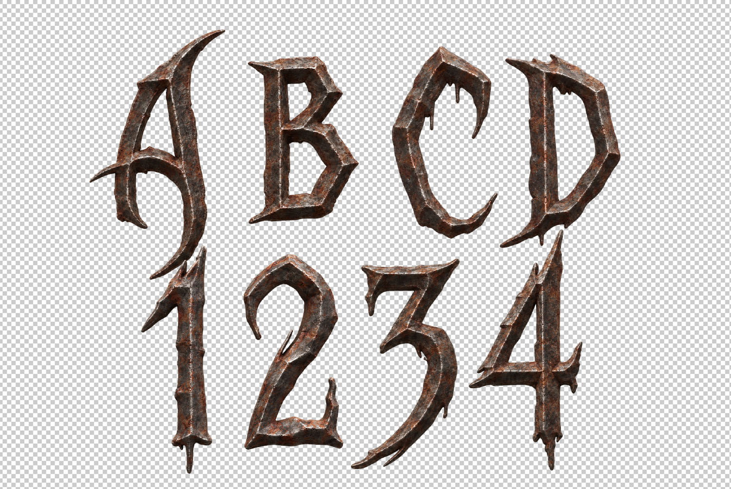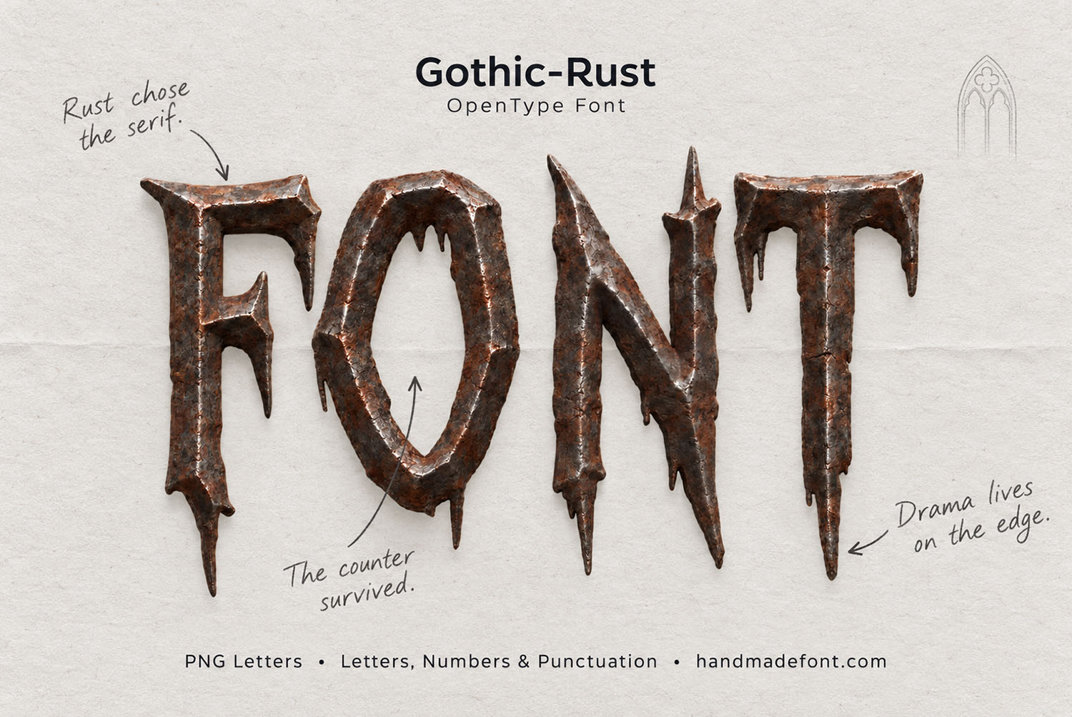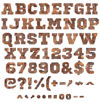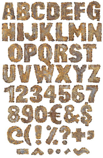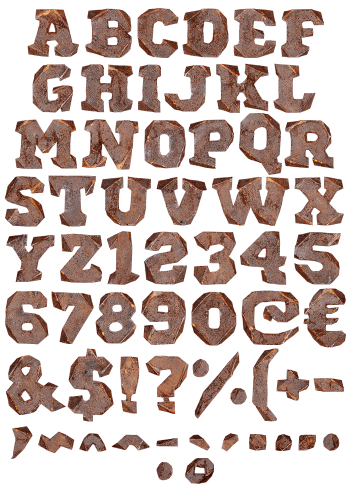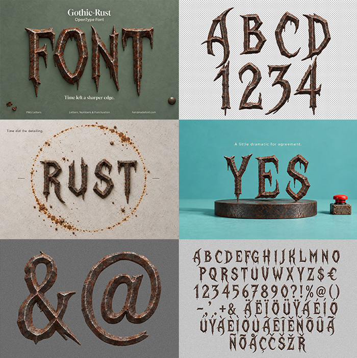
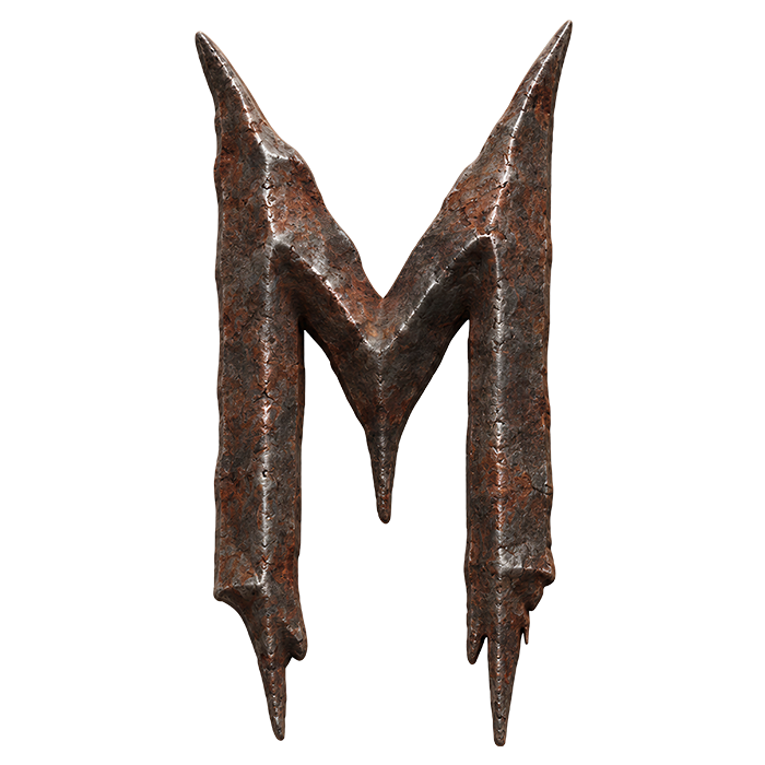
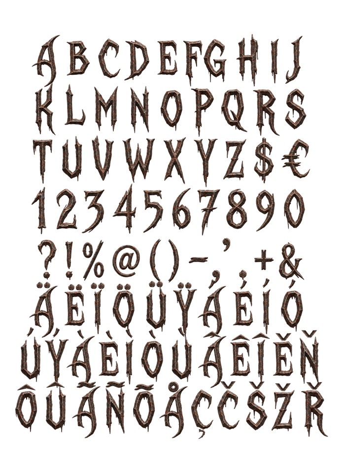
Gothic Rust Font is an alphabet of narrow iron capitals that corrosion got to first. The serifs pull out into long spikes, rust crawls over the flats, and small holes sit where the metal gave way. It shouts on dark posters, band merch and horror covers. Uppercase only, plus numbers, punctuation and accents. One word usually says plenty.
Gothic Rust Font Came Out of a Scrapyard, Not a Sketchbook
Every capital here wears a coat of corrosion, so the metal underneath only shows in patches. Orange-brown scale creeps across the flats, while darker iron holds the edges. The serifs have grown into long spikes, though several taper to a plain needle. Rust has chewed small holes through the thinner strokes, because nothing here ever saw paint. Naturally the whole alphabet reads as one object that sat outside for years. Gothic Rust Font carries that history in every glyph.
Sharp Gothic Bones Sit Under All That Decay
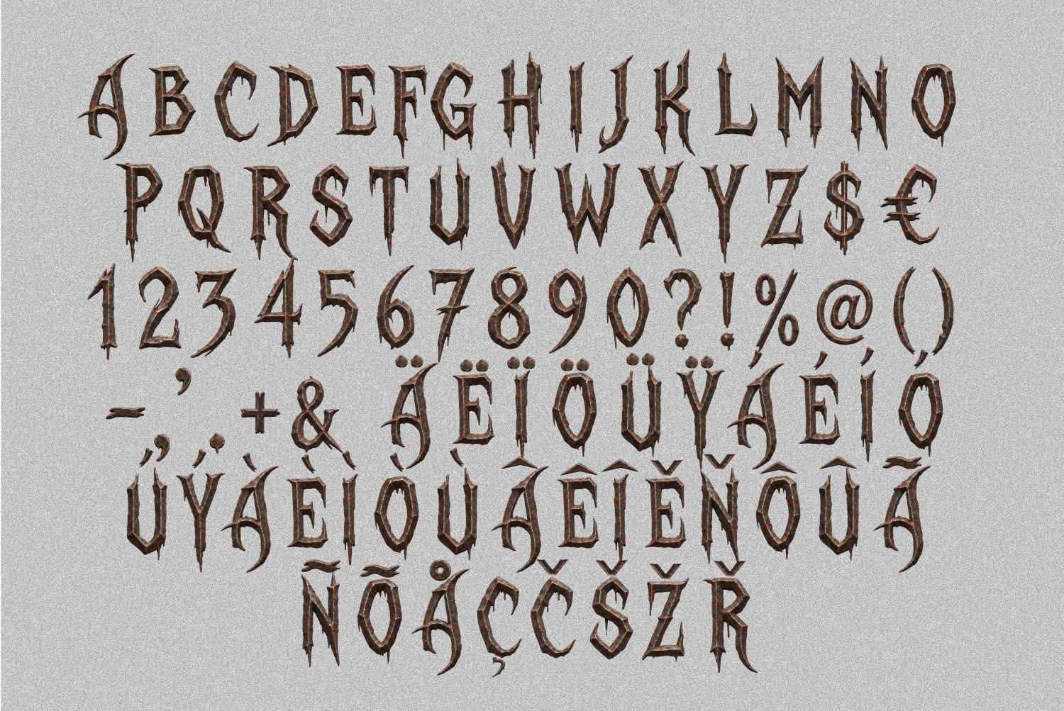
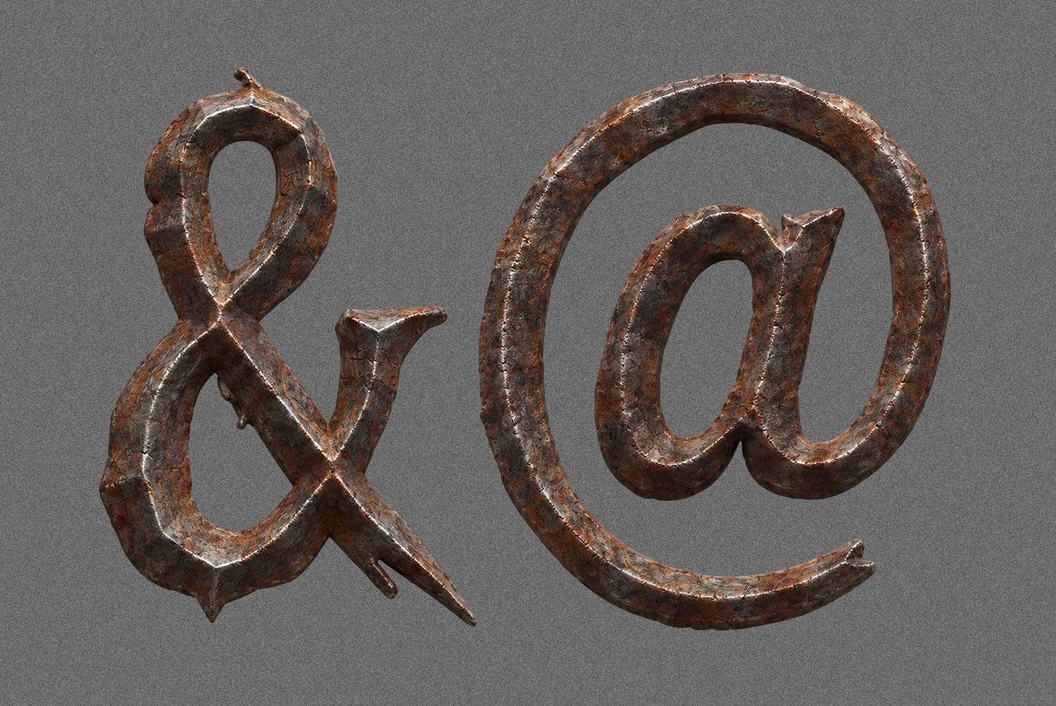
Strip the texture away, then a narrow gothic capital stays behind. Strokes run heavy and vertical, though the counters in O, D and R stay wide open. That openness matters, since a spiky face turns into mush at small sizes without it. Numbers, currency, punctuation and a long row of accents also follow the same rule. Meanwhile the ampersand and the at-sign got the full treatment, with spurs long enough to snag a sleeve. Uppercase only, of course, because lowercase would soften the whole idea.