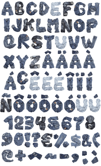
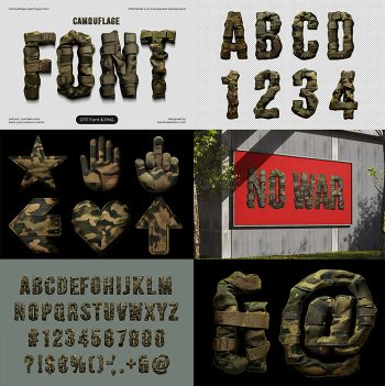
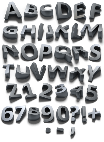
Washed indigo denim cut into letter panels, gold topstitching doubled along every edge, copper rivets at the corners. The Jeanius Font keeps the twill weave visible even small, so it reads as real cloth rather than a texture fill. Mockups run from a stitched t-shirt to a brick wall billboard. Supplied as an OTF plus transparent PNG letters.
Cut, Sewn and Riveted
Each letter is cut from washed indigo denim and sewn together like a garment panel. Twill weave runs visibly across the surface, with lighter fading along the raised areas. Gold topstitching then traces every edge, doubled up the way real jeans are stitched. Copper rivets sit at the stress points too, and some glyphs carry a pocket seam. So the alphabet reads as tailored rather than draped.
Topstitching Is the Detail That Sells It
That contrast stitching does most of the work, because it defines the whole outline. So the letters hold their shape against denim blue or black backgrounds alike. Also the weave stays visible at small sizes, which many fabric fonts lose. Meanwhile the fading gives each stroke a natural highlight without any added effect. Naturally the punctuation got the same treatment, rivets and all.