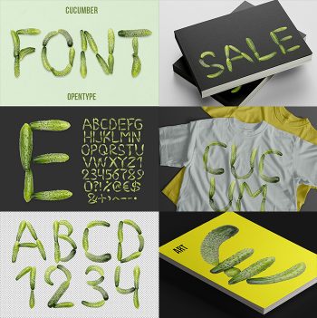
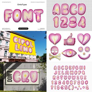
The Potato Font shapes every letter from real, whole potatoes, bumps, eyes, and dirt-flecked skin included. It’s rustic, funny, and completely unpretentious, the kind of alphabet that turns a menu or a farmers’ market sign into something people actually stop and read. Great for food branding, farm-to-table packaging, or any project that could use a little dirt-under-the-nails charm. Comes as a color OpenType font plus PNG letters.
Typography Grown Straight From the Ground
Every letter in the Potato Font started life as an actual potato, photographed whole, then arranged and retouched until the alphabet held together as type. You can see the real skin: the eyes, the dirt marks, the uneven bumps that no two potatoes share. It’s closer to what you’d find in a root cellar than a sanitized food font, and that’s exactly the point. Tight tracking gives words a stacked, sculptural weight, while looser spacing lets each letter read as its own small vegetable portrait.