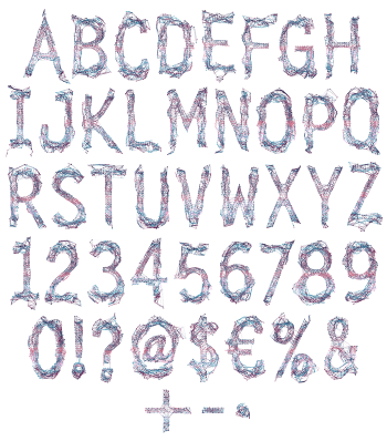
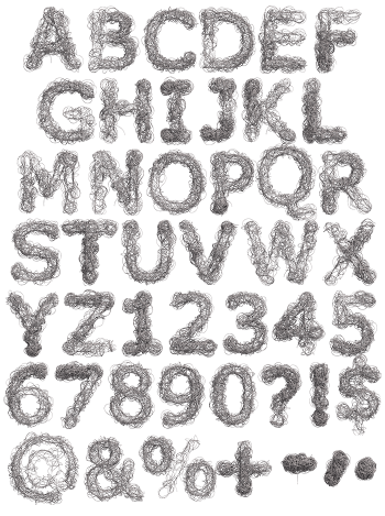
Hundreds of fine black lines crossing over each other until a letter appears out of the mess. Tangle Font is nervous, sketchy and completely monochrome, with the density shifting from stroke to stroke. Uppercase, numbers and punctuation, plus separate PNG letters. Suits album art, editorial, poetry covers and anything about knots.
Tangle Font Draws Itself Out of a Mess
There is no solid stroke anywhere, since every shape is only a build-up of lines. Where the lines cross most often, the letter goes dark and reads solid. Elsewhere they thin out, so the edges dissolve into the paper. Because the density varies, each glyph carries a different weight. So a word set in this never sits perfectly even, and that is the charm.
Thin Enough to Feel Anxious
The lines are hair-fine, which keeps the whole alphabet light despite the chaos. Tall narrow capitals hold underneath, so the letters stay upright and readable. Meanwhile the palette is black on white and nothing else. Set it large, and you can follow individual threads right across the page. Besides, the sparse areas leave the paper showing through.