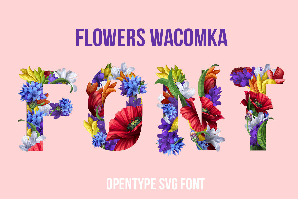
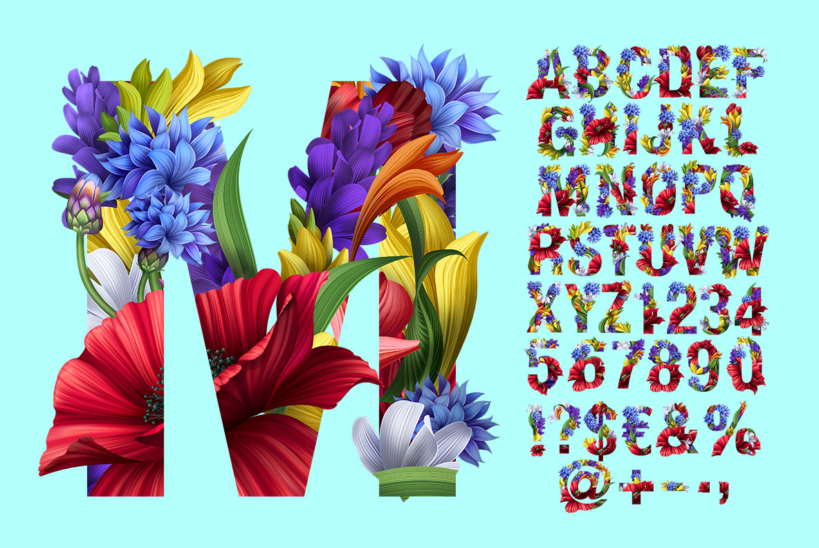
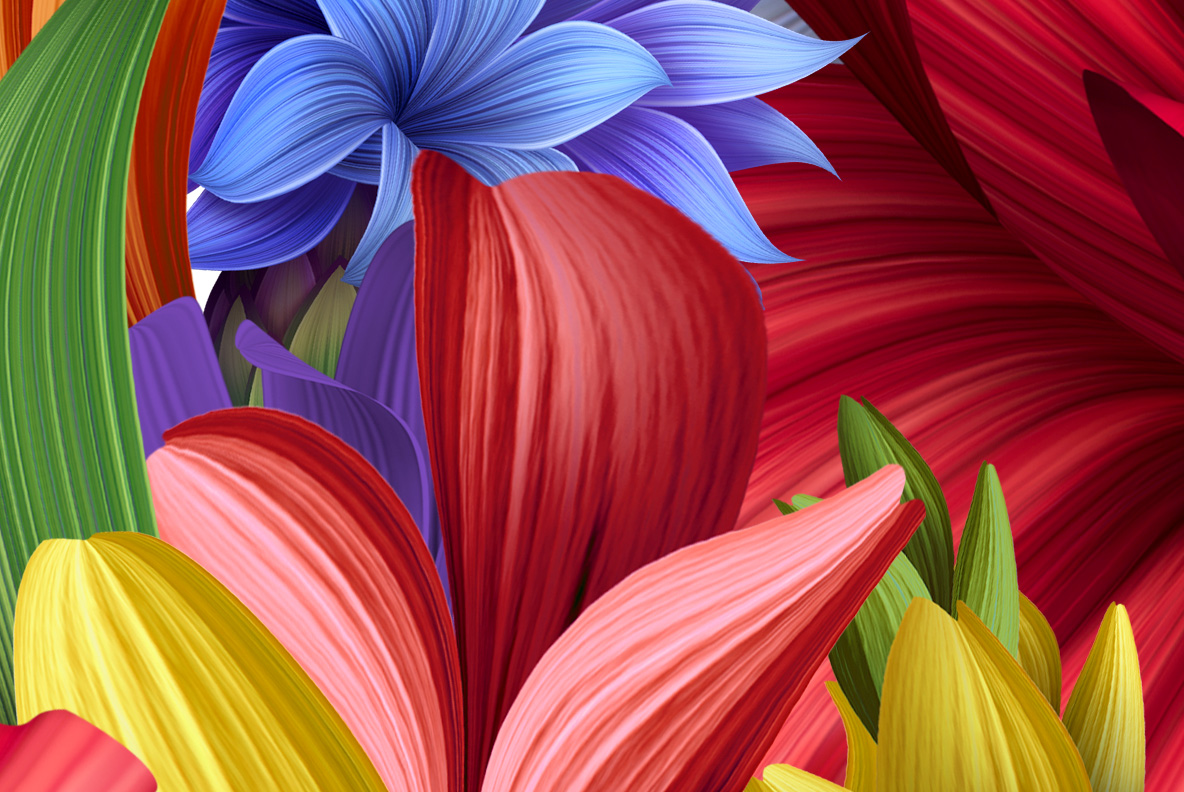
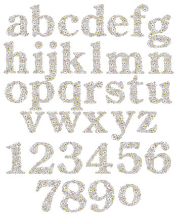
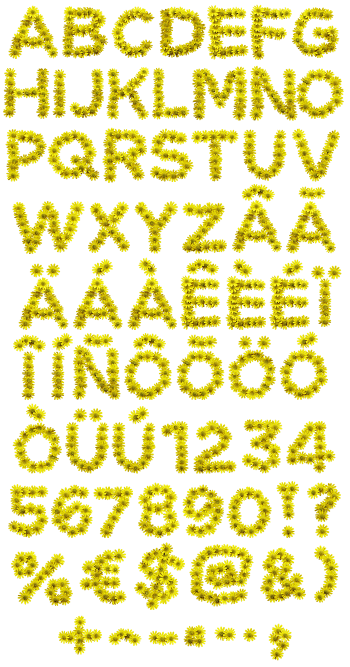
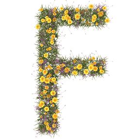
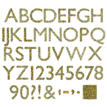
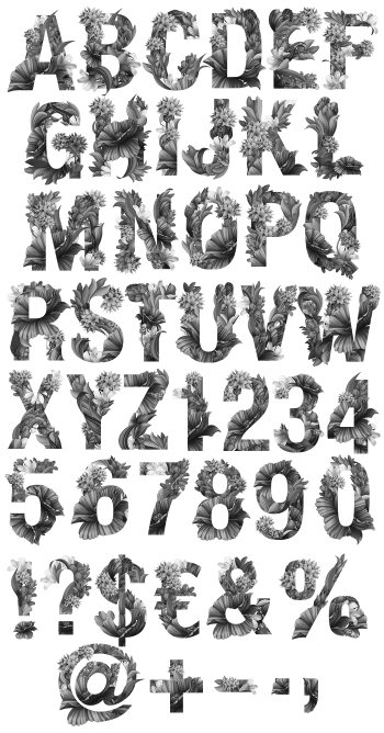
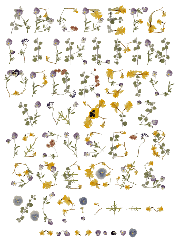
Red gladioli, blue cornflowers, white hyacinths and yellow petals painted into every capital, with green leaves pushing through the gaps and petals leaning out past the outline. The Flowers Wacomka Font keeps a wide slab-ish letterform underneath, so words stay recognisable under all that colour. Figures and punctuation are planted the same way.
Blooms Painted Straight Into the Letterforms
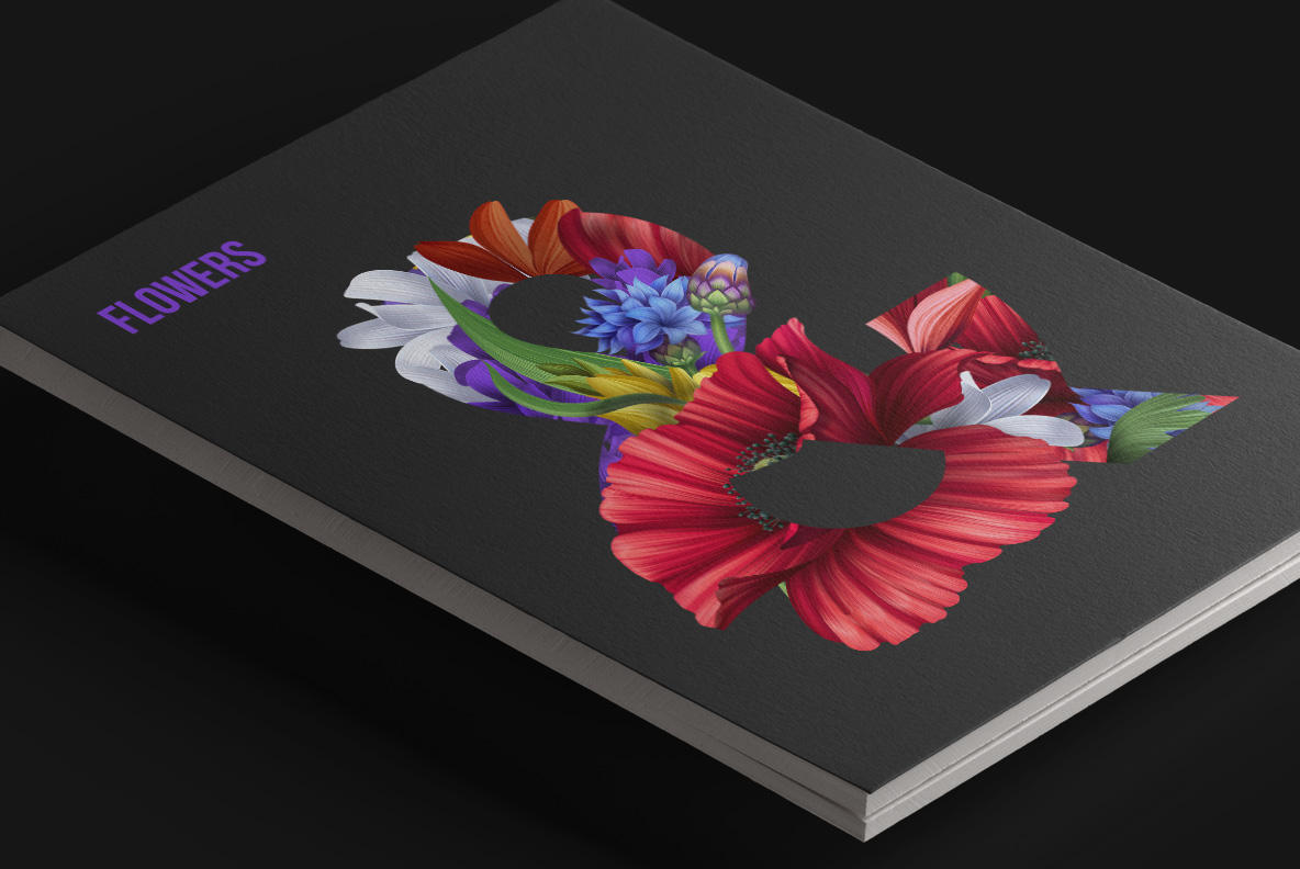
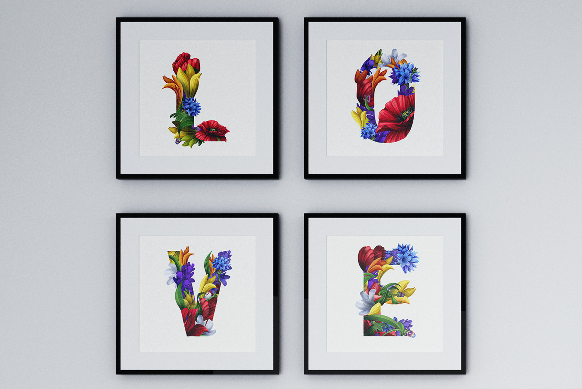
Red gladioli, blue cornflowers, white hyacinths and yellow petals crowd every capital. They are painted rather than photographed, with clean edges and deep saturated colour. Petals overlap and lean past the outline, so the shapes stay loose and generous. Green leaves push through the gaps and hold each arrangement together. Of course, the colour does most of the talking. Because each letter carries its own bouquet, the alphabet never repeats itself.
Structure Hiding Under the Flowers
There is a real letterform in there, and it does the heavy lifting. Wide slab-ish capitals give the flowers something to sit on, so words stay recognisable. Stems and leaves mark the strokes where petals would otherwise blur them. Since the palette keeps returning to red, blue and cream, the whole alphabet reads as one set. In addition, figures and punctuation come planted the same way. Meanwhile a white background lets every bloom breathe.