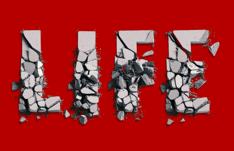
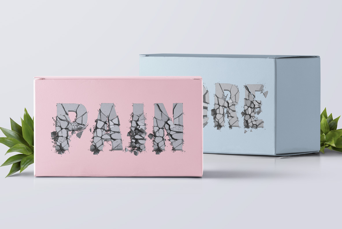
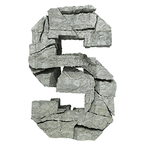
Bold grey capitals caught in the act of falling apart: heavy chunks drifting away from each other, dust spraying off the torn faces and small debris scattering below the baseline. The Fall of the Concrete Font keeps a plain bold sans underneath, so a word stays legible while it disintegrates. Figures and punctuation crumble the same way.
A Letter Caught Mid-Collapse
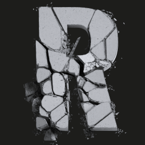
In fact, this is not weathered concrete, it is concrete losing the argument. Each capital has split into heavy chunks that drift apart, and dust sprays off the broken faces. Gaps open between the pieces, so the silhouette stays readable while the mass falls away. The grey runs pale and dry too, with aggregate showing wherever the surface tore. Of course, the effect reads as a moment rather than a texture. Because the break happens differently in every glyph, repeated letters never match.
The Fall of the Concrete Font Keeps a Heavy Sans
Underneath the destruction, of course, the drawing is a plain bold sans. Strokes stay wide, corners square, counters generous as well. That simplicity is therefore what keeps a word legible while it disintegrates. Since the fragments stay large, the letters survive at moderate sizes too. In addition, small debris scatters below the baseline for extra weight. Figures, currency signs and punctuation likewise crumble the same way. Meanwhile the palette never leaves grey, which suits stark layouts.