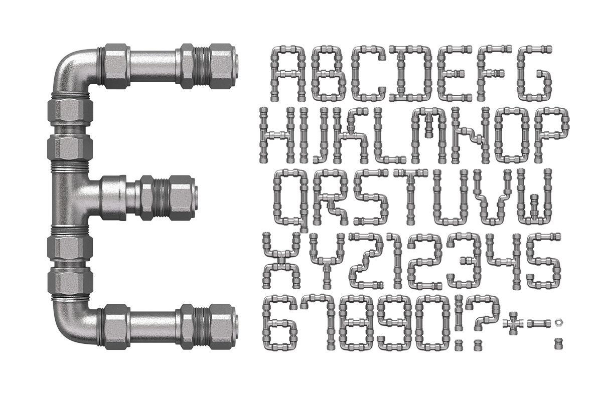
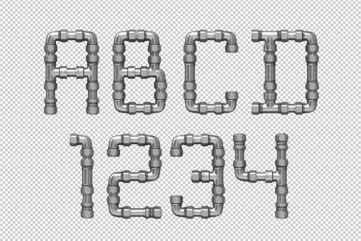
Galvanised steel pipe, elbows and threaded unions assembled into letters. Every joint is a real fitting, every corner a proper elbow, and the nuts still show their flats. It is plumbing, laid out by somebody with too much time and a decent eye. The whole alphabet reads as workshop rather than decoration, which is the useful part.
Elbows, Unions and Straight Runs
Each letter is built from real plumbing parts, obviously. Straight runs of galvanised pipe carry the stems, while ninety-degree elbows turn every corner and threaded unions join the sections. Notably, the nuts keep their hex flats and the threads stay visible at each collar. Because the steel is brushed rather than polished, it holds a soft grey sheen instead of hard reflections. So the whole set reads industrial without looking like chrome trim.
The Pipe Font Bends Like Real Plumbing
Curves are the hard part, and of course the Pipe Font solves them bluntly. A bowl becomes a series of short straight runs mitred together, since real pipe does not bend smoothly. In addition, that gives the alphabet an angular, faceted character. Above all the fittings stay consistent in scale, so a long word looks assembled from one kit. Besides, the visible joints are what sells the whole thing. Since every fitting was built separately, no two collars line up quite the same.