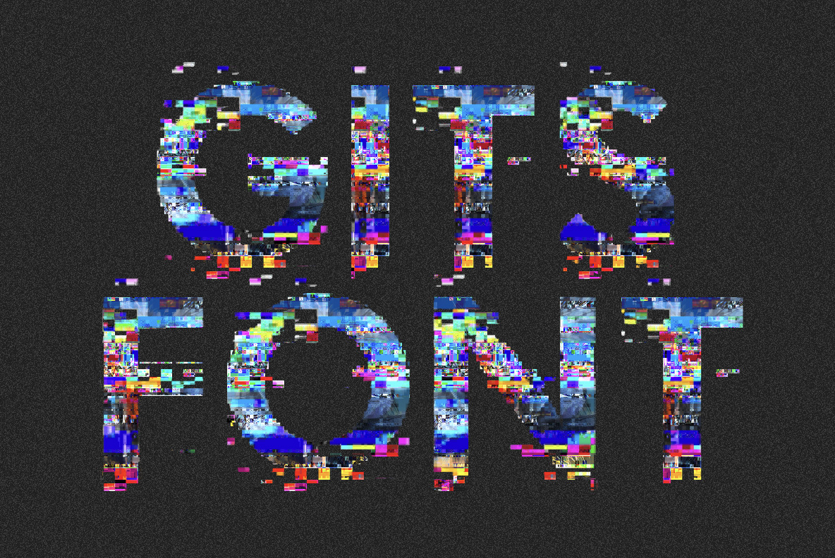
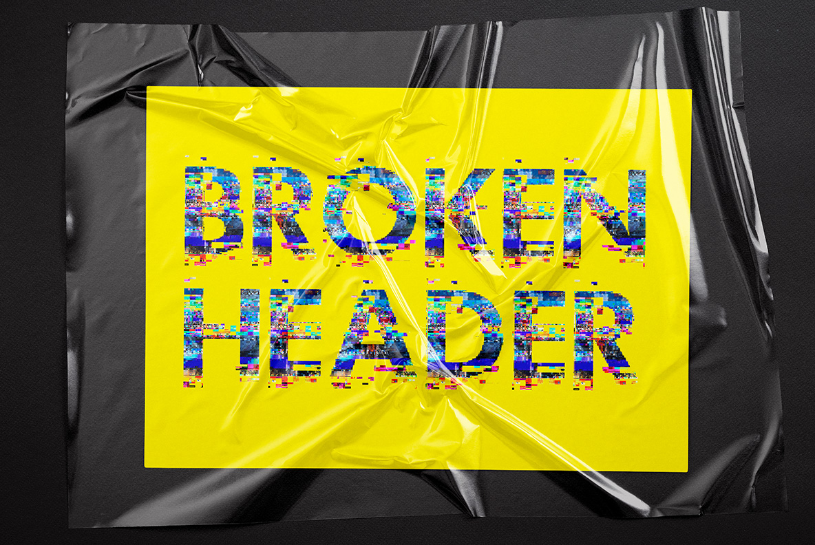
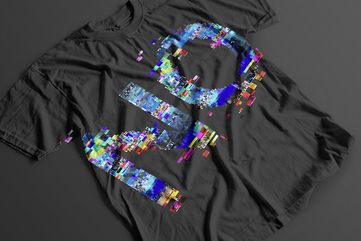
Letters assembled from thousands of small coloured squares in blue, magenta, cyan and yellow, with black showing through every gap. The Gits Font hides a bold condensed skeleton inside all that mosaic, so words still hold at headline size. Stray blocks drift off the edges, and figures and punctuation corrupt the same way.
Data That Forgot How to Be a Letter
Of course, this alphabet is built from pixels rather than strokes. Thousands of small squares stack up in blue, magenta, cyan and yellow until a capital appears. The blocks sit at different sizes too, so the edges fray into loose mosaic instead of a clean outline. Black shows through the gaps, which keeps every colour bright. Because nothing is drawn smoothly, the letters look decoded rather than designed. Zoom in and the individual squares stay visible, which is exactly the point.
Colour Blocks Doing the Drawing
Look longer and a bold condensed skeleton is hiding in the noise. Strokes stay upright and even, so words hold together at headline size. The palette leans cold, since blue and magenta dominate while yellow only punctuates. In addition, stray blocks drift off the edges and land in the background. Figures, currency signs and punctuation corrupt the same way. Naturally the corruption stops short of destroying the shape. Above all, the Gits Font stays readable where most pixel faces give up.