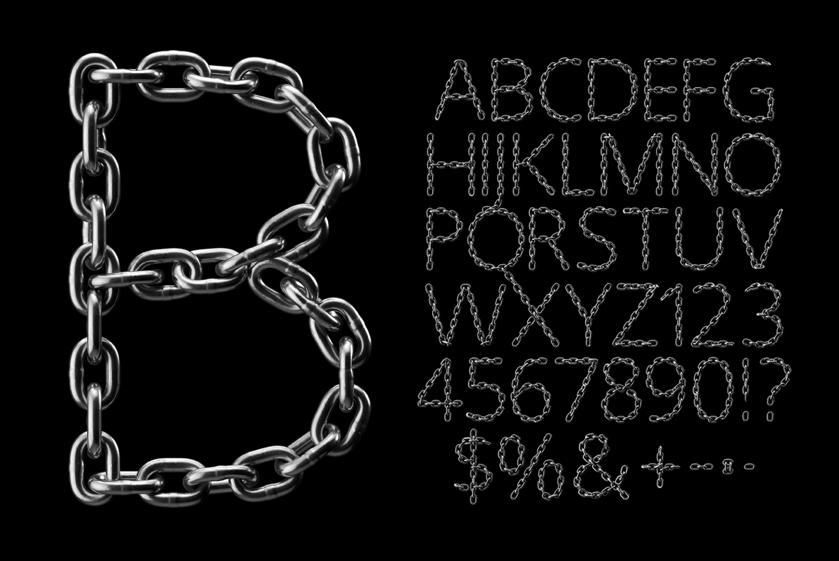
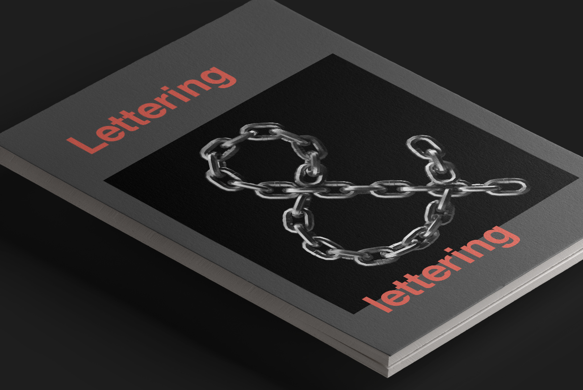
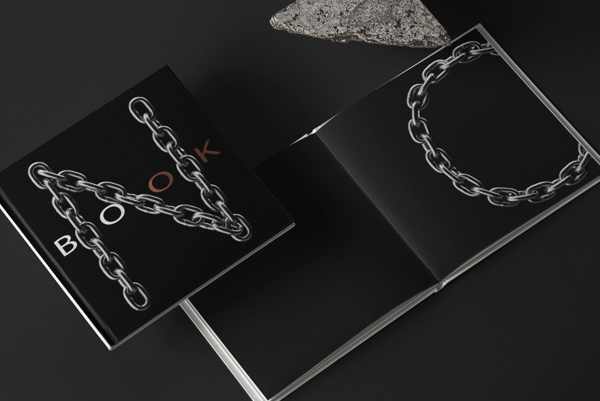
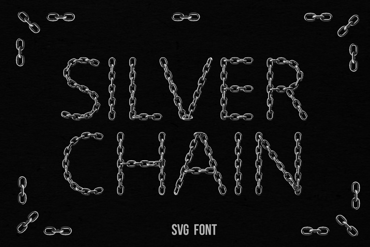
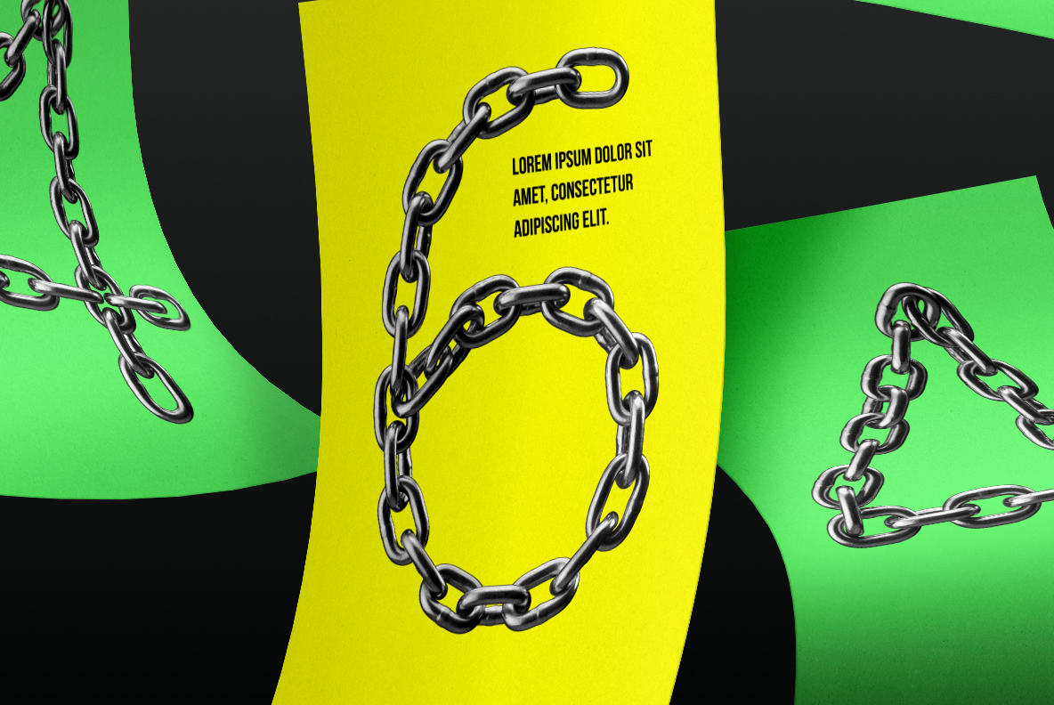
Silver Chain Font threads one run of heavy mirror-chrome links along a thin monoline skeleton, so each letter is drawn by the chain itself. Because the links stay bright and highly polished, dark backgrounds make them snap. Loose ends hang free at the terminals, and the OTF plus transparent PNG files ship together.
Silver Chain Font Threads One Chain Through Each Letter
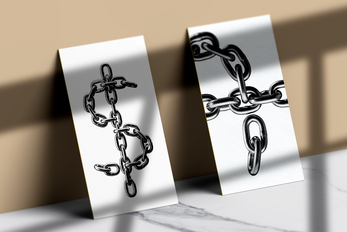
Silver Chain Font runs a single line of heavy oval links along every character, so the chain itself draws the letterform. Because the links interlock and twist as the stroke turns, each glyph shows both flat and edge-on faces. Meanwhile loose ends hang free at the terminals, which keeps the alphabet from looking sealed and mechanical. So the letters read as jewellery laid out on a surface.
Thin Skeleton, Heavy Links
The underlying shapes stay light and monoline, which is unusual for a metal font and the reason whole words stay readable. Since the chrome is polished to a mirror, the links pick up hard white highlights against deep shadow. Besides, the contrast is strong enough that the alphabet works small as well as large. Meanwhile black backgrounds suit it best, because the highlights need darkness to bite against.