


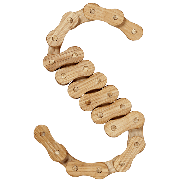
Wooden Chain Font rebuilds a bicycle chain in pale oak, every link a peanut-shaped plate with a wooden rivet through the middle. The letters are assembled link by link, so they keep a slightly angular, hand-built rhythm. Good for cycling brands, workshops, craft packaging and posters that want visible construction.
Wooden Chain Font Carves a Bike Chain Out of Oak
Somebody took a bicycle chain apart, then rebuilt every link in pale oak. Each plate is a peanut shape with a wooden rivet punched dead centre. The grain runs lengthwise along the plate, so no two links look identical. Because links only bend at the joints, the letters stay slightly angular too. That is the charm of the Wooden Chain Font: it is assembled rather than drawn.
Light Oak, Small Parts, Plenty of Shadow
Colour stays honey-pale, while thin shadows fall between the overlapping links. Meanwhile the letterforms underneath are a plain condensed sans, so words stay readable. Caps, numerals, currency signs and a long run of punctuation are all chained too. Arrows, brackets and dashes come along as well, built exactly the same way. On black the oak really pops, though on paper it turns quieter and warmer.








