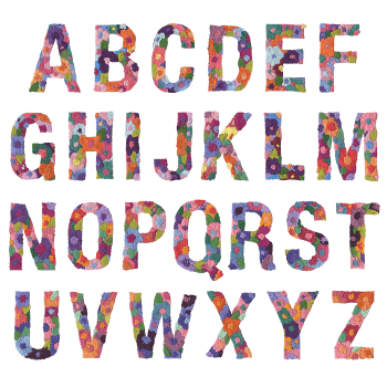
Wacomka Flowers BW Font fills wide slab capitals with finely drawn botanicals in greyscale, and lets the blooms spill past the letter edges. High contrast keeps the shapes readable while the detail rewards a close look. Made for covers, packaging, invitations and any brand that wants flowers without colour.
Wacomka Flowers BW Font Grows Plants Through the Letters
Each capital is packed with drawn botanicals: dahlias, lilies, spiky leaves and seed heads. Then the planting spills over the edges, so blooms hang off the corners. Everything stays greyscale, since colour would only fight that level of detail. Because the drawings are dense, the letter shape still holds from across a room. Up close, though, the Wacomka Flowers BW Font turns into a proper engraving.
Monochrome Botanicals Over Bold Underlying Shapes
The skeleton beneath is a wide slab capital with generous open counters. That matters, since the flowers need room to sit inside the strokes. Tones run from near-white petals to almost-black leaves, so contrast stays high. Numerals, currency signs and punctuation are planted the same way too. Naturally, the whole set prints in one colour, which keeps production simple.