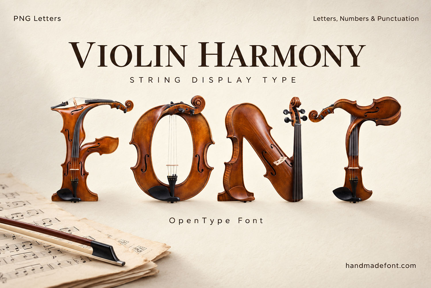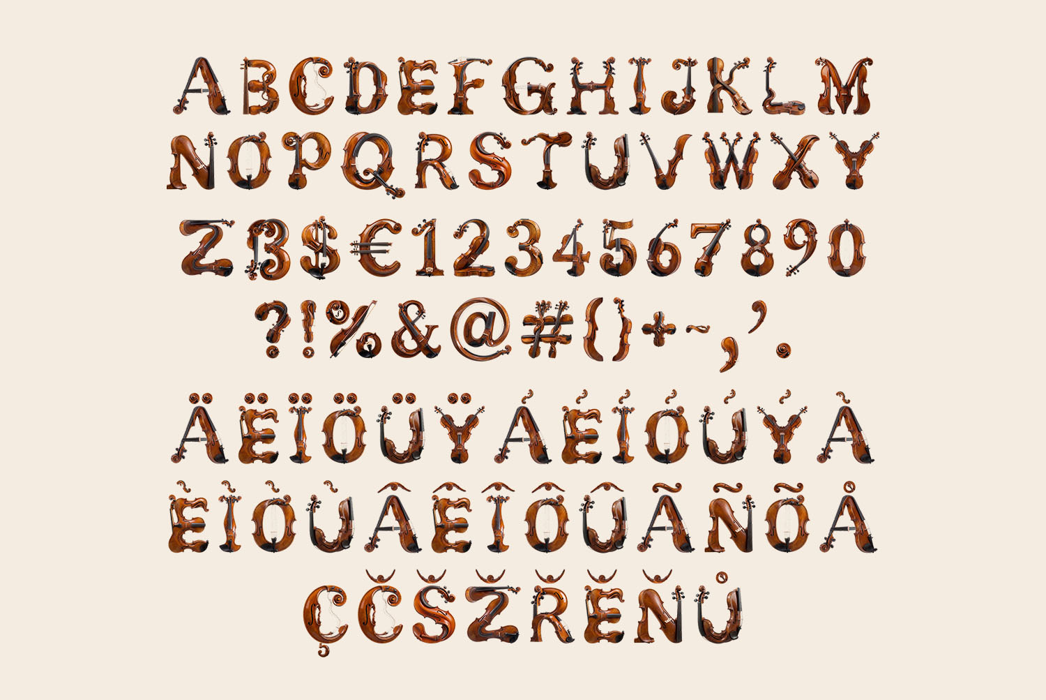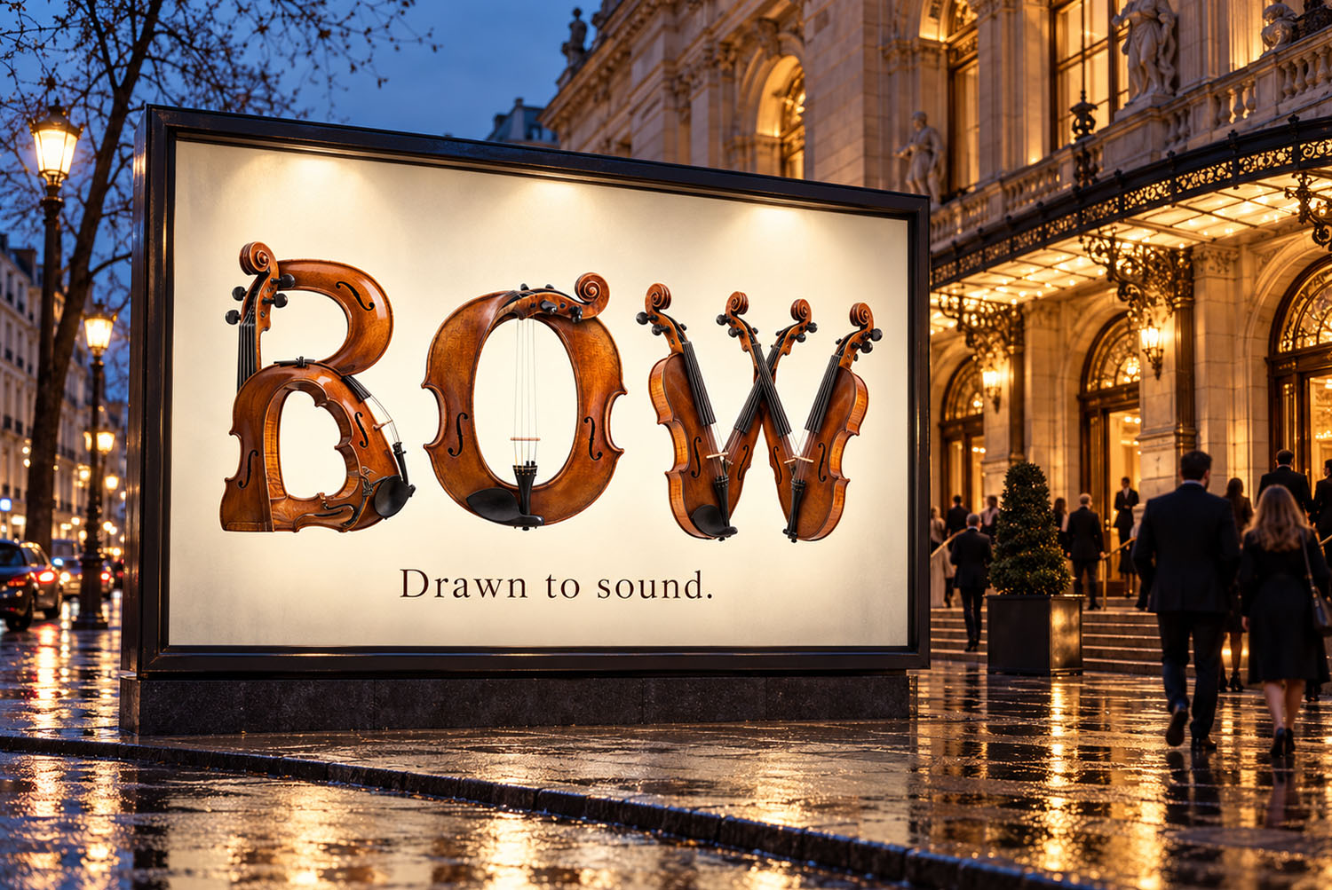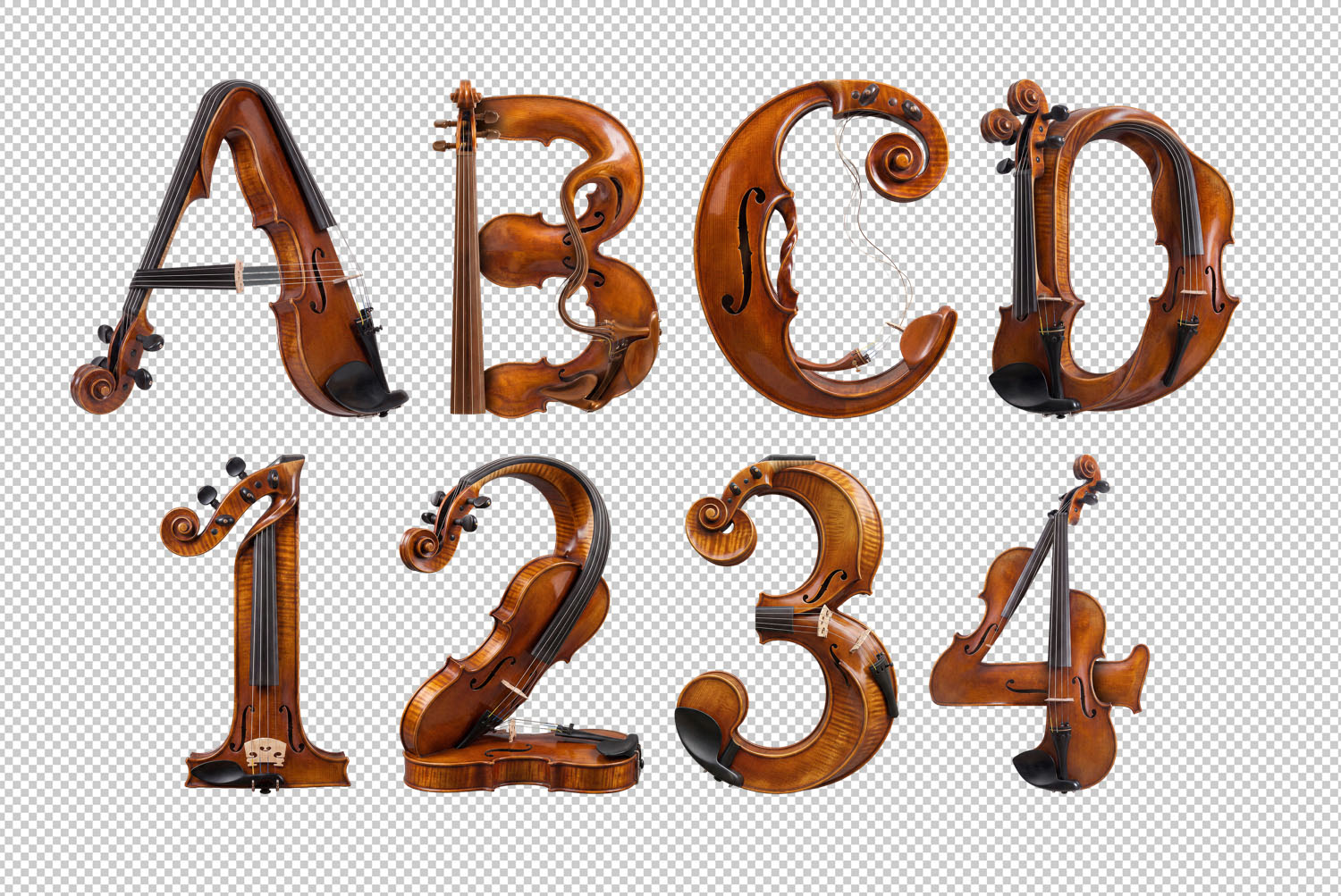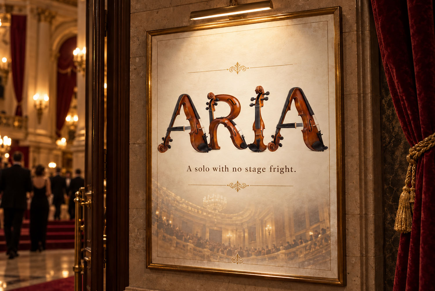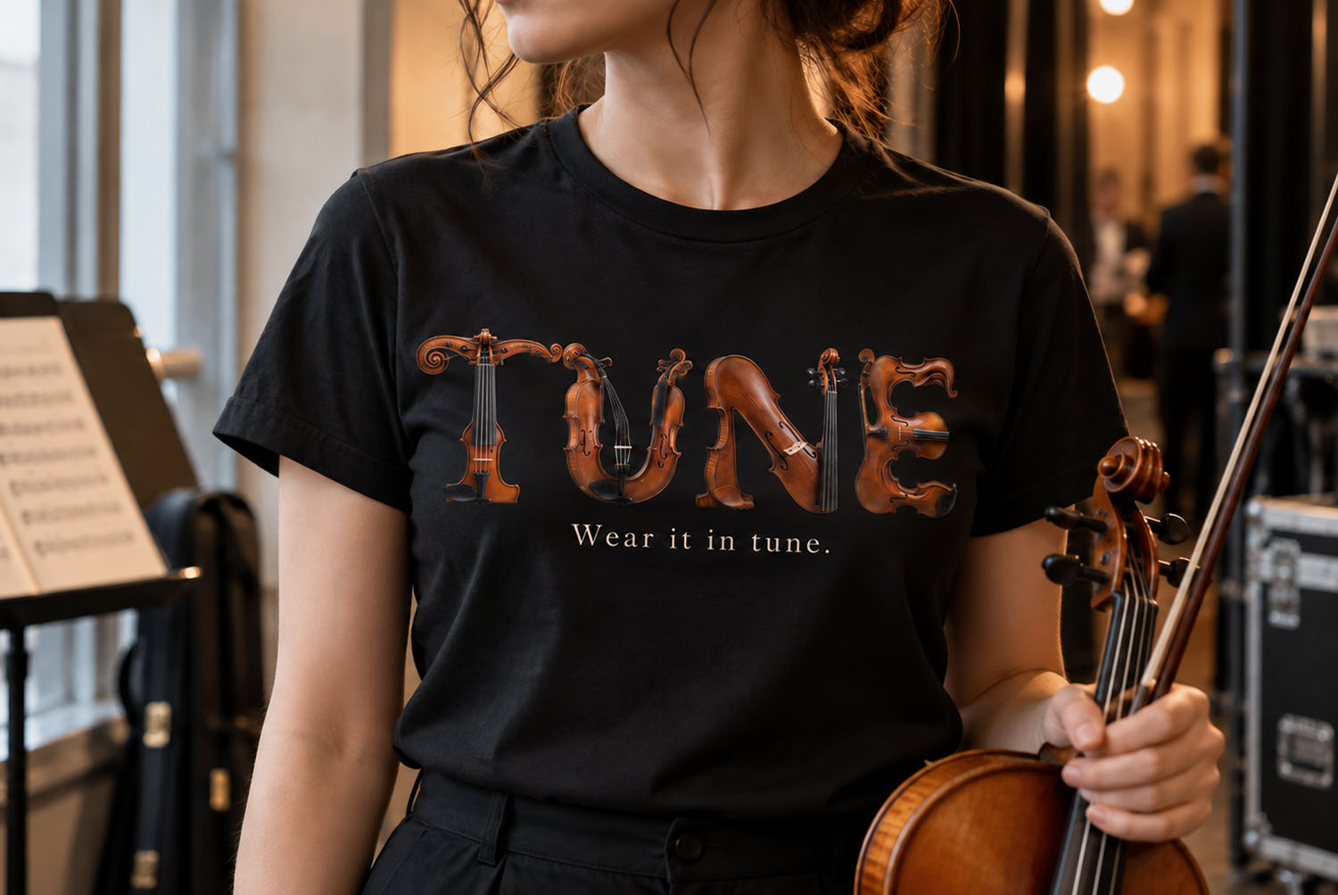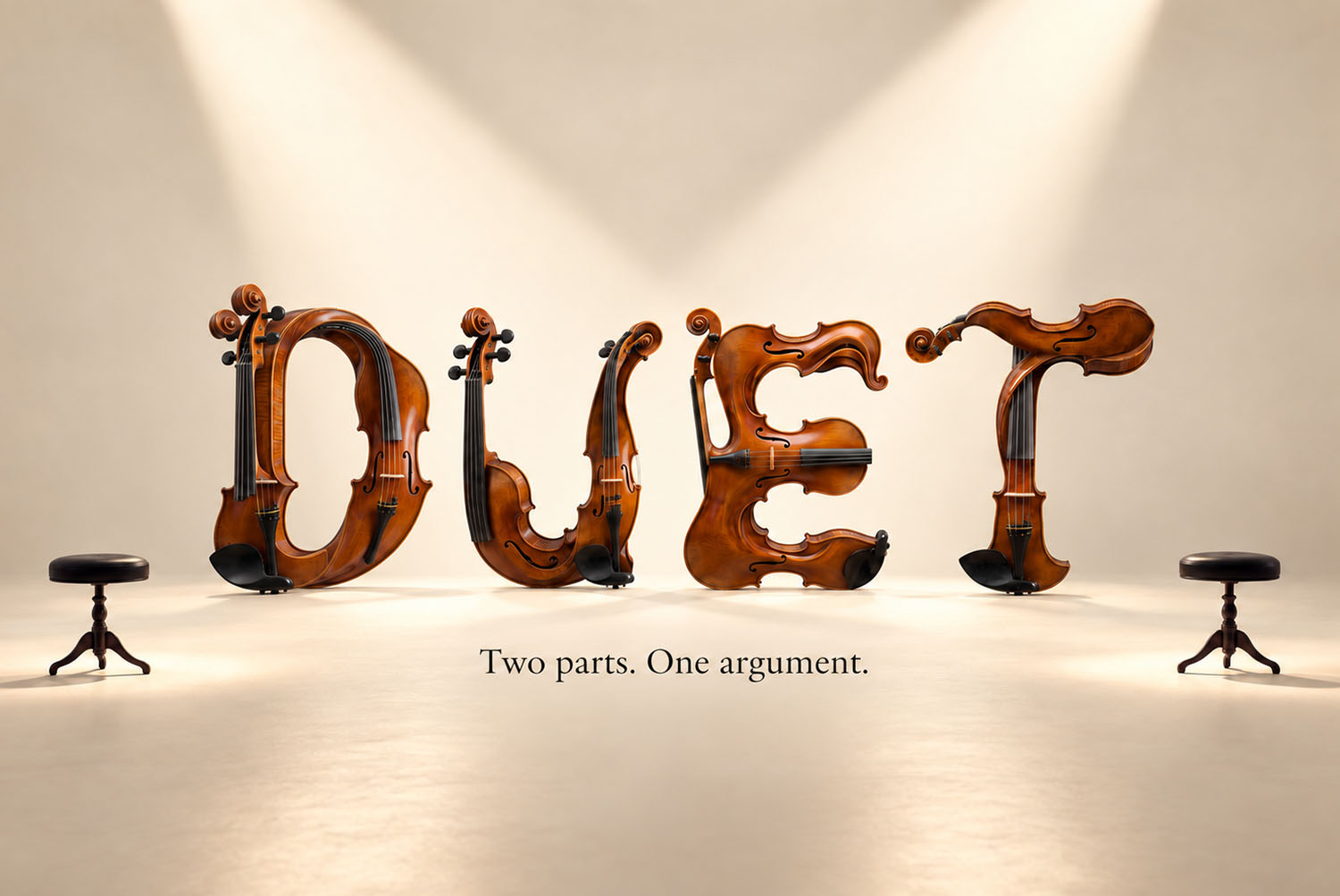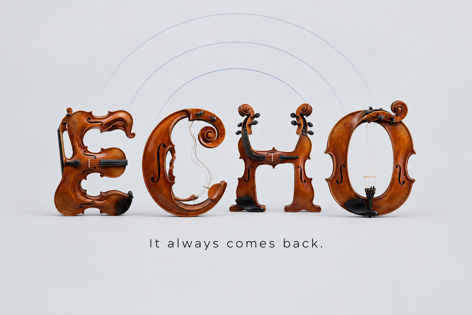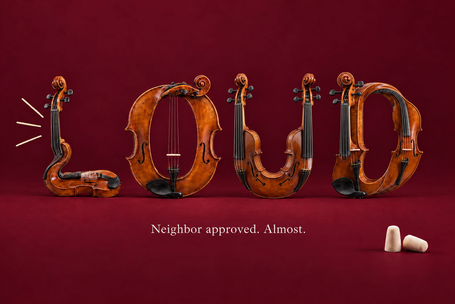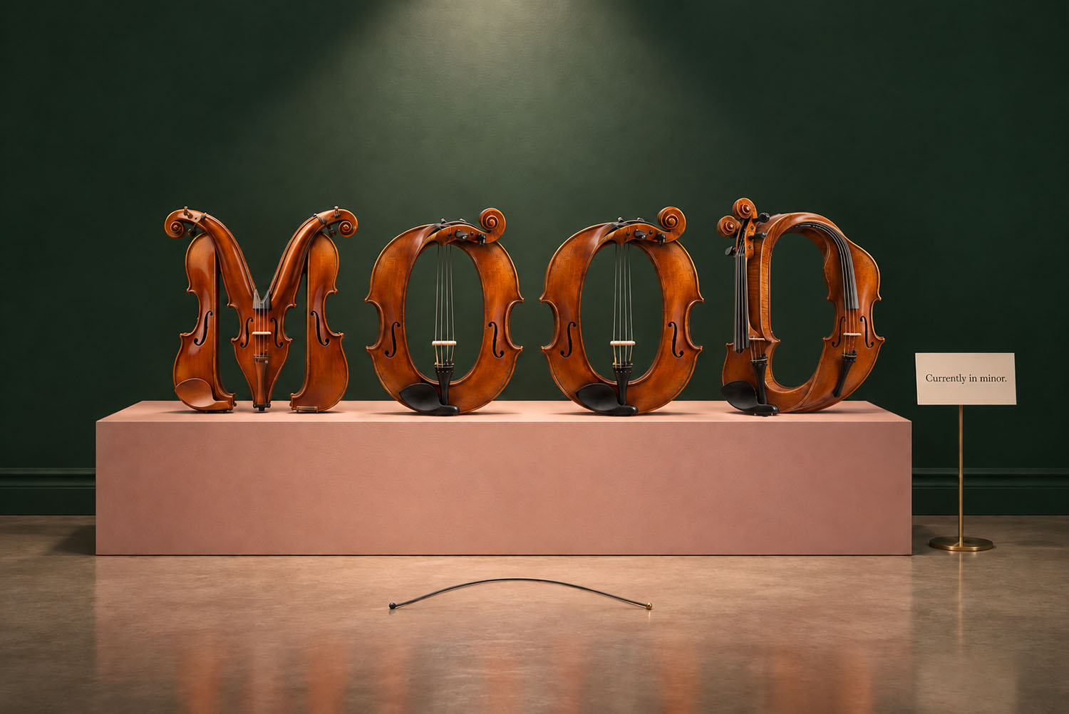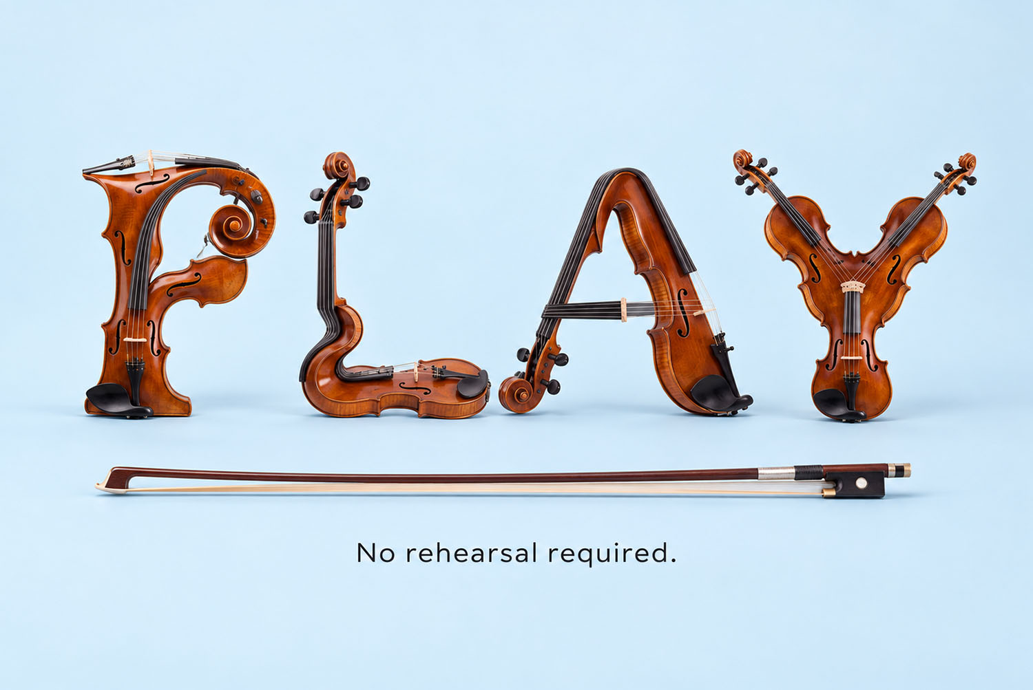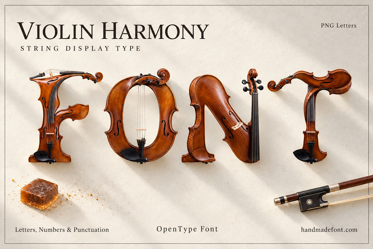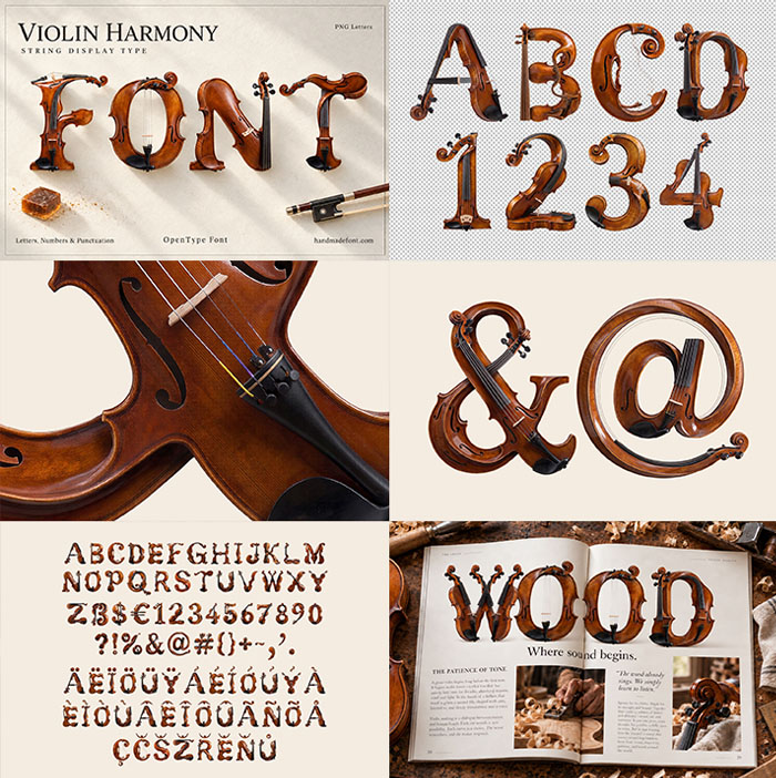
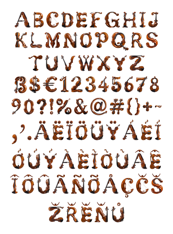
Violin Harmony Font builds every letter from real violin parts: bodies bent into stems, scrolls curling into terminals, pegs, strings and small f-holes. The varnish is warm amber-brown with a deep gloss and black ebony accents. It installs as an OTF you can type with, plus separate high-resolution PNG letters on transparent backgrounds.
Violin Harmony Font, Built From the Instrument Itself
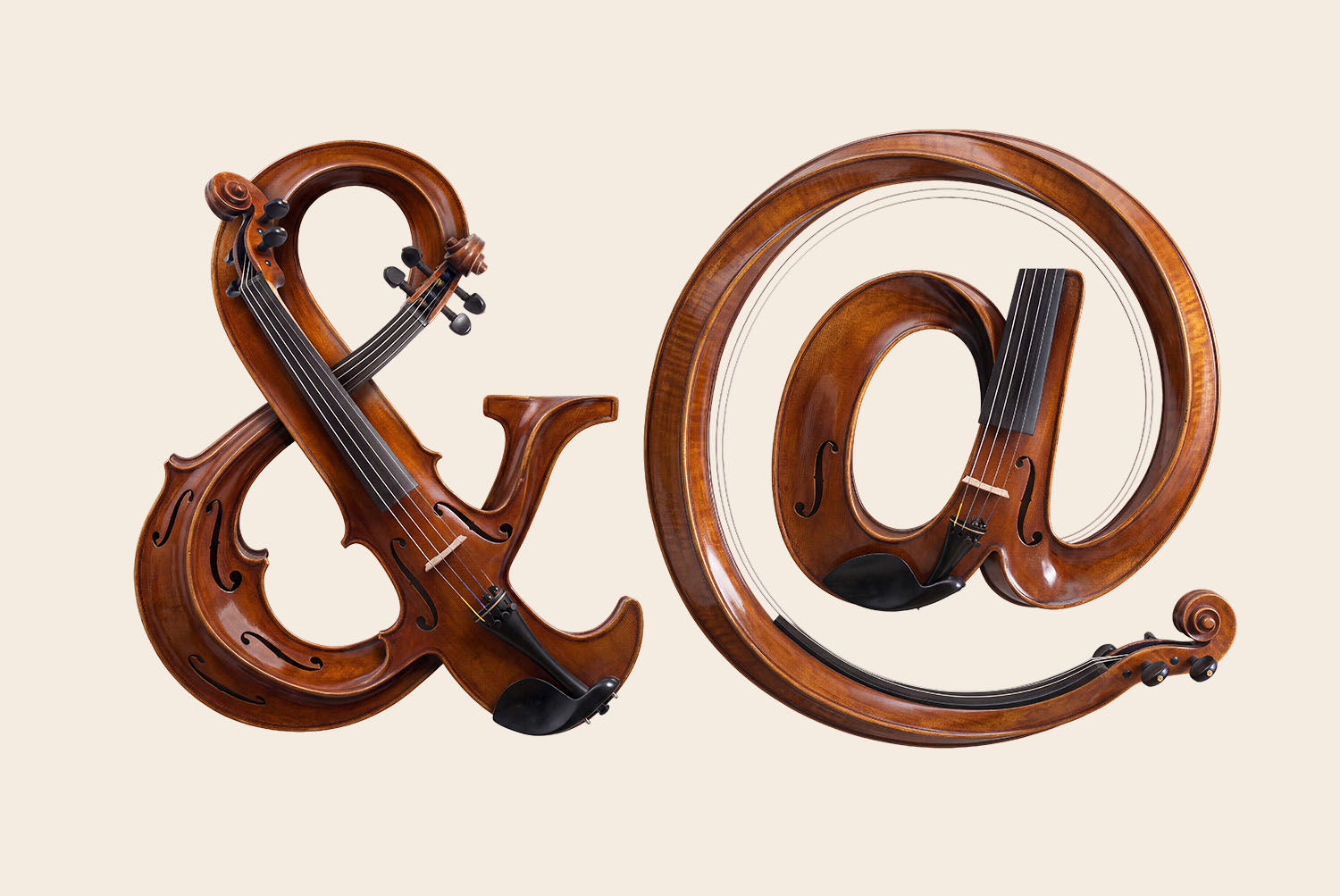
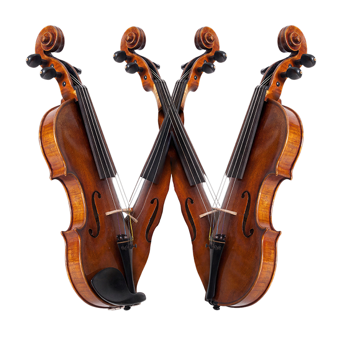
Every letter here started life as a violin, or at least as its parts. The long body bends into a stem, while the scroll curls round to become a terminal. Because the pegs stay in place, many letters finish in tiny tuning keys. So the Violin Harmony Font reads like an instrument before it reads like type. Strings stretch across the bowls of B, D and O, and small f-holes appear where a counter would usually sit. Naturally, no two letters use the same part in the same way.
Varnish You Can Almost Smell
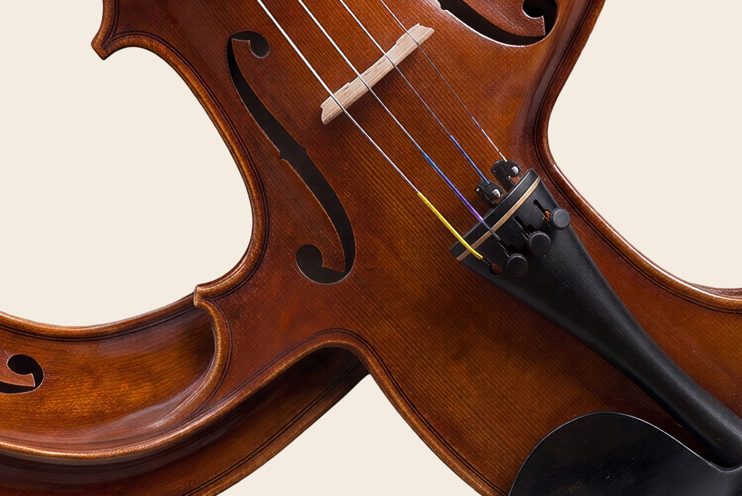
The finish is warm amber-brown with a deep gloss, just like a well-kept violin. Light pools on the curves, then fades into darker grain near the edges. Meanwhile, black ebony fingerboards and chinrests break up all that honey colour. As a result, the Violin Harmony Font looks expensive even at a modest size. On pale cream they glow, although a deep red or green backdrop makes the varnish look richer still.