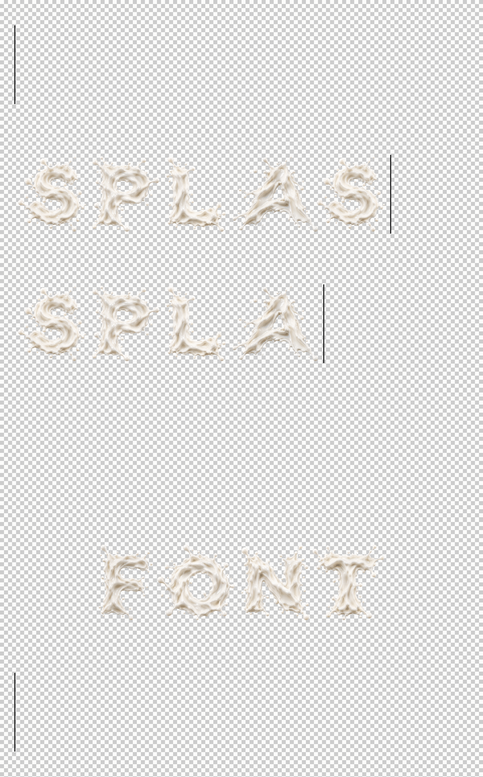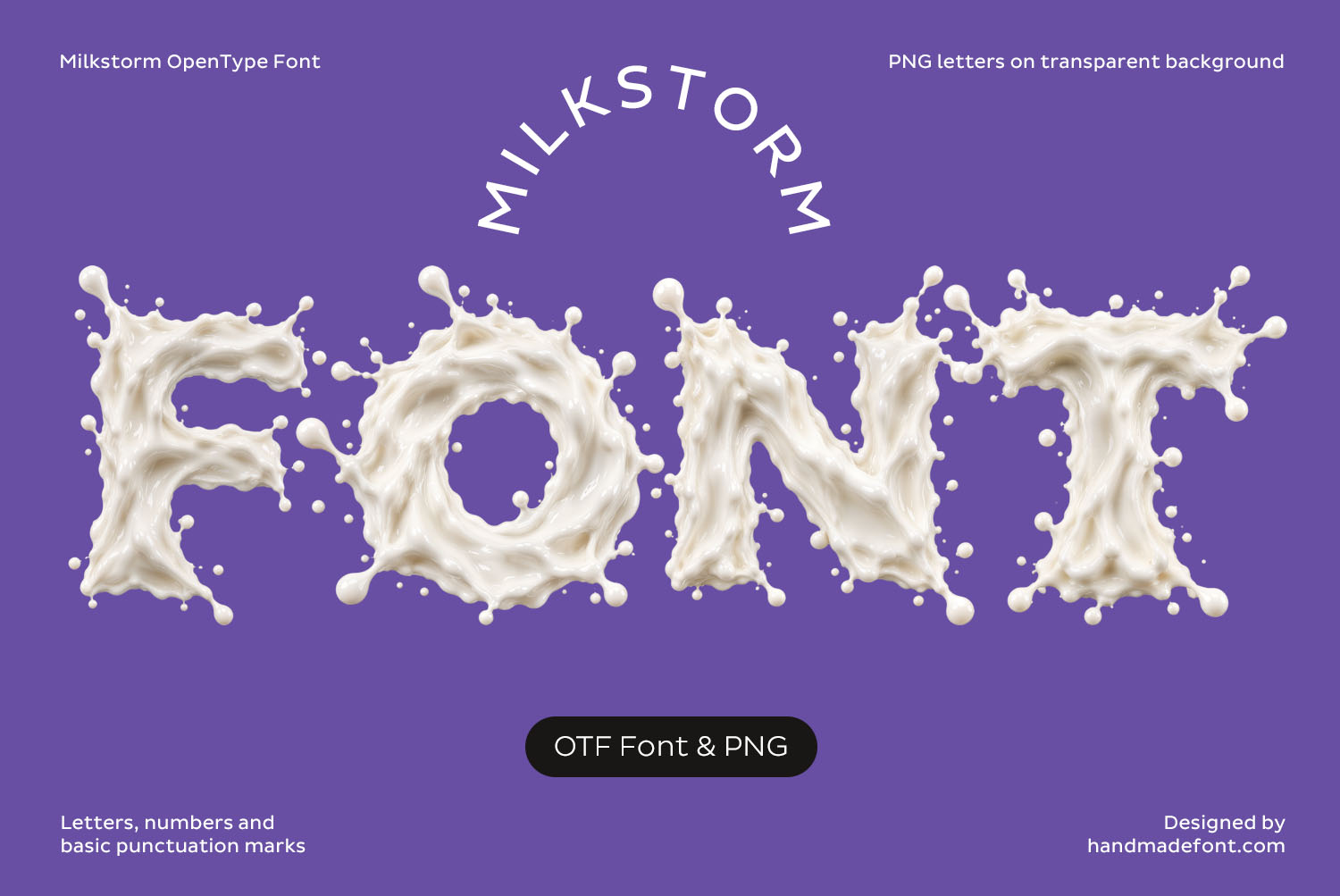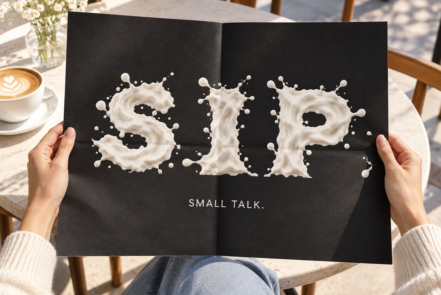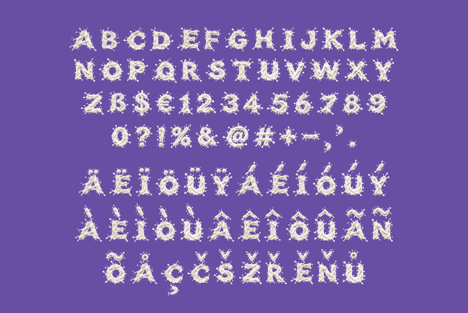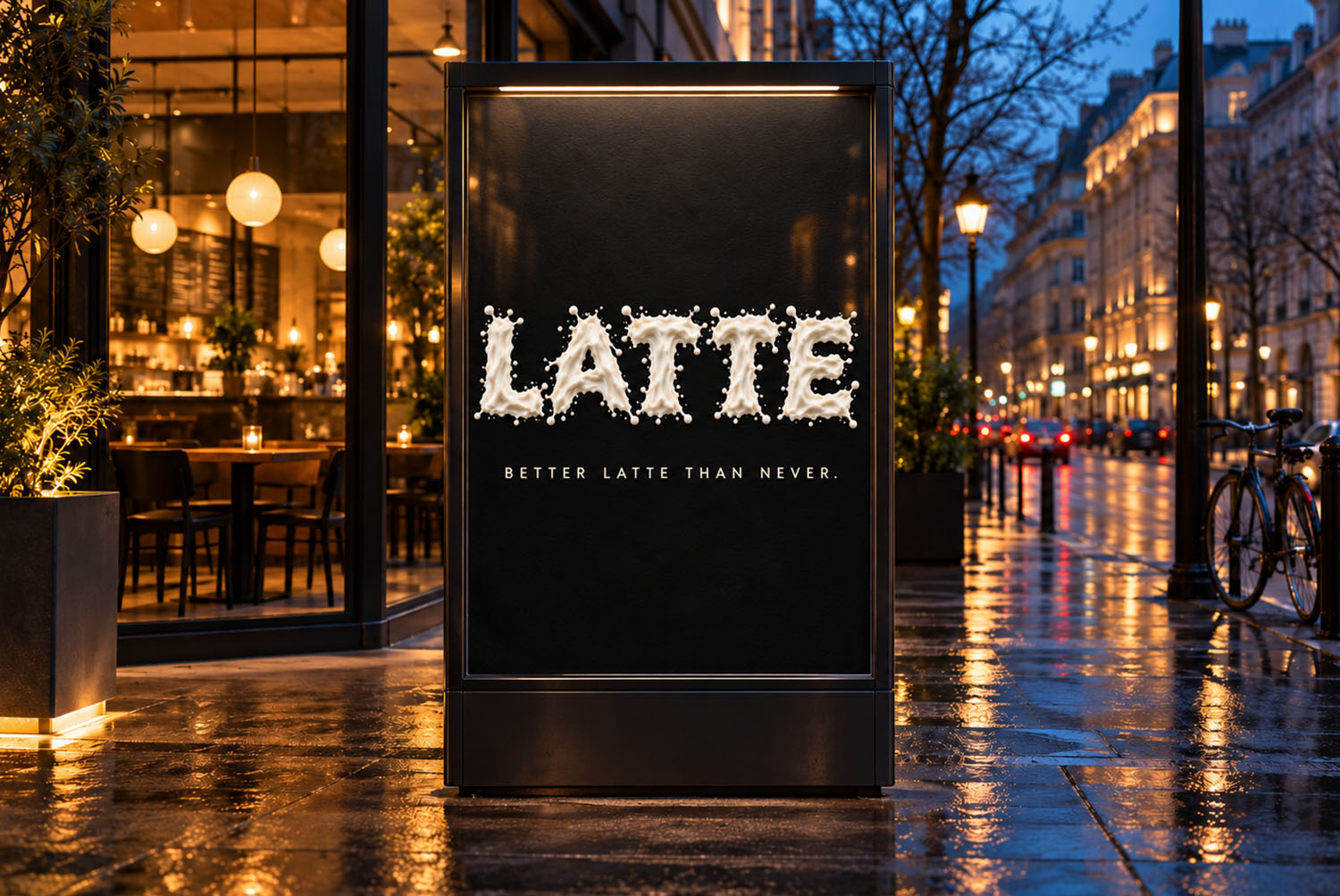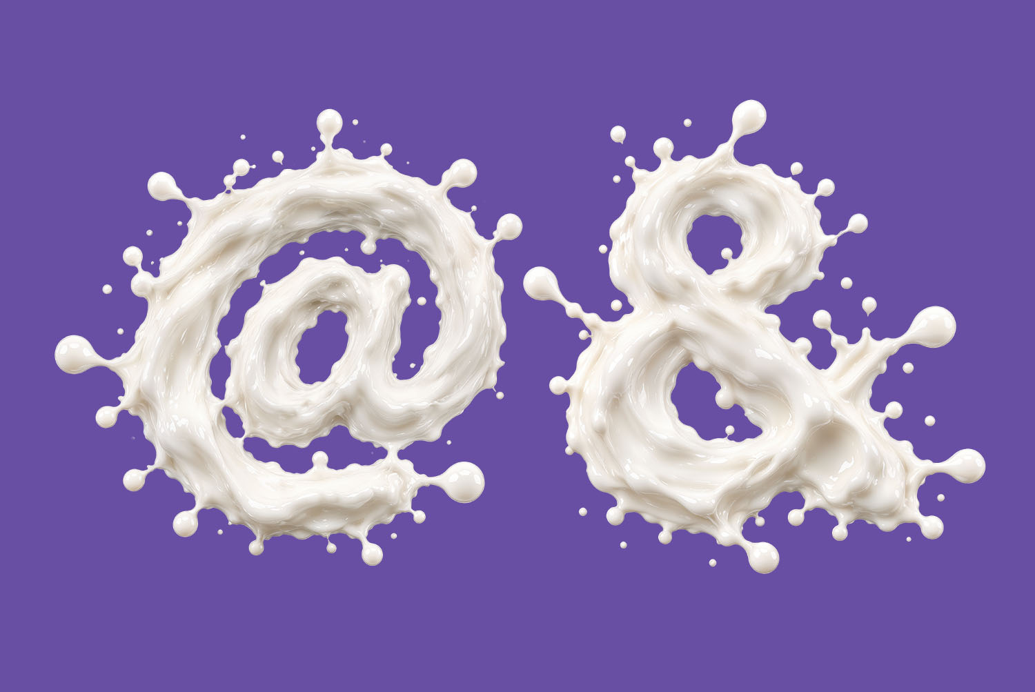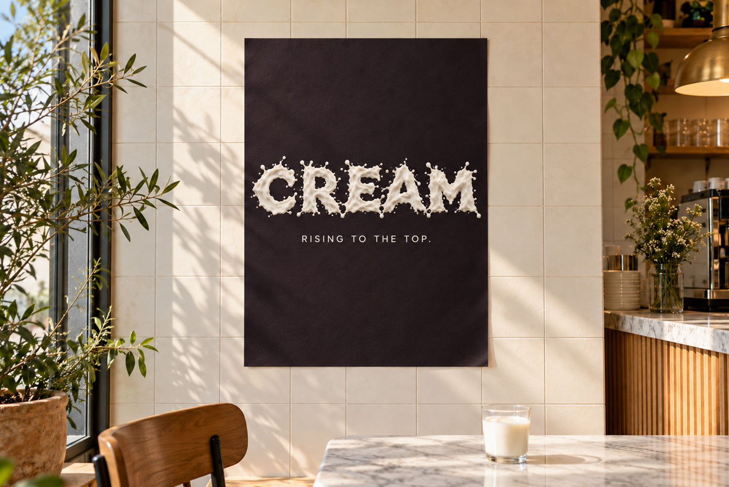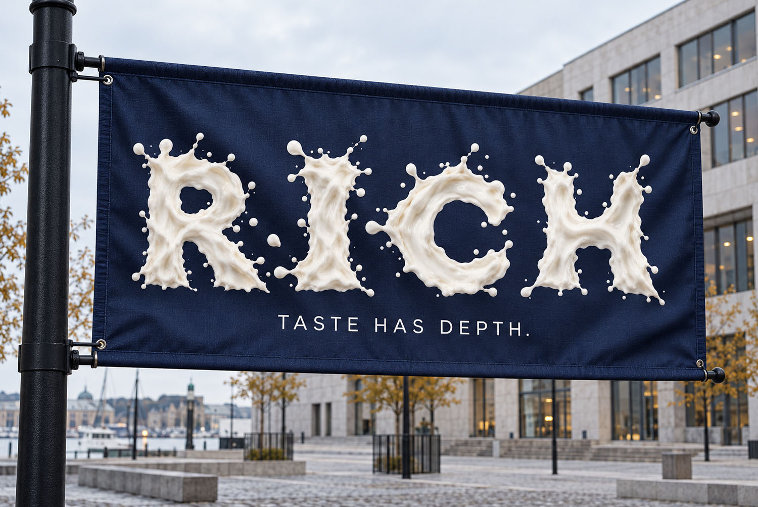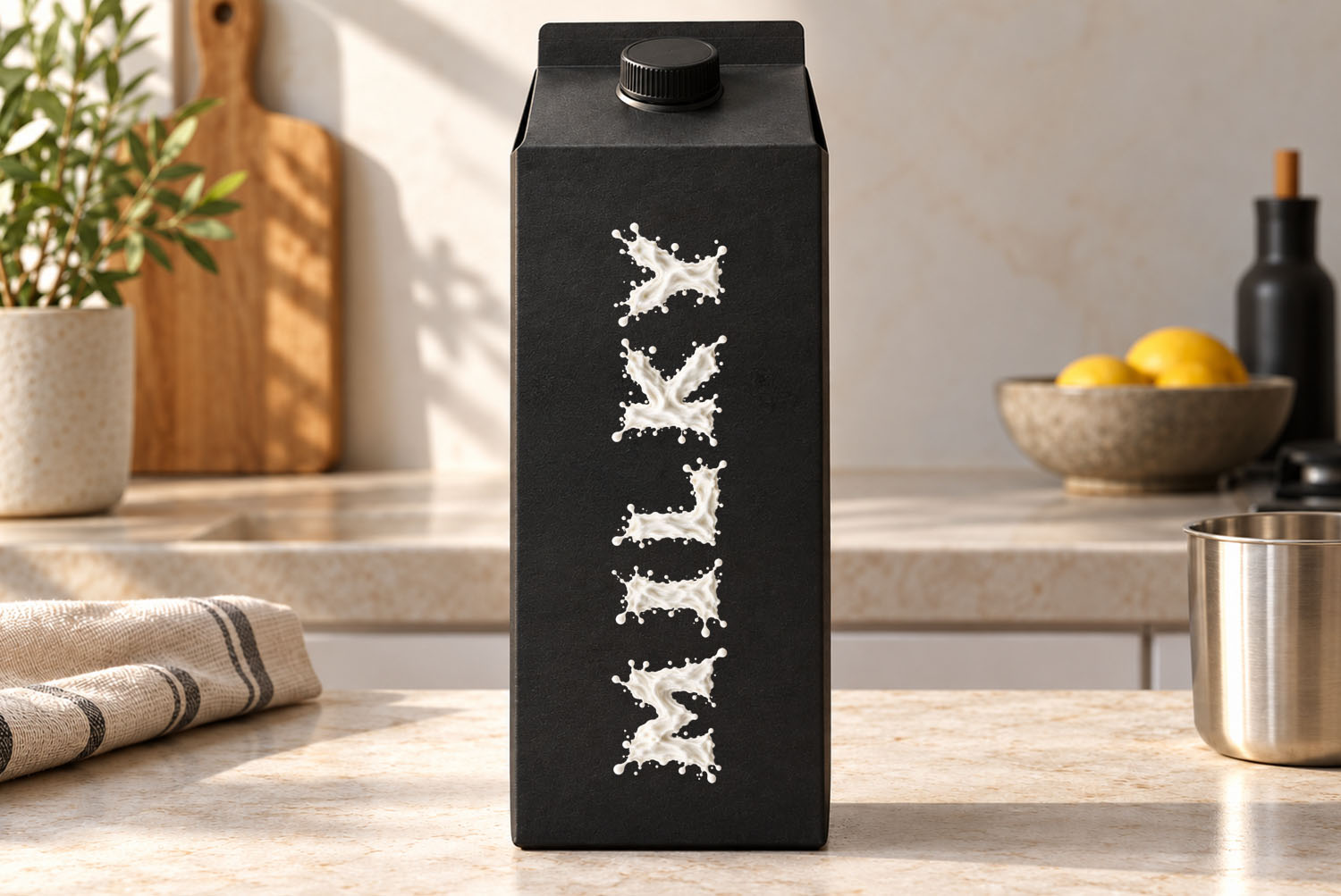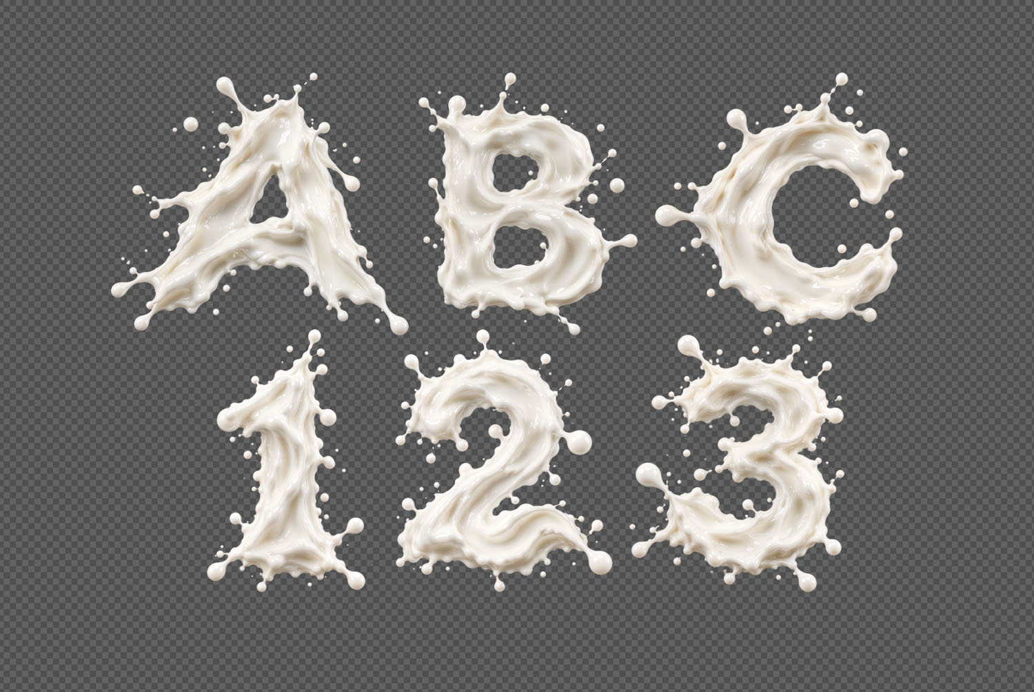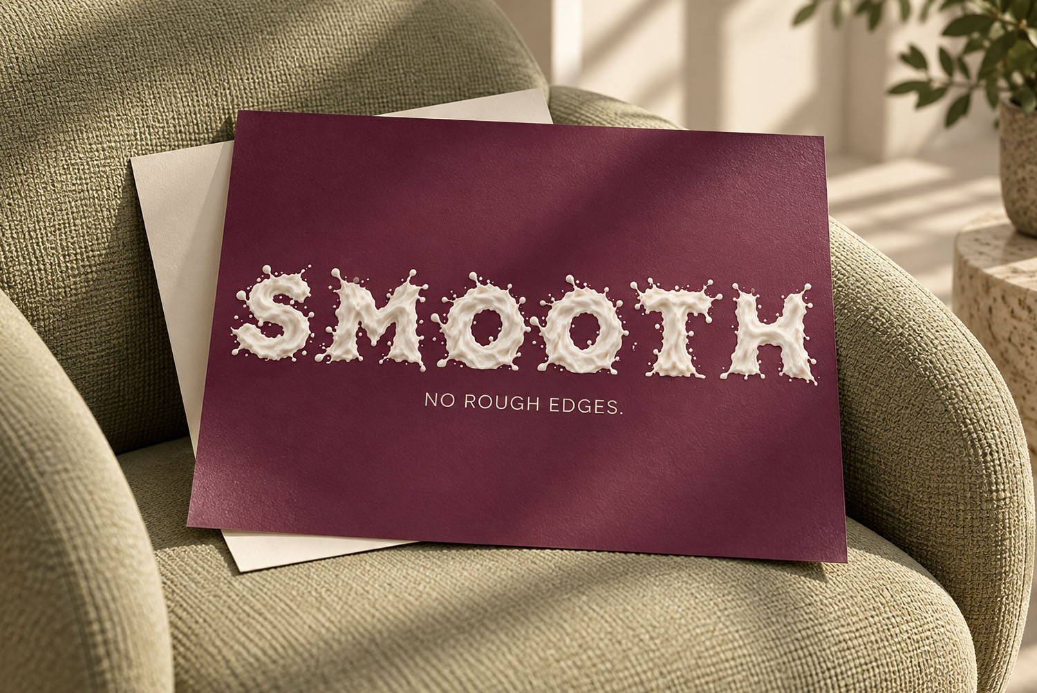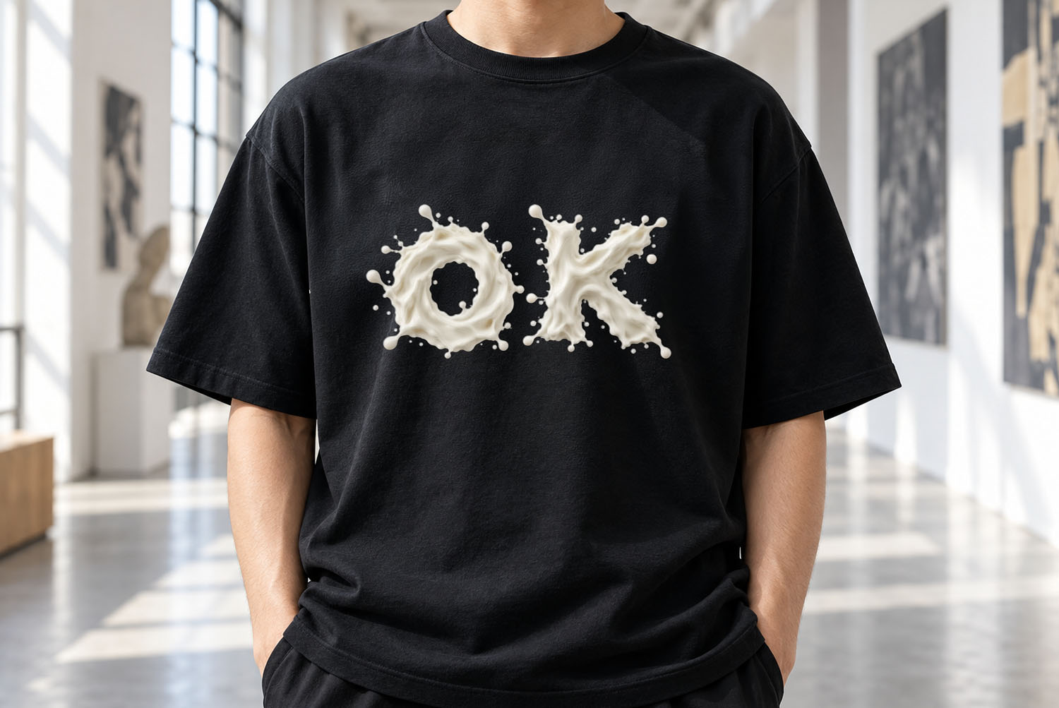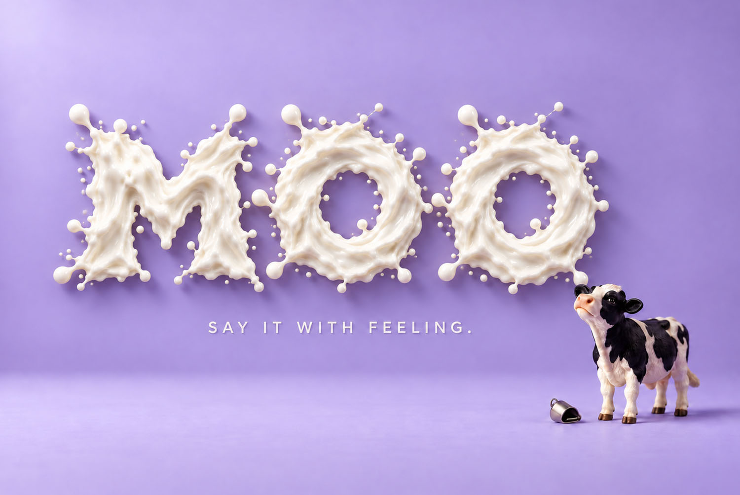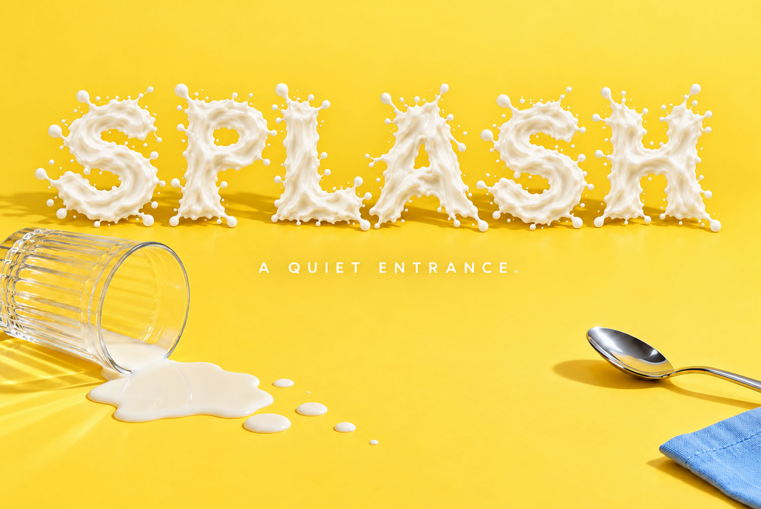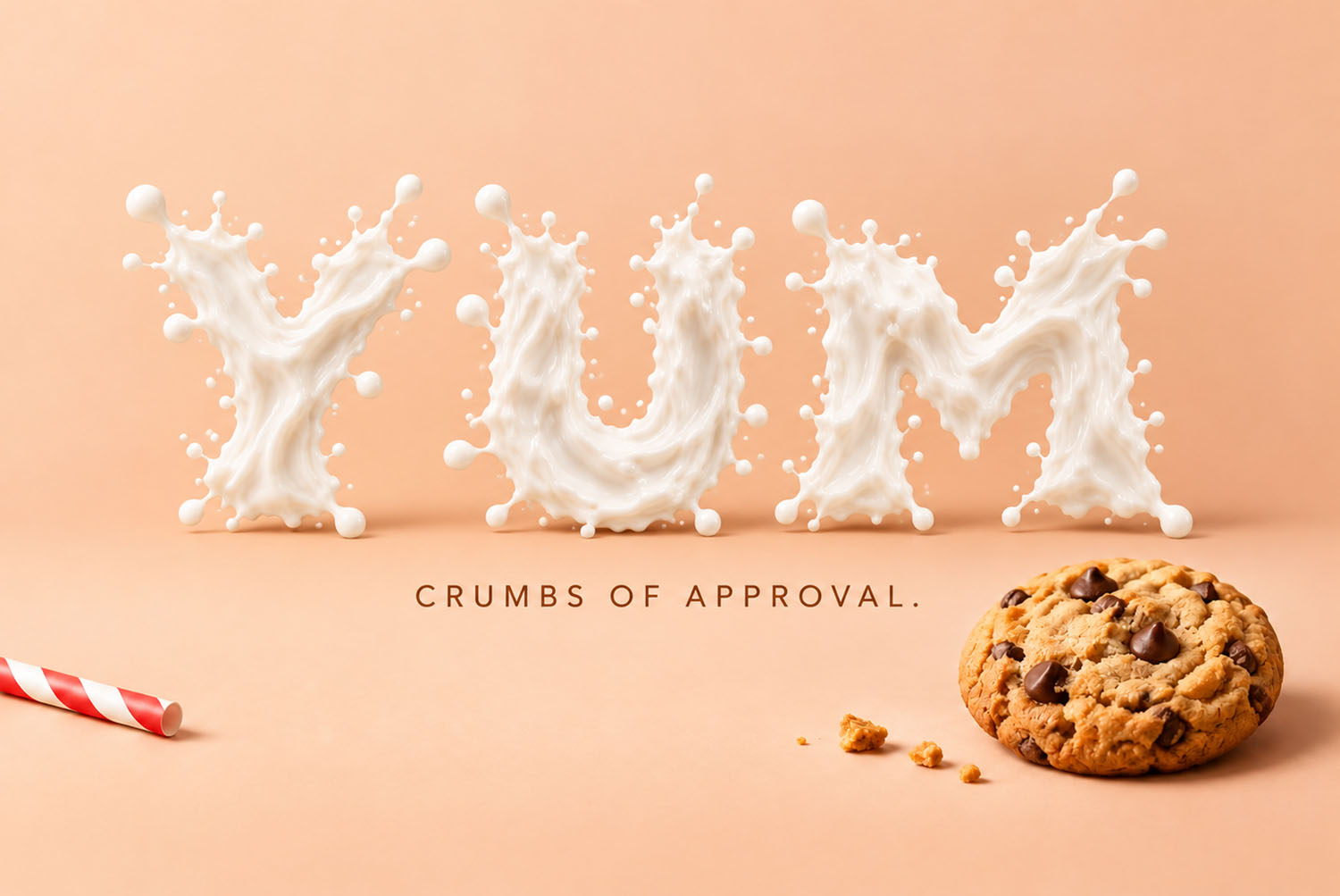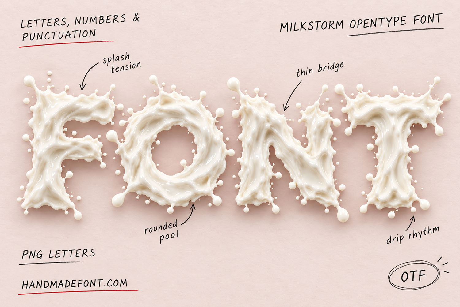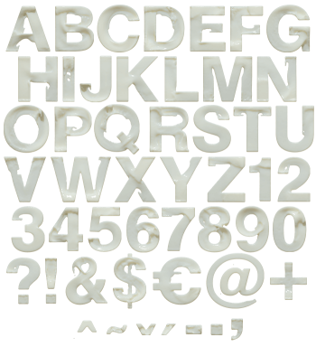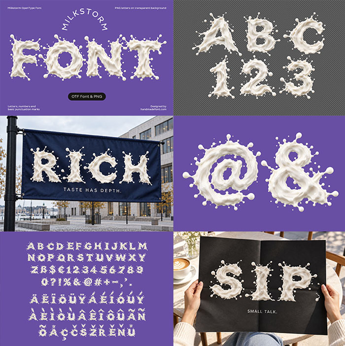
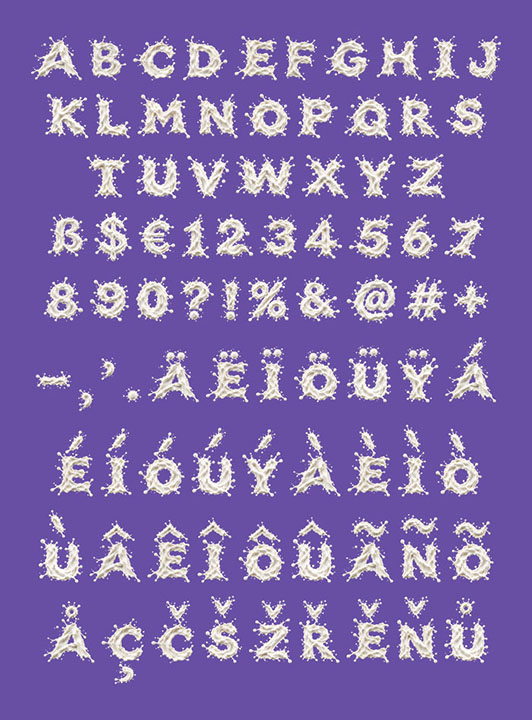
Milkstorm Font turns every capital into a burst of fresh milk caught in mid-air: creamy swollen strokes, crowns of droplets, thin milky bridges and round little pools. It looks like breakfast just went wrong in the best possible way. Dairy packaging, café menus and breakfast brands suit it best, and it comes as an OTF font plus transparent PNG letters.
Milkstorm Font Is What Happens When the Glass Tips Over
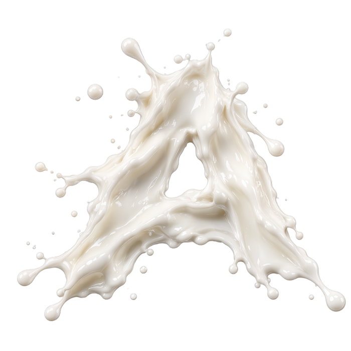
Milkstorm Font begins at the worst moment of breakfast, right after the glass tips over. Every capital is a burst of fresh milk caught in mid-air, so the strokes still look wet and moving. Creamy cores hold each shape, while the edges burst into flying drops.
Because no stroke sits flat, light behaves the way it does on real milk. Soft highlights run along the swollen curves, and small shadows tuck under every curl. So the letters look wet enough to wipe off the screen.
Droplets, Crowns and a Little Bit of Mess
Up close, each glyph gets its own small accident, too. A crown of droplets rises off the M, while the S throws a thin milky bridge across its middle. Meanwhile, round pools gather where two strokes meet, just like on a kitchen table.
Still, the mess follows rules. Every capital keeps a clear skeleton, so LATTE or CREAM reads at a glance. The splashes stay on the edges instead of filling the counters, so long words survive too.