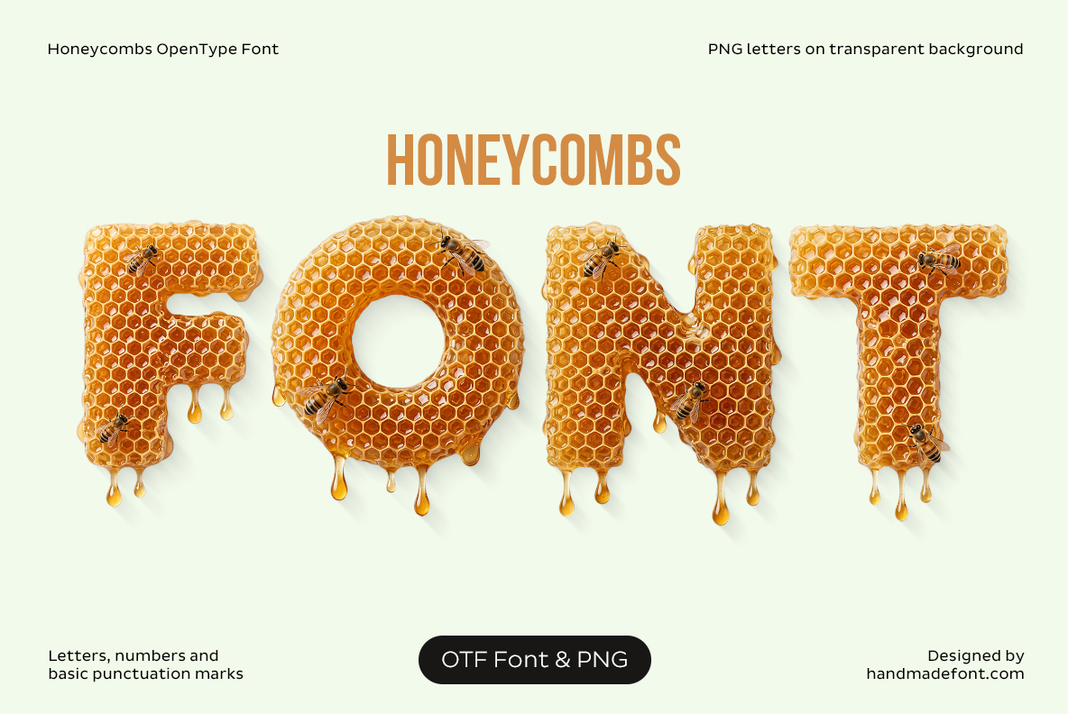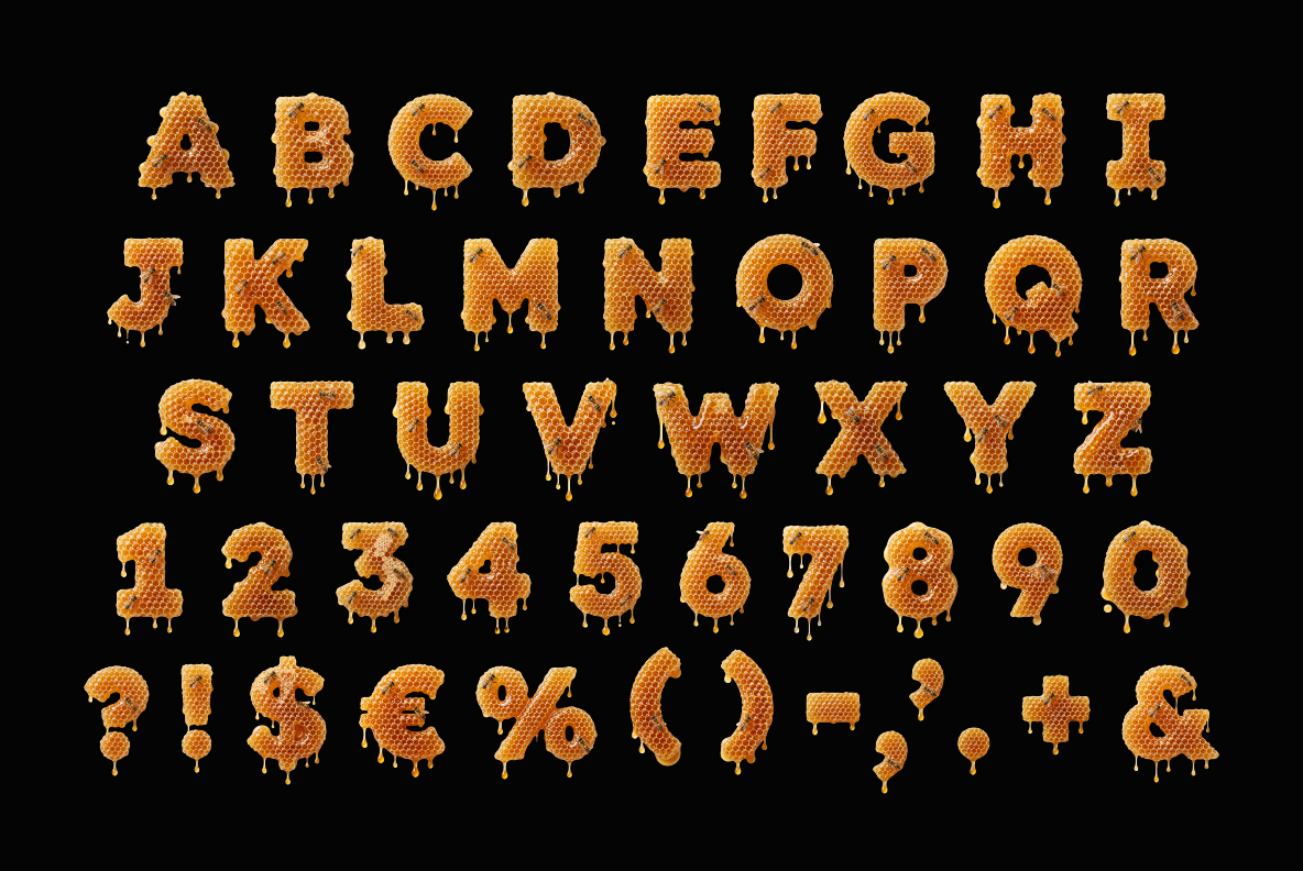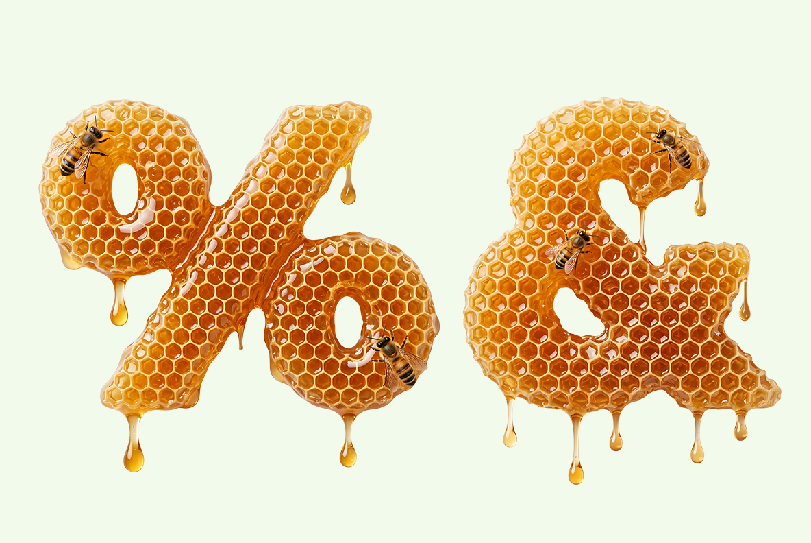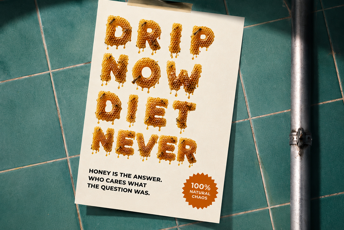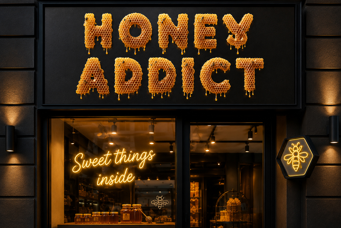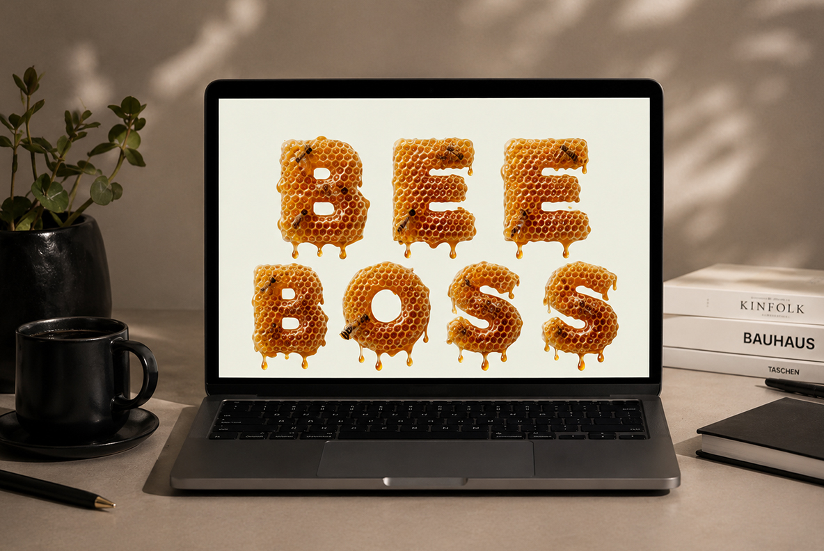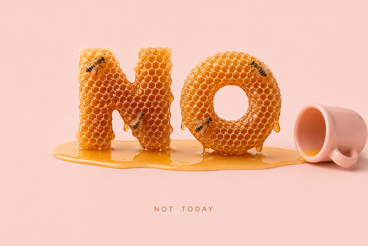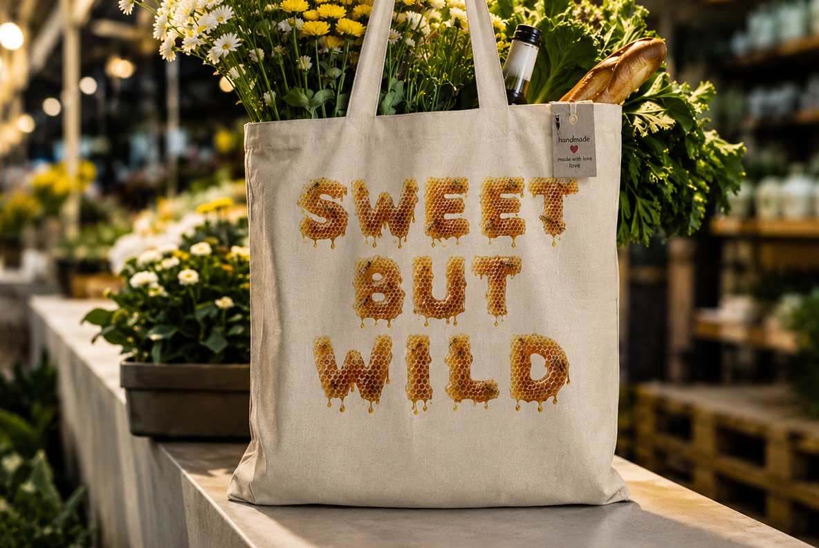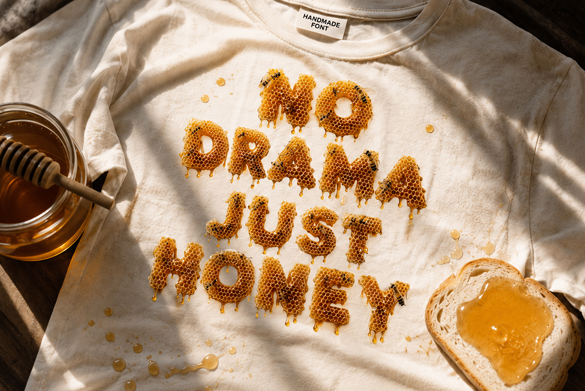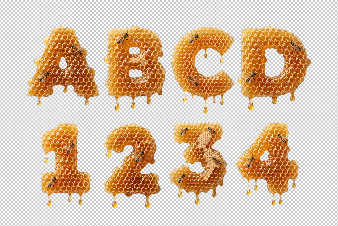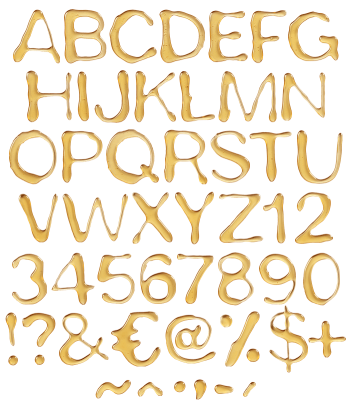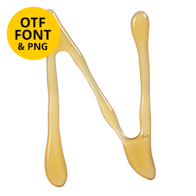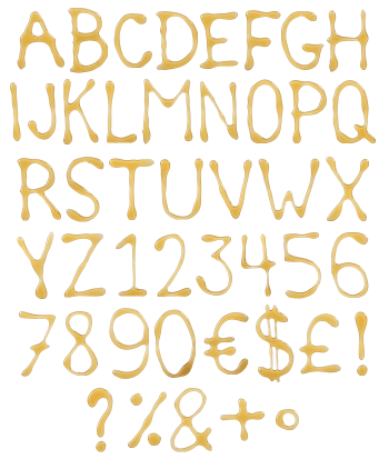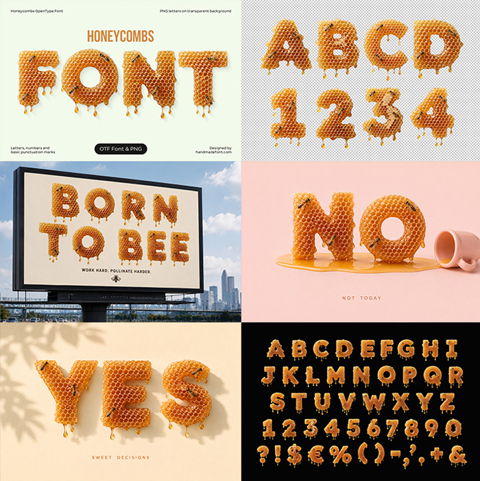
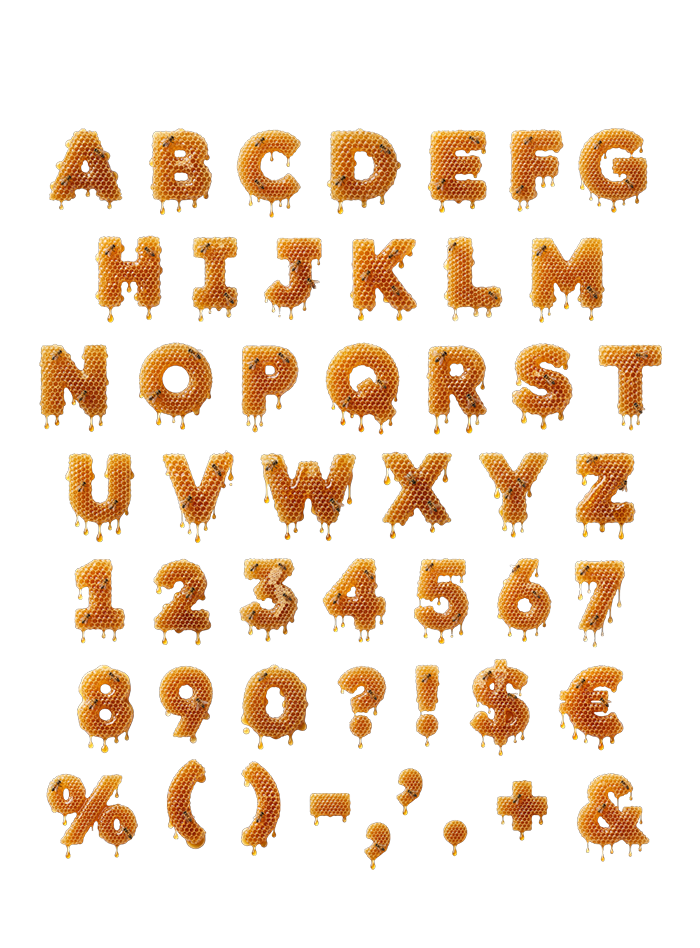
Honeycombs Font combines glowing amber honey, geometric wax cells, and tiny bees in a richly textured display alphabet. Designed for food packaging, organic products, cosmetics, farmers’ markets, seasonal campaigns, posters, and playful branding, it makes every headline feel freshly gathered from the hive. Sweet, dimensional, and considerably less sticky than the real material.
Typography Fresh from the Hive
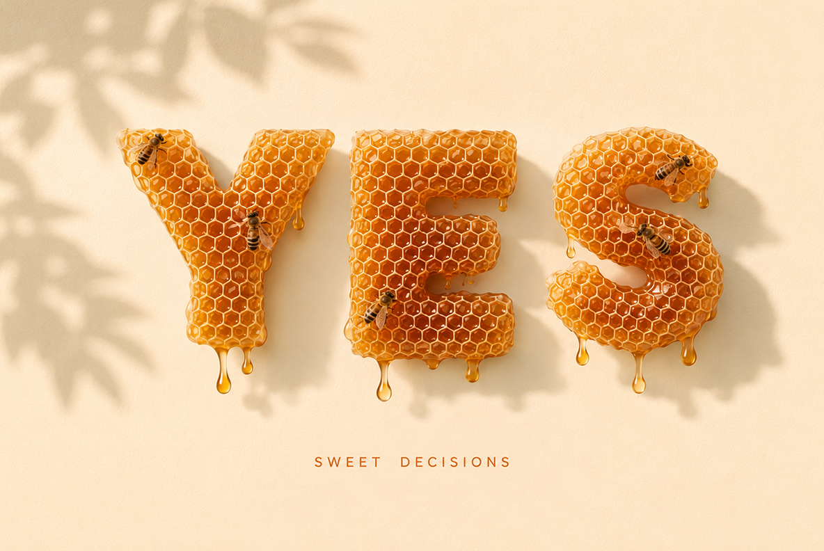
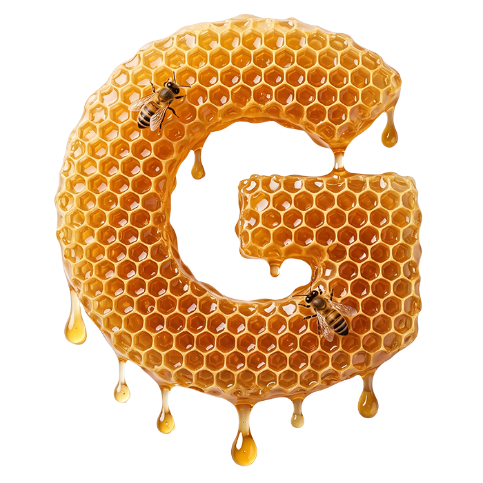
Honeycombs Font shapes translucent honey and structured wax cells into warm, dimensional characters. Small bees and natural drips add detail without hiding the letterforms, while the amber color gives every word an inviting glow. The result feels organic, tactile, and cheerful—like a very disciplined swarm has finally discovered art direction. Hexagonal structures give the alphabet a recognizable rhythm, and the glossy highlights keep it from feeling rustic or flat. Even one short word becomes a miniature product scene with its own material, workers, and golden lighting.
Sweet Ideas for Packaging and Campaigns
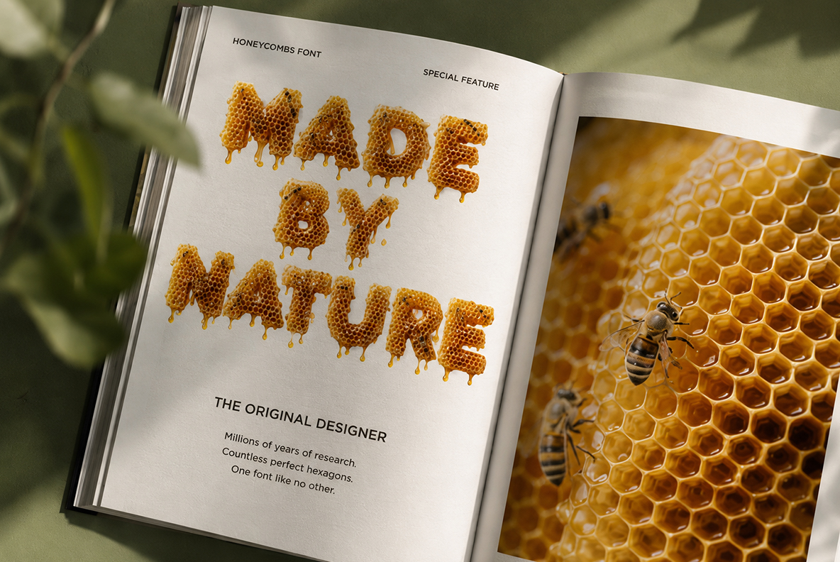
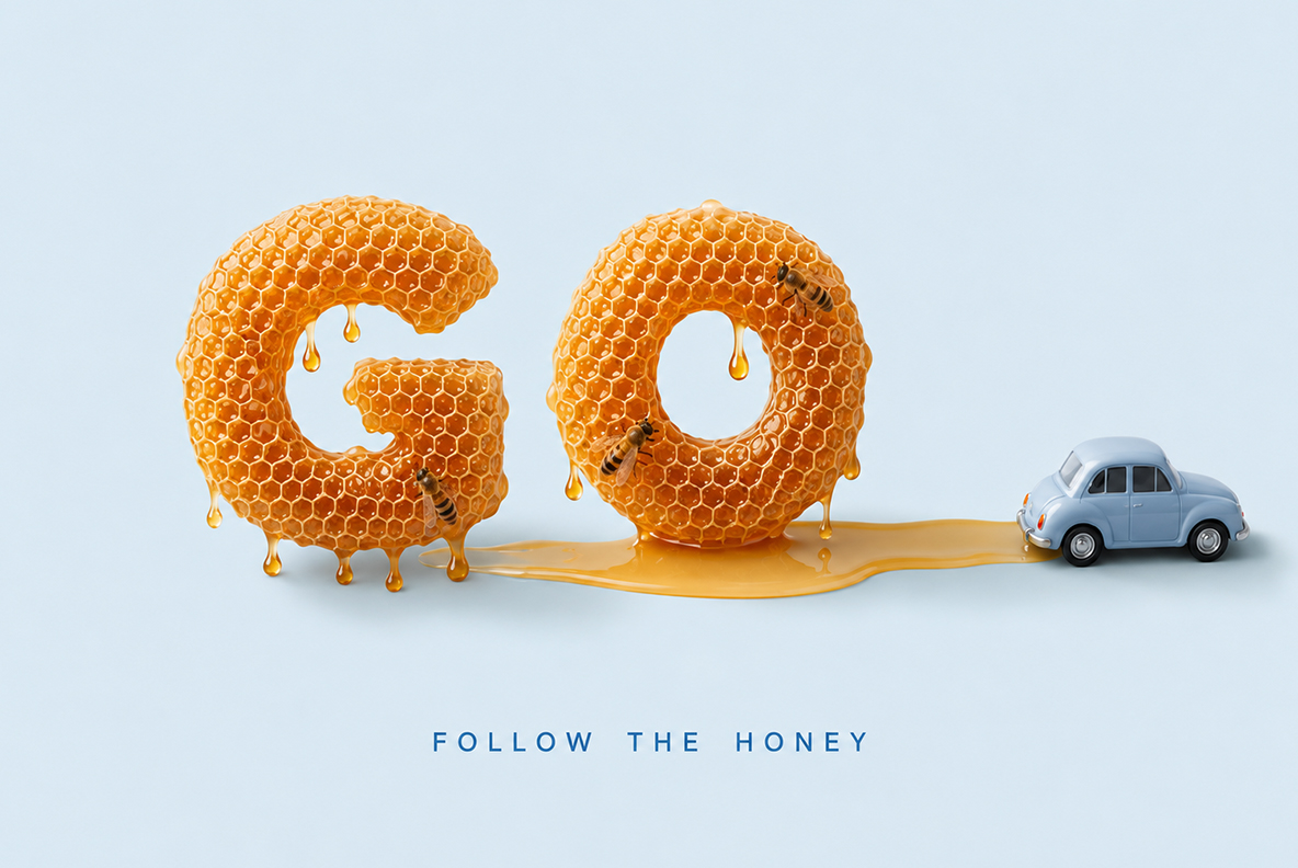
This alphabet works beautifully for honey labels, bakery promotions, natural cosmetics, handmade soaps, breakfast products, farmers’ markets, children’s projects, eco campaigns, and summer events. Cream, dark brown, muted green, and deep blue backgrounds complement the golden transparency. For more edible lettering with character, explore our Food Fonts collection.