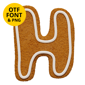

Crisp geometric capitals baked in gingerbread, with even strokes, round bowls and a single fat rope of white icing piped inside every shape. The Gingerbread Sans Font stays machine-even where most biscuit type goes wobbly, so whole words line up neatly. Figures, currency signs and punctuation are piped exactly the same way.
A Sans That Went Through the Oven
Generally, most gingerbread type is hand-cut and wobbly. This one is not. Each capital instead keeps a crisp geometric skeleton, with even strokes and perfectly round bowls. The biscuit still reads properly baked, though, coarse crumb at the cut edges and a warm caramel top. Because the shapes stay machine-even, whole words line up neatly. Small cracks run across the surface as well, since baked dough always splits a little.
One Fat Rope of Icing
The icing, of course, is what makes it work. A single fat rope likewise runs inside every stroke, following the shape at a constant distance. Small ridges show where the nozzle moved, so the piping never looks printed. That restraint matters, since extra decoration would clutter such a clean letterform. In addition, figures, currency signs and punctuation are piped the same way. Naturally the icing sits slightly proud, so it catches its own light.