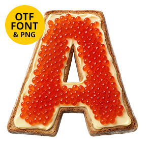
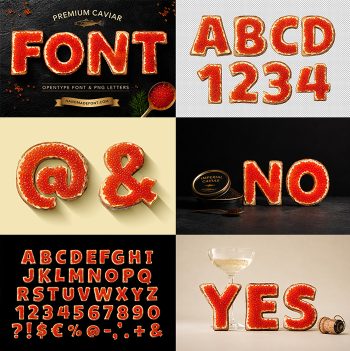
Red salmon roe heaped into letters, thousands of eggs glowing orange because the light goes straight through them. A few pale amber ones break up the run, and strays roll clear of the baseline. Expensive-looking and appetising at once, made for fish counters, delicatessens, restaurant menus, vodka labels and New Year invitations.
Roe, Heaped Rather Than Spooned
Salmon eggs behave almost like little lamps. Light goes in, bounces around inside and comes out warmer, which is why these letters glow orange rather than simply sit orange. Thousands of them heap into each stroke, with a few pale amber ones scattered through for variety. Loose eggs roll away from the baseline as well, so nothing looks tidied up. Naturally the surface stays wet throughout. Figures and punctuation come from the same tin.
What the Caviar Font Does With Orange
Contrast is the whole job here. Against white the Caviar Font reads hot and appetising, while on black it turns almost neon. Because every egg carries its own highlight, the strokes sparkle instead of flattening. The silhouette underneath is a plain bold sans, of course, which is what keeps all that texture legible. Even at small sizes the colour survives. Since the eggs sit in a single dense layer, the outline stays crisp.