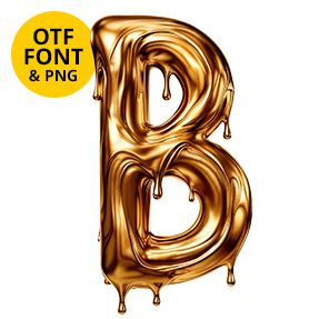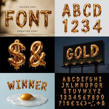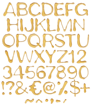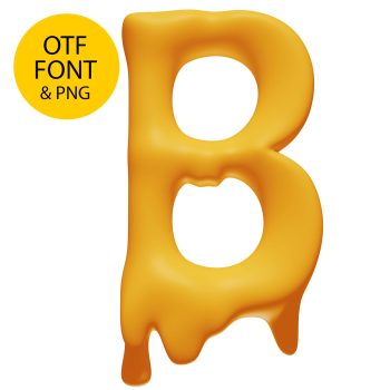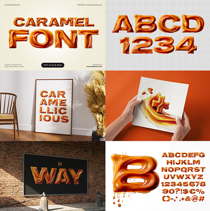


Caramel Font pours hot sugar into a bold rounded sans, then folds each stroke back on itself before it sets. Ends swell into blobs, droplets flick off mid-air, and the wet highlights stay hard. Colour runs burnt orange to warm amber rather than gold, with darker treacle collecting in every crease. It reads as food, not metal.
Poured, Then Folded
Hot sugar refuses to sit still, and these letters remember it. Each stroke looks poured, then folded back over itself before it set. The ends swell into soft blobs, while a few droplets flicked off and stopped mid-air. Highlights stay wet and hard, so the surface reads sticky rather than glassy. Nothing looks carved, because the shapes simply cooled where they landed. Because every fold catches light differently, one letter never quite matches its neighbour.
Orange, Not Gold
Colour is what separates the Caramel Font from the metal shelf. The tone runs burnt orange through to warm amber, with darker treacle pooling in the creases. Nothing here turns translucent either, since cooked sugar goes opaque. Meanwhile the deepest tone collects along the bottom of each stroke, so the letters sit down properly. Above all the palette stays edible, which gold never quite manages.