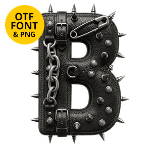
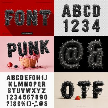
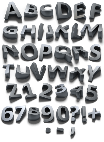
Matte black letters with metal spikes and studs pushed through them from the inside. The spikes point every way at once, long ones along the stems and short cones crowding the curves. The surface underneath is rubbery and slightly pitted. Handle with care is the general idea, and that is exactly what sells it.
Studded, Spiked and Matte Black
Spikes come first here. Long tapered ones run along the stems while shorter cones crowd the curves, and all of them are chrome against a matte black body. The surface underneath is rubbery and pitted, so it swallows light instead of reflecting it. Because the spikes break the silhouette, the outline gets jagged rather than smooth. Since no two glyphs carry the same arrangement, a repeated letter never looks copied.
The Punk Font Is Rougher Than It Looks
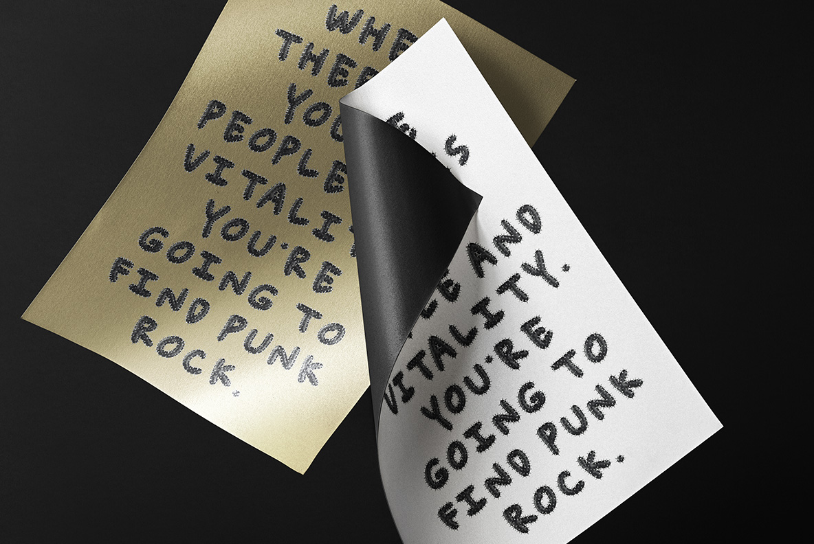
There is a hand-drawn wobble under all that hardware. The Punk Font uses a chunky, slightly uneven marker skeleton, which is what keeps it from feeling like a corporate metal logo. Strokes swell and thin the way a fat pen does. Above all the letters lean and sit unevenly on the baseline, though they still line up well enough to set a word. Besides, the wonkiness is what makes it read as punk.