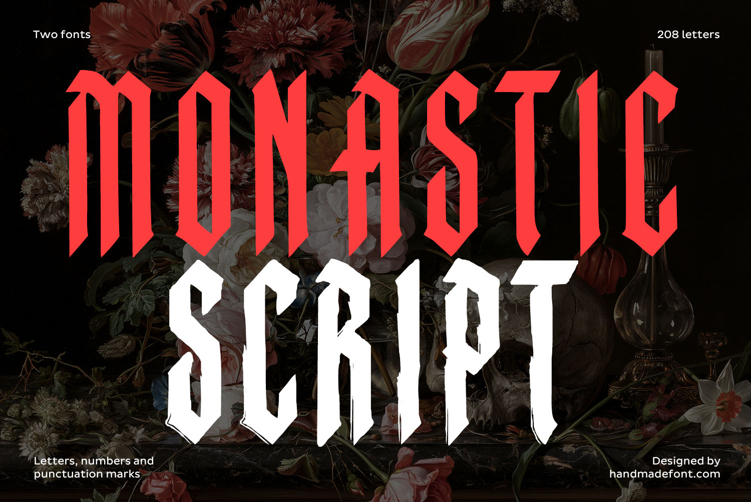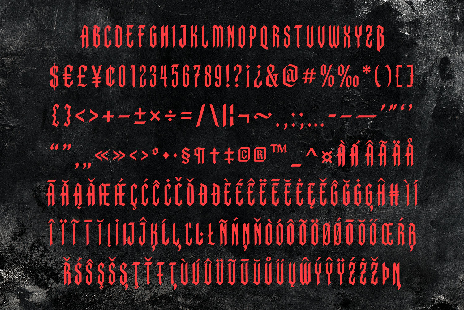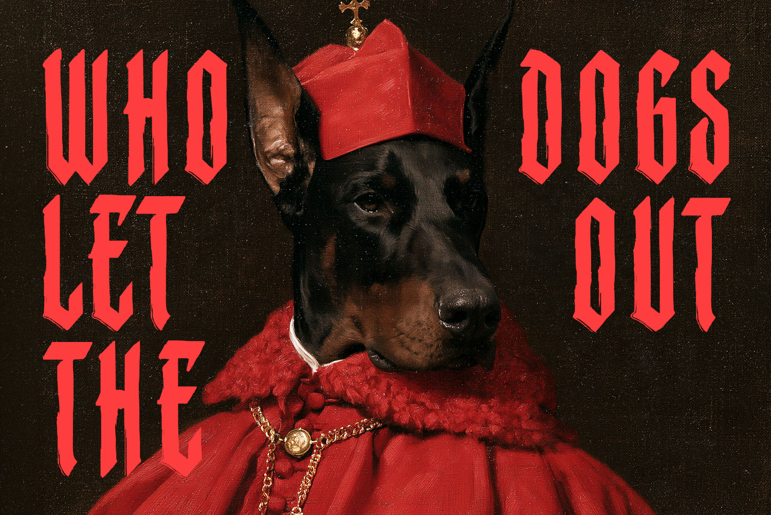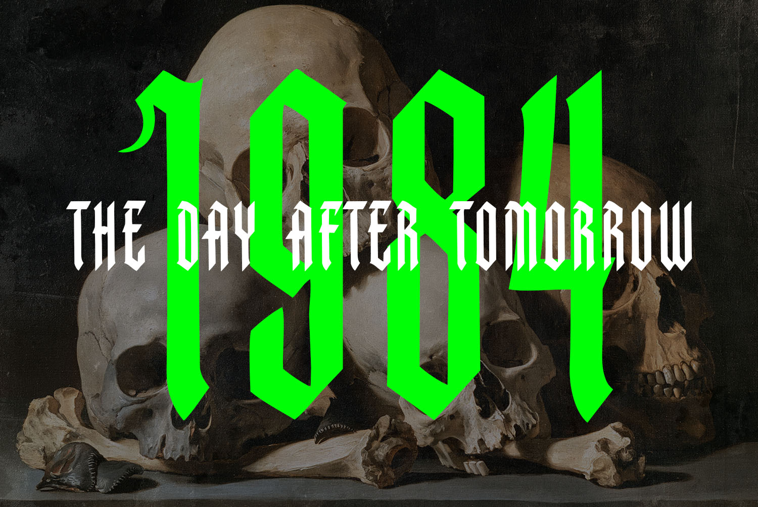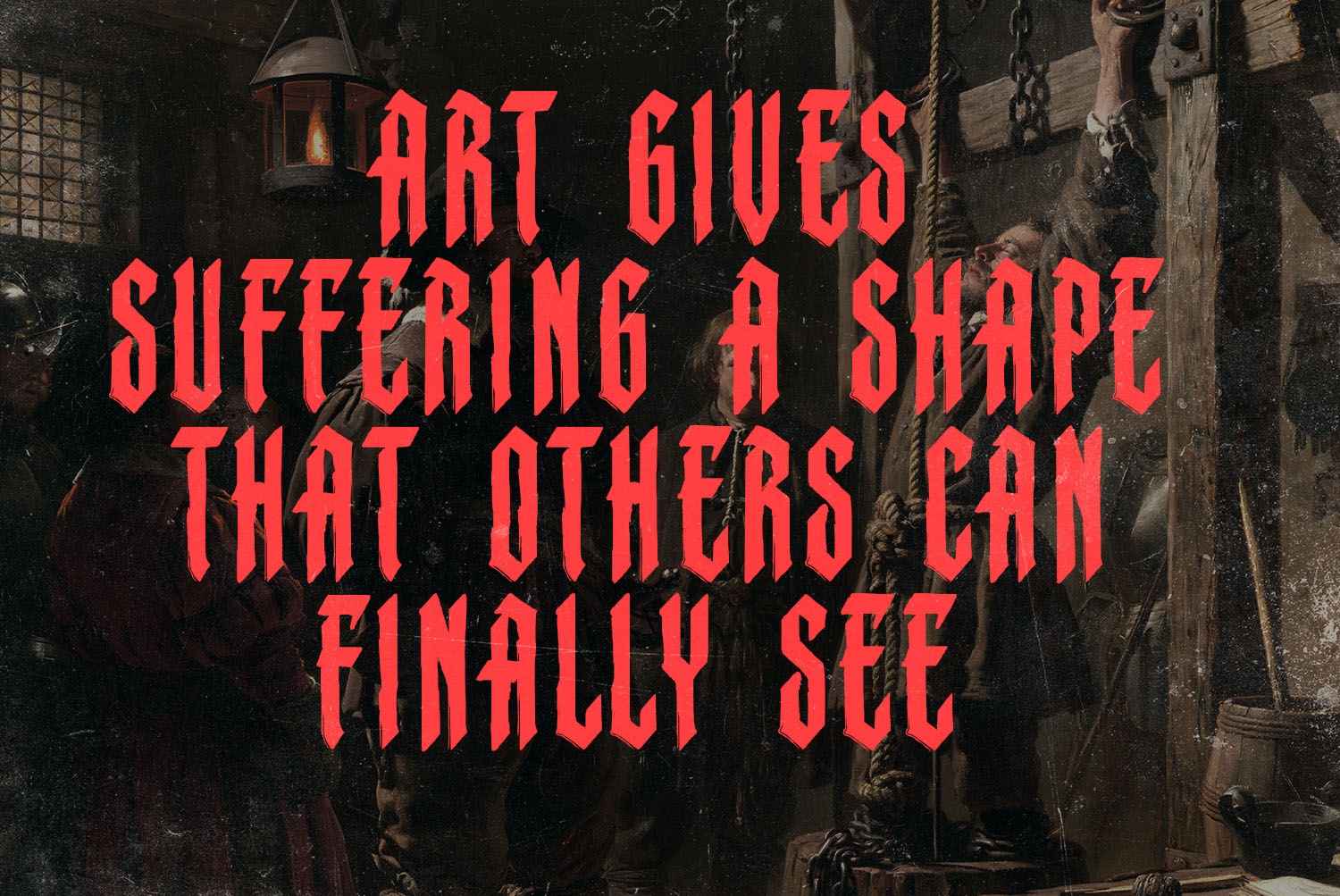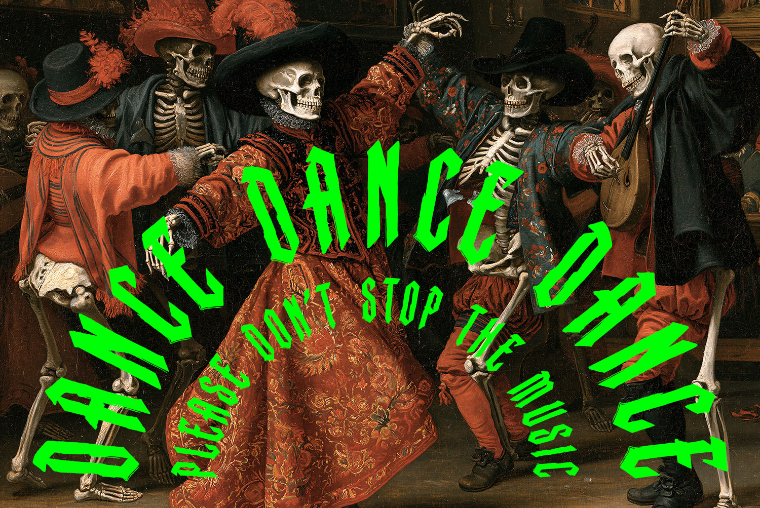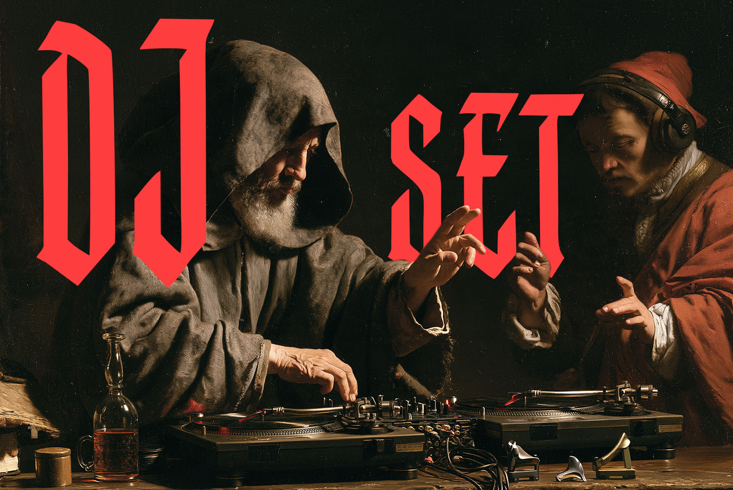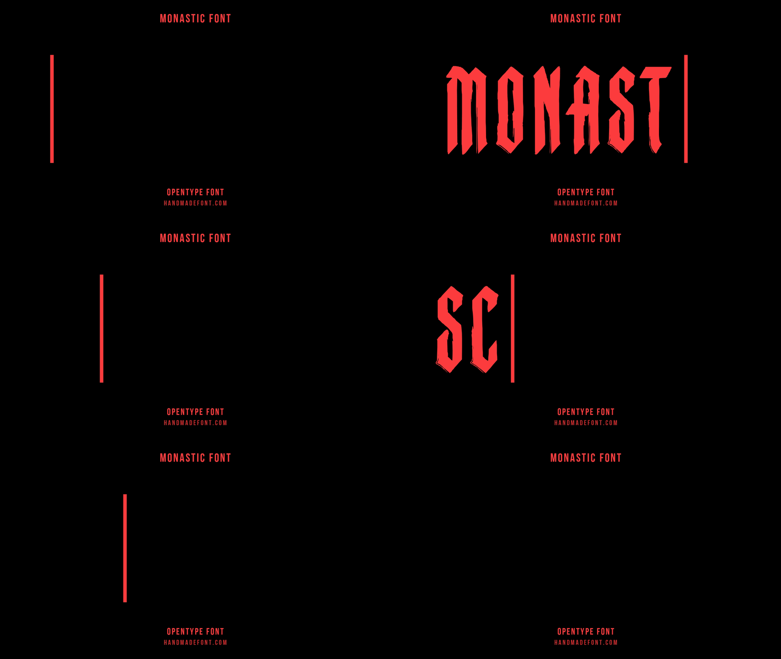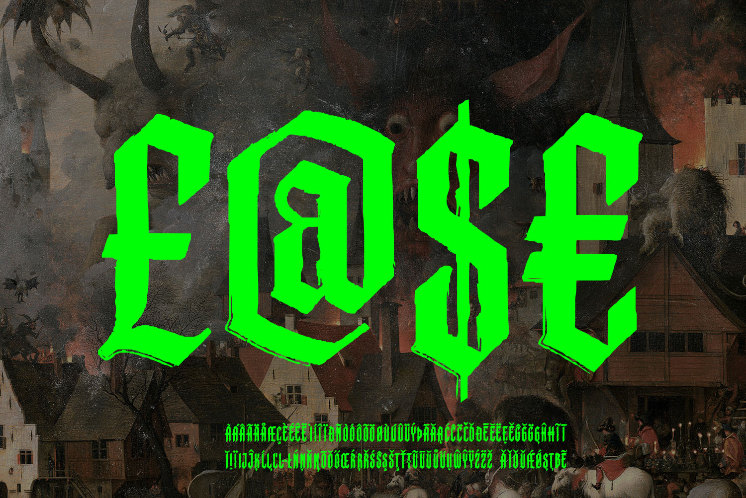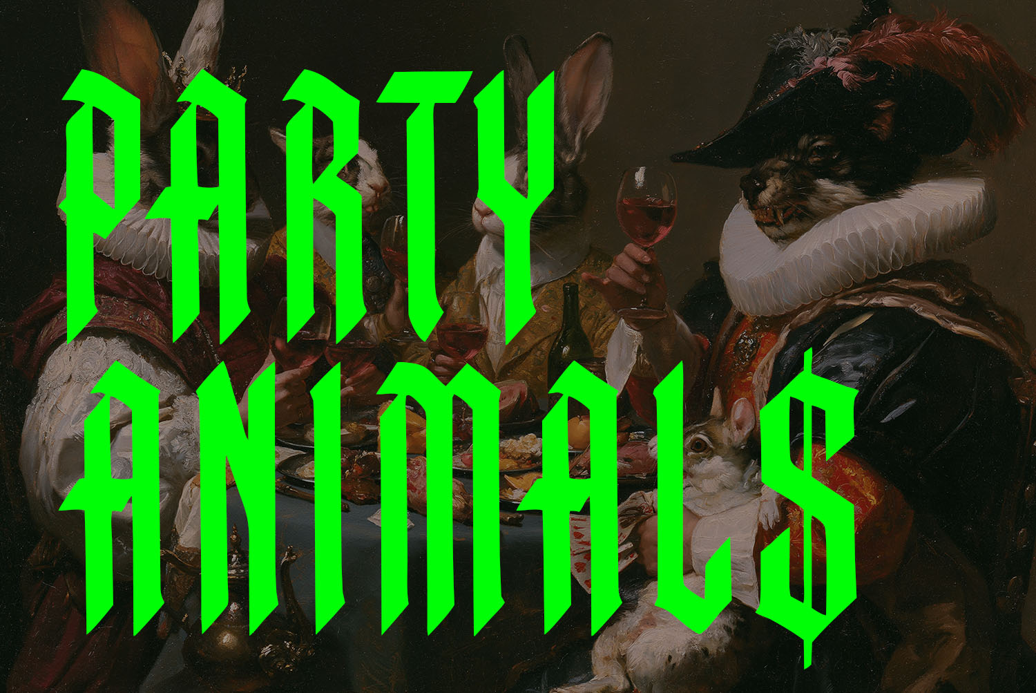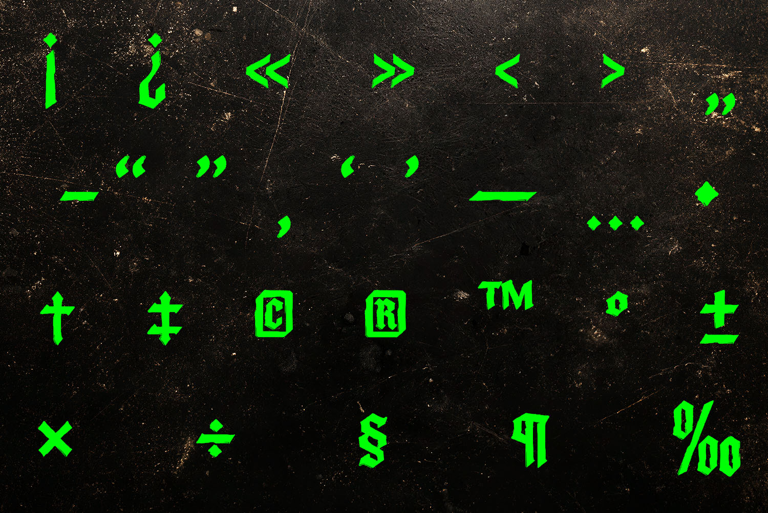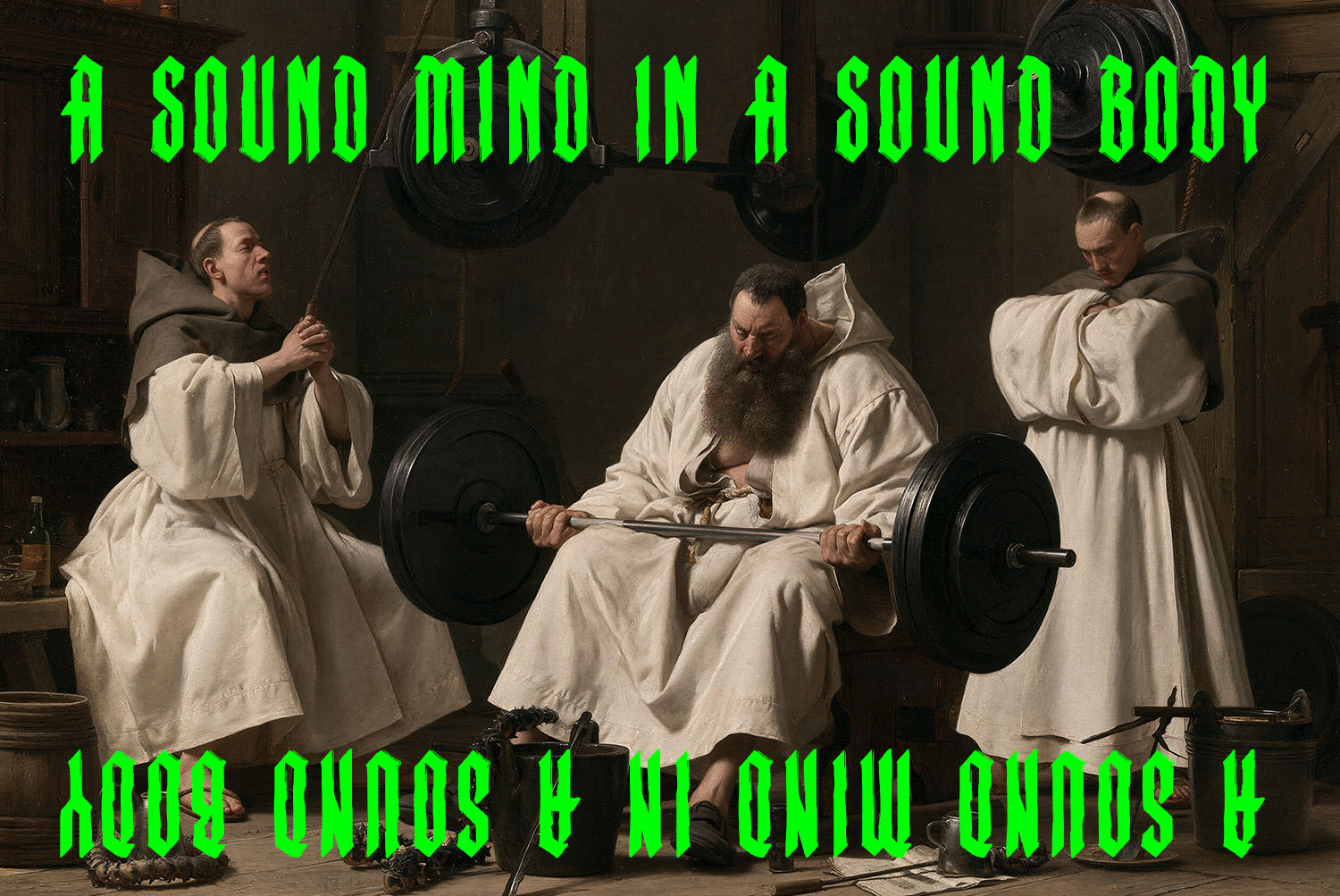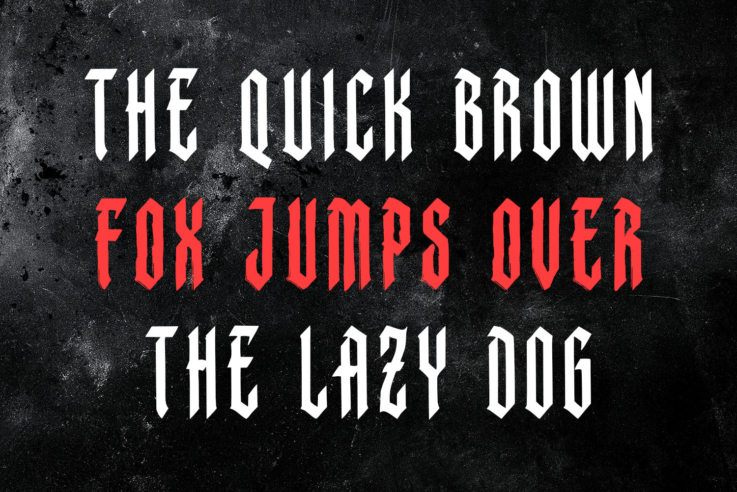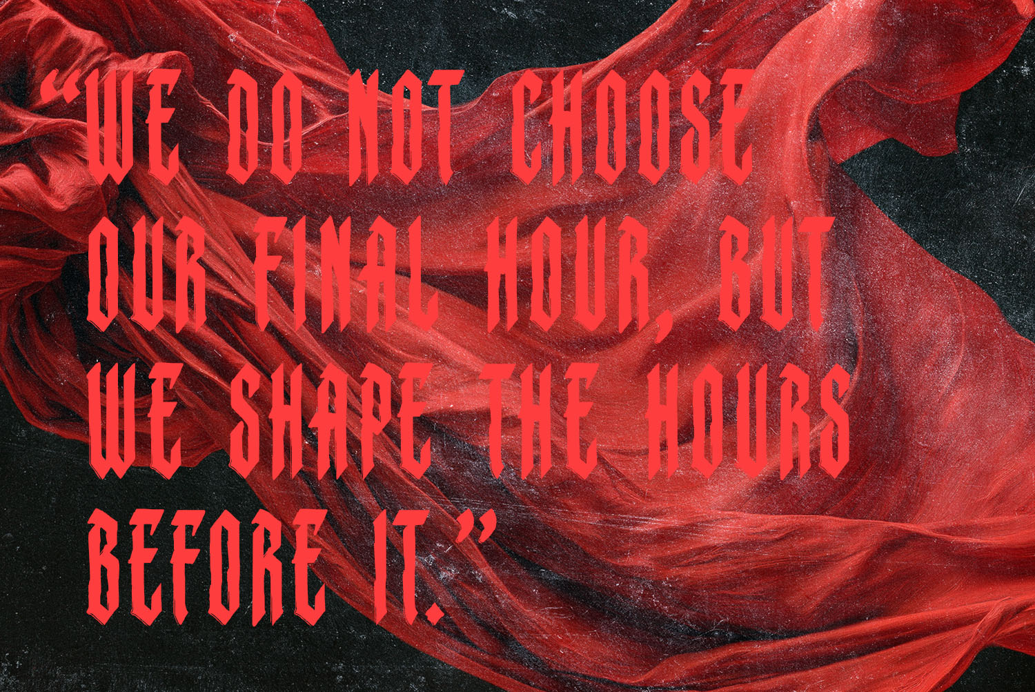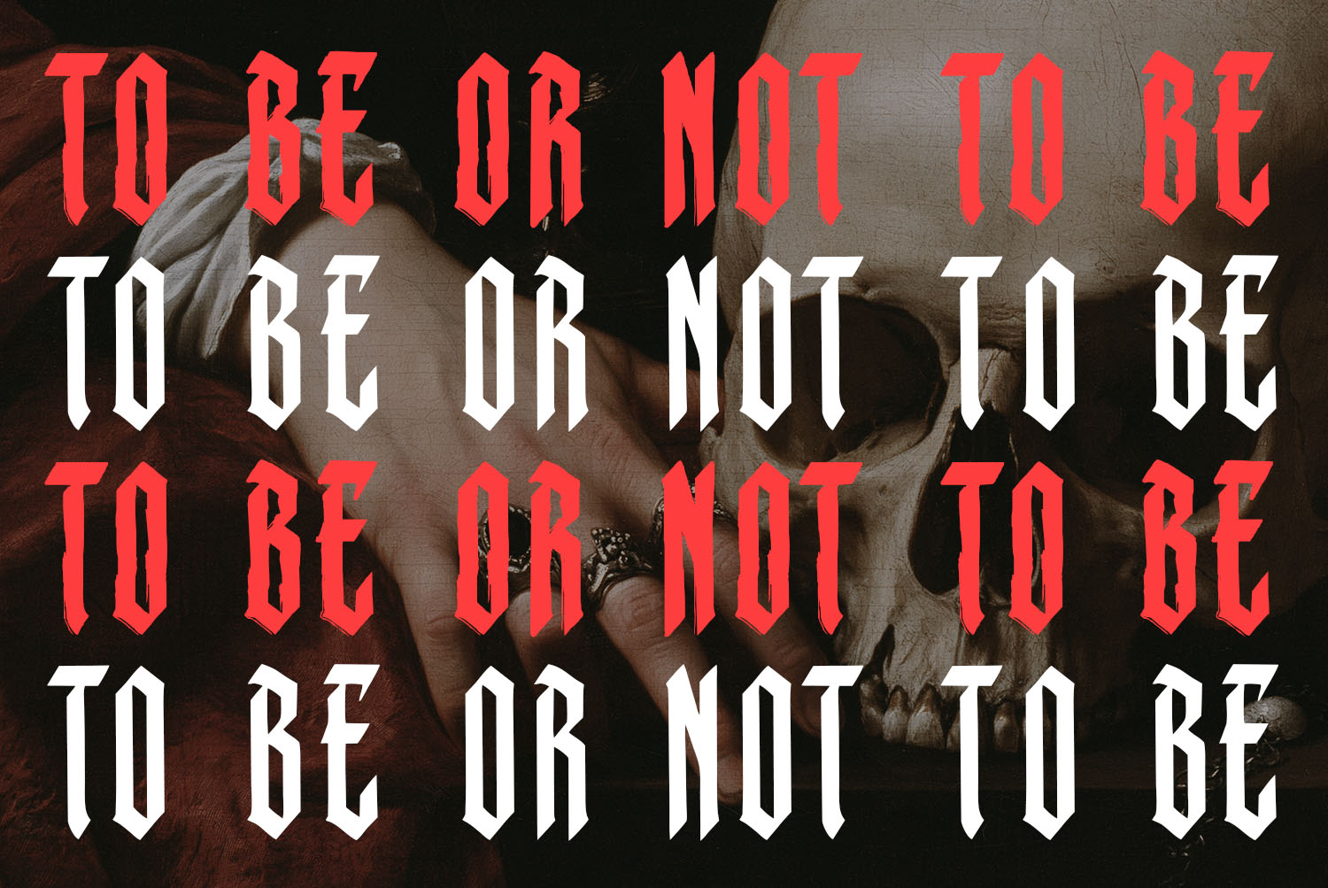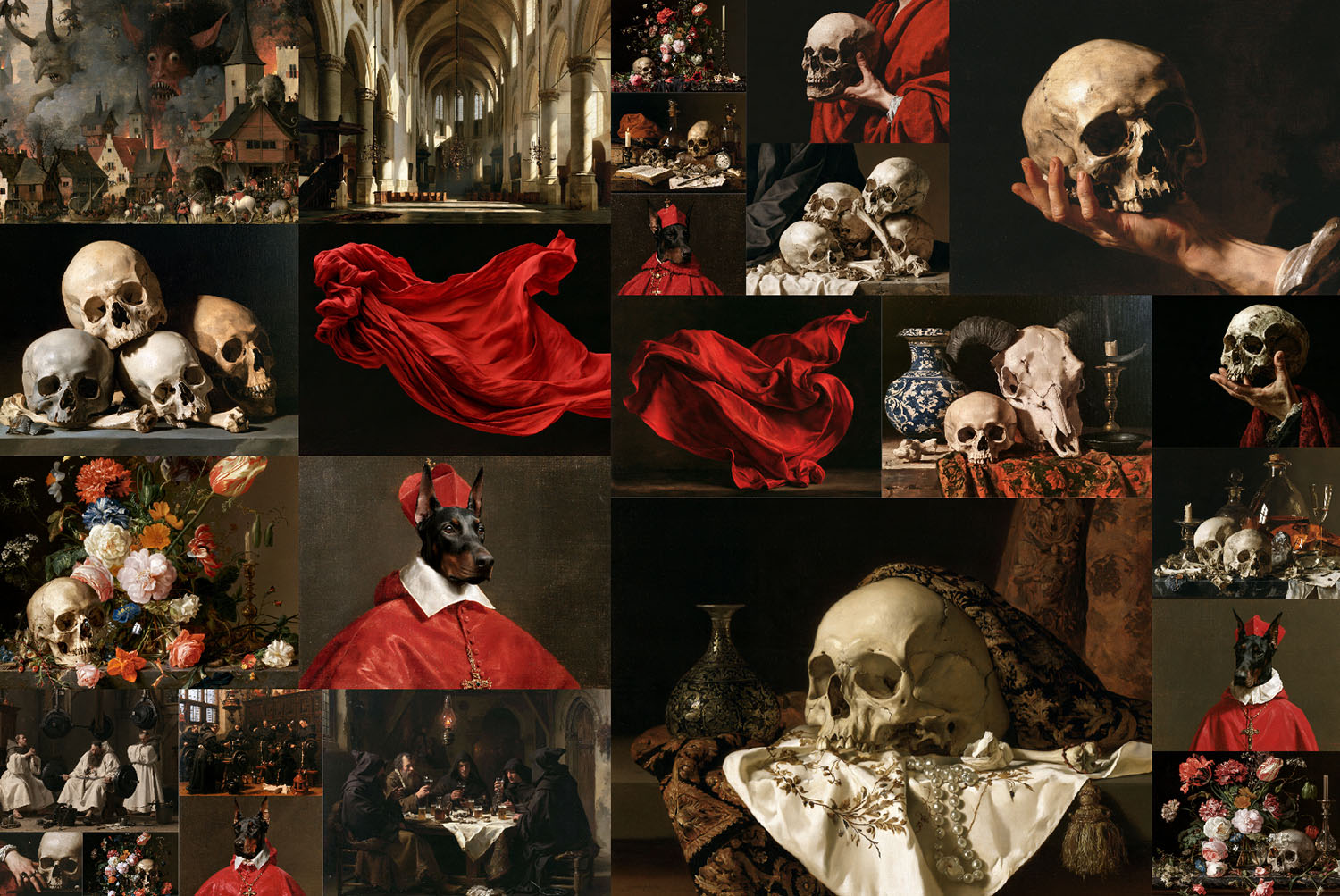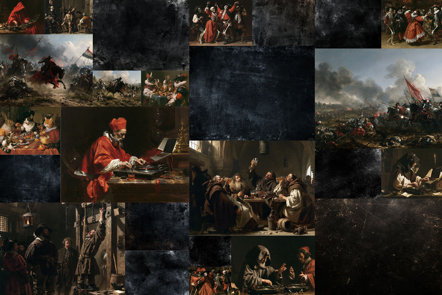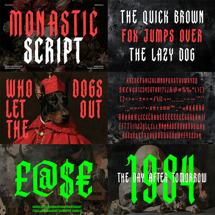


Monastic Font is a tall, condensed blackletter duo that looks lifted from a medieval manuscript and then given a dark sense of humour. Monastic Tall stays crisp for logos and labels, while Monastic Quill comes rough and ink-worn. The pack also holds 50 Baroque-style artworks, from skull still lifes to a monk on the decks. OTF, TTF and WOFF files included.
Monastic Font Reads Like a Manuscript With a Grudge
Monastic Font started in the margins of old prayer books, where scribes drew tall letters and lost patience. So every capital here is narrow, upright and finished with sharp diagonal cuts. Still, the shapes never turn fussy. Because the counters stay open, a word like SINNER reads clearly from across the room.
Two Ways to Hold the Quill
The family comes in two styles. Monastic Tall keeps clean, crisp edges, so it suits logos, labels and big headlines. Monastic Quill, on the other hand, looks like it spent a winter in a damp scriptorium. Its edges are rough and ink-worn, as if each letter was cut by hand and then left to age. Both share one skeleton, so you can swap them mid-project.